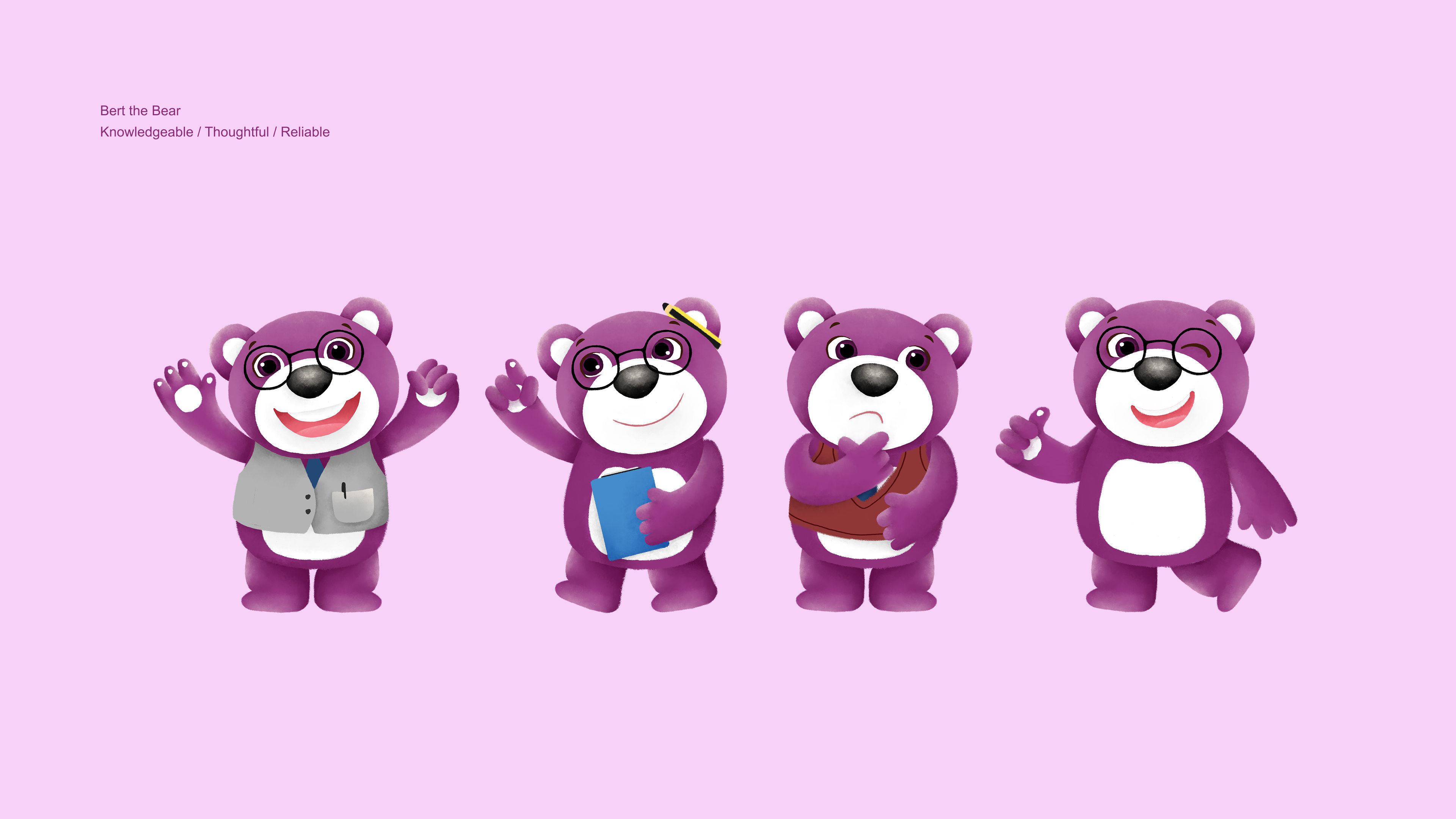
I am a graphic designer and freelance illustrator based in Canada, with three years of experience in the advertising industry. My work focuses on concept thinking, visual storytelling, and brand-driven design across print and digital platforms. I develop campaign visuals, social media content, packaging and merchandise illustrations that bring ideas to life.
For me, it’s about improving my craft, staying curious, and learning from every project. I enjoy turning concepts into visuals that feel simple, engaging, and human.


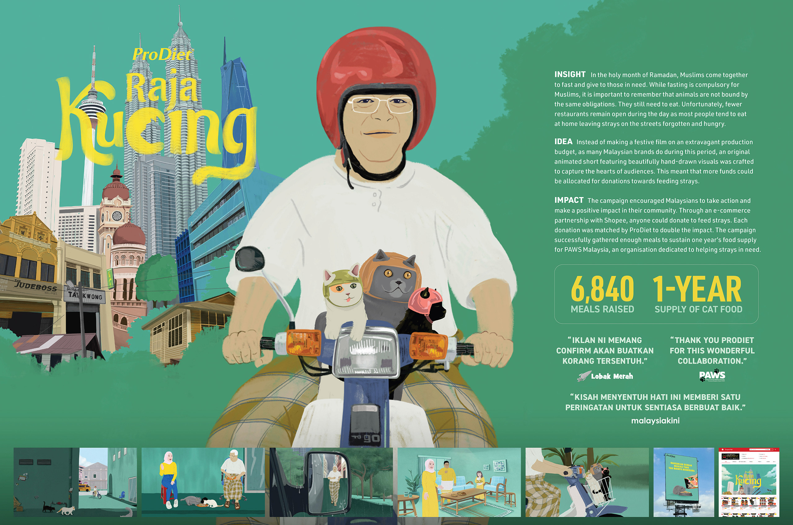
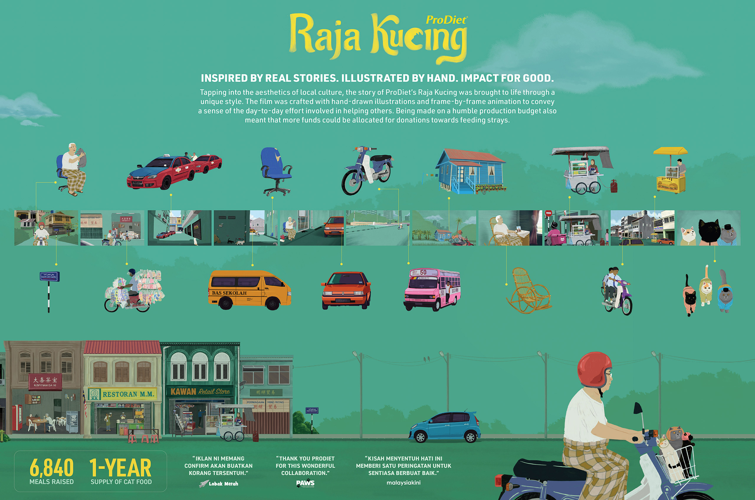
During Ramadan, a season of compassion and togetherness in Malaysia, communities come together to give back. Yet for many stray animals, this period becomes even harder as fewer restaurants remain open and food sources disappear.
ProDiet chose to turn empathy into action by creating a hand-illustrated animated short film inspired by real stories of Malaysian kindness. The film gently invited the community to care for those often forgotten. Through a partnership with Shopee, the campaign made it easy for the public to contribute, resulting in 6,840 meals provided and enough support to sustain PAWS Malaysia’s strays for an entire year.
Silver
Illustration
Design
Motion Design
Bronze
Experience & Activation
Merit
Best Low-Budget Film
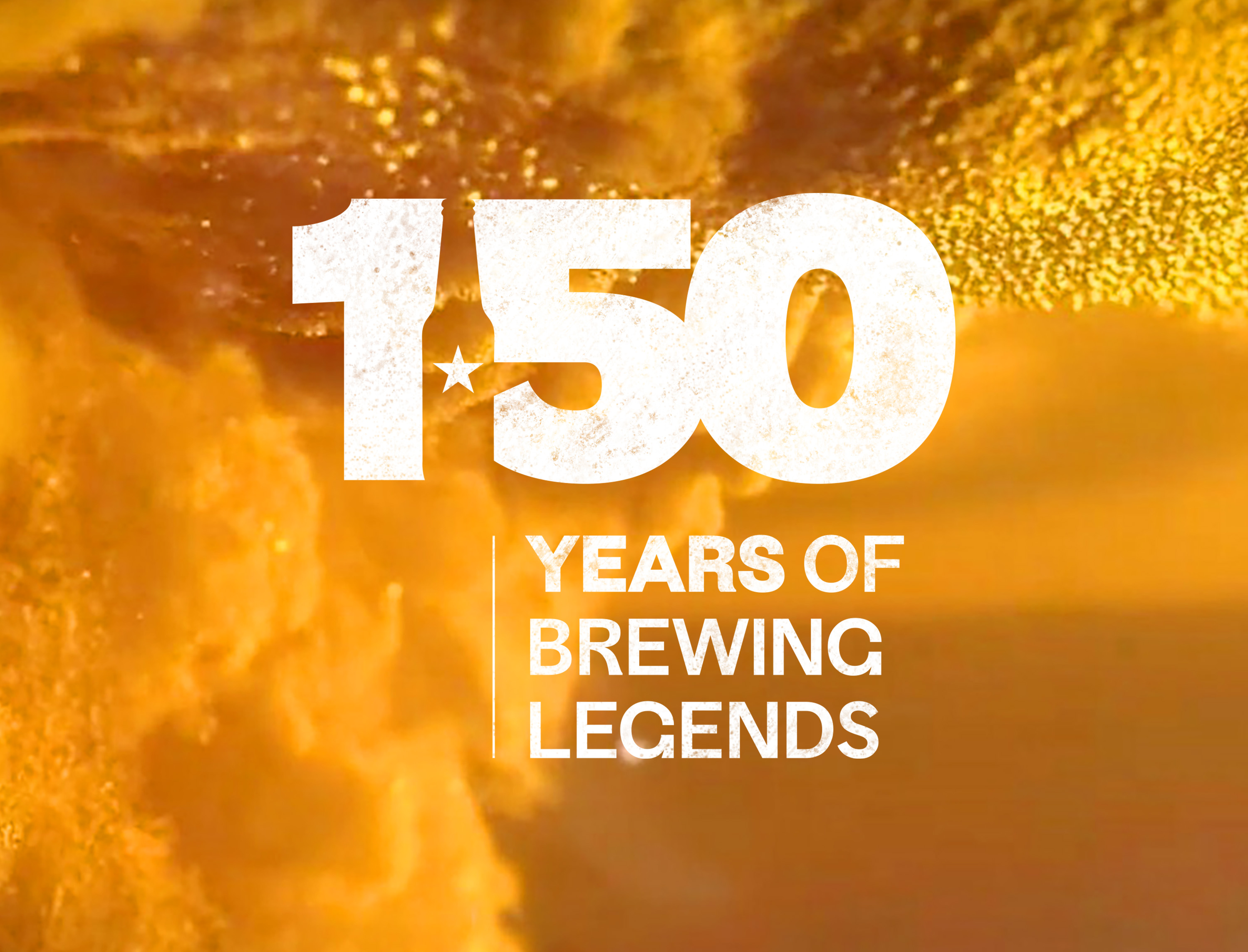
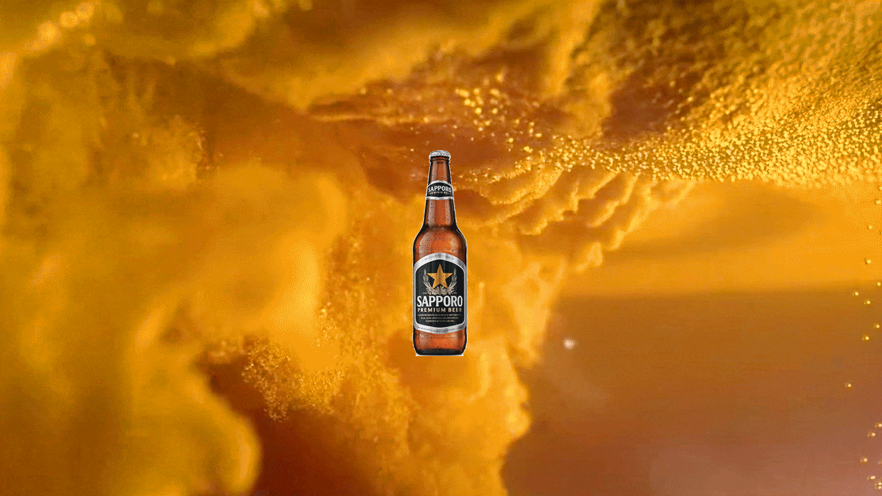
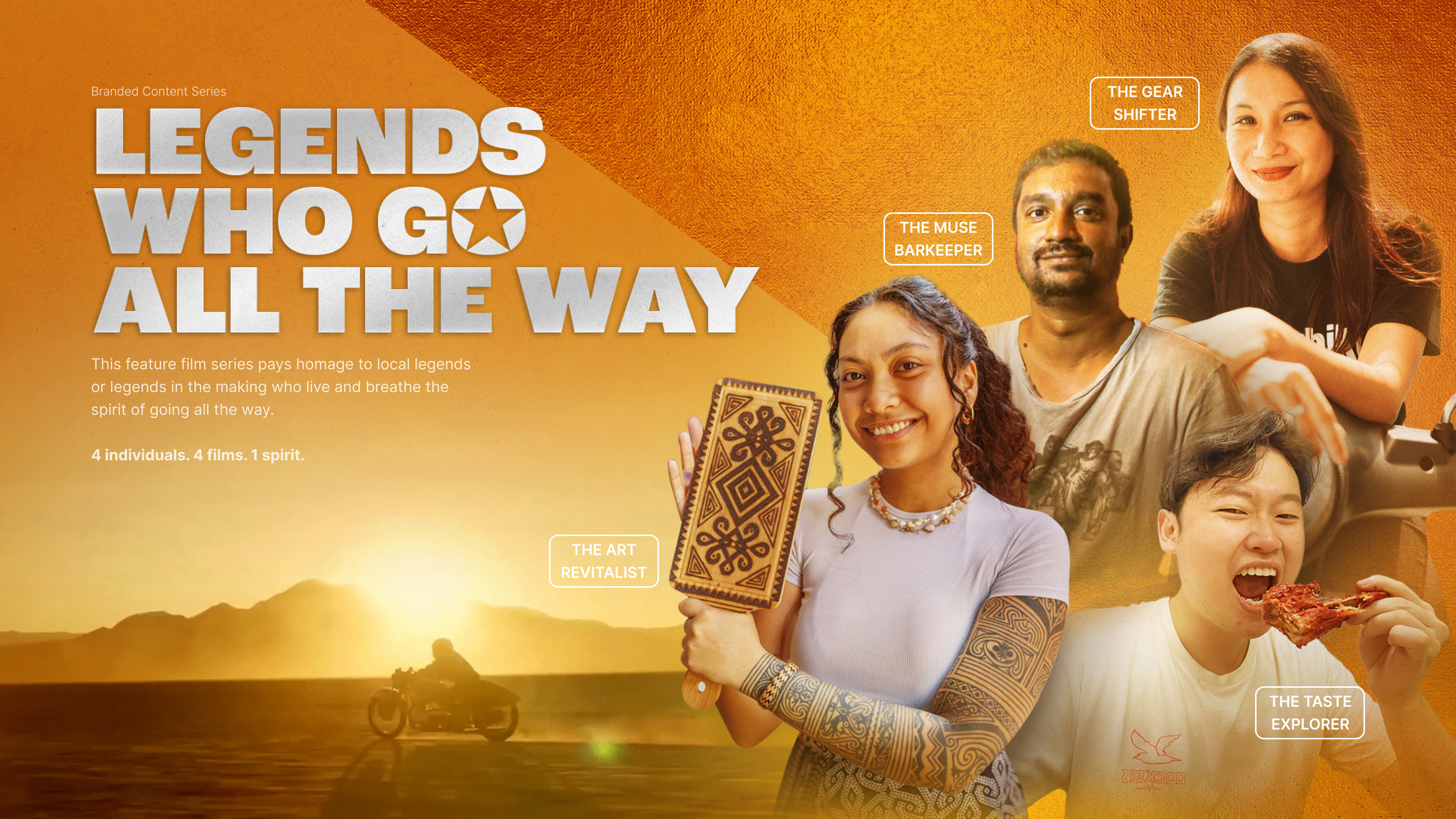
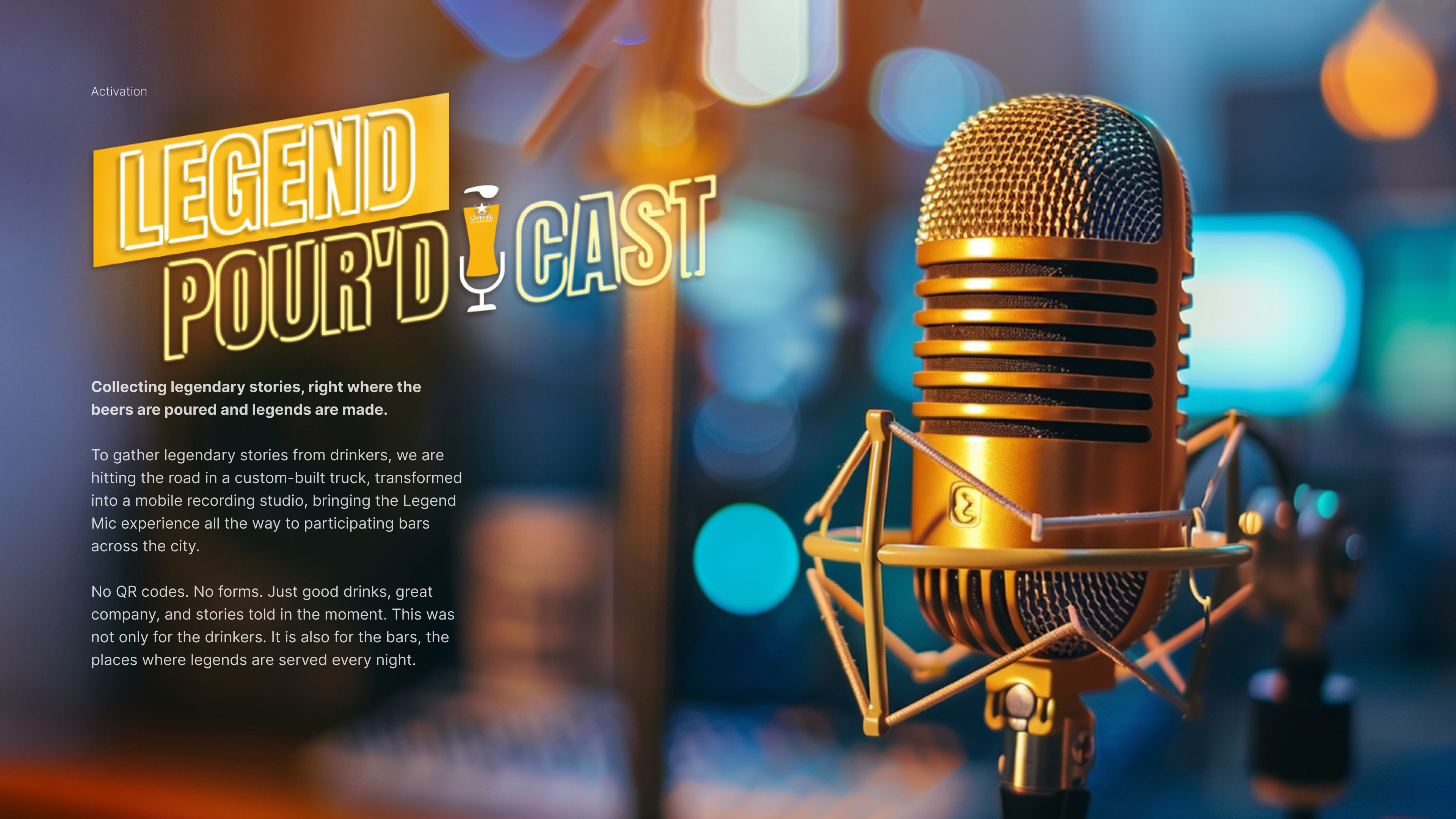
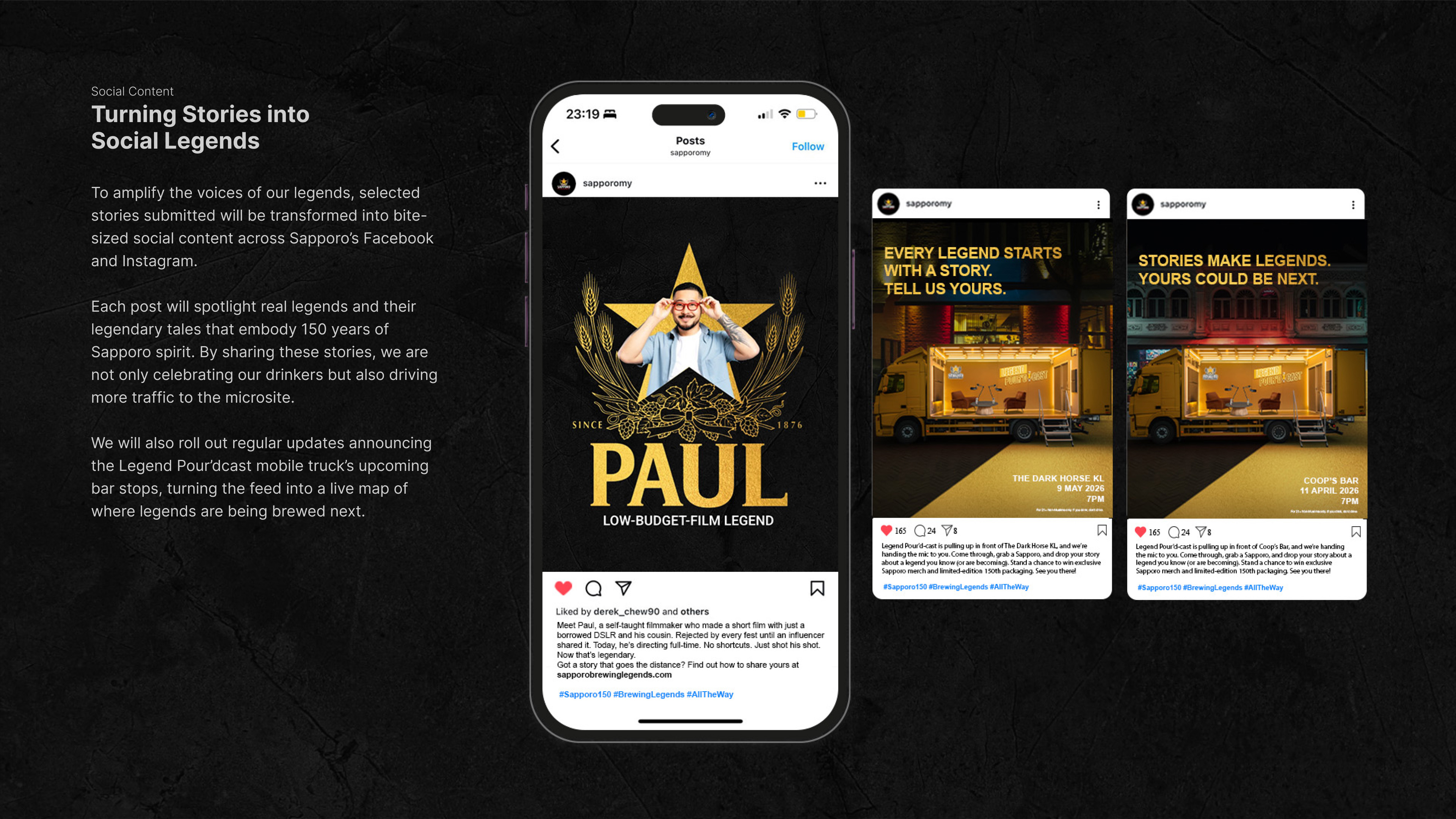
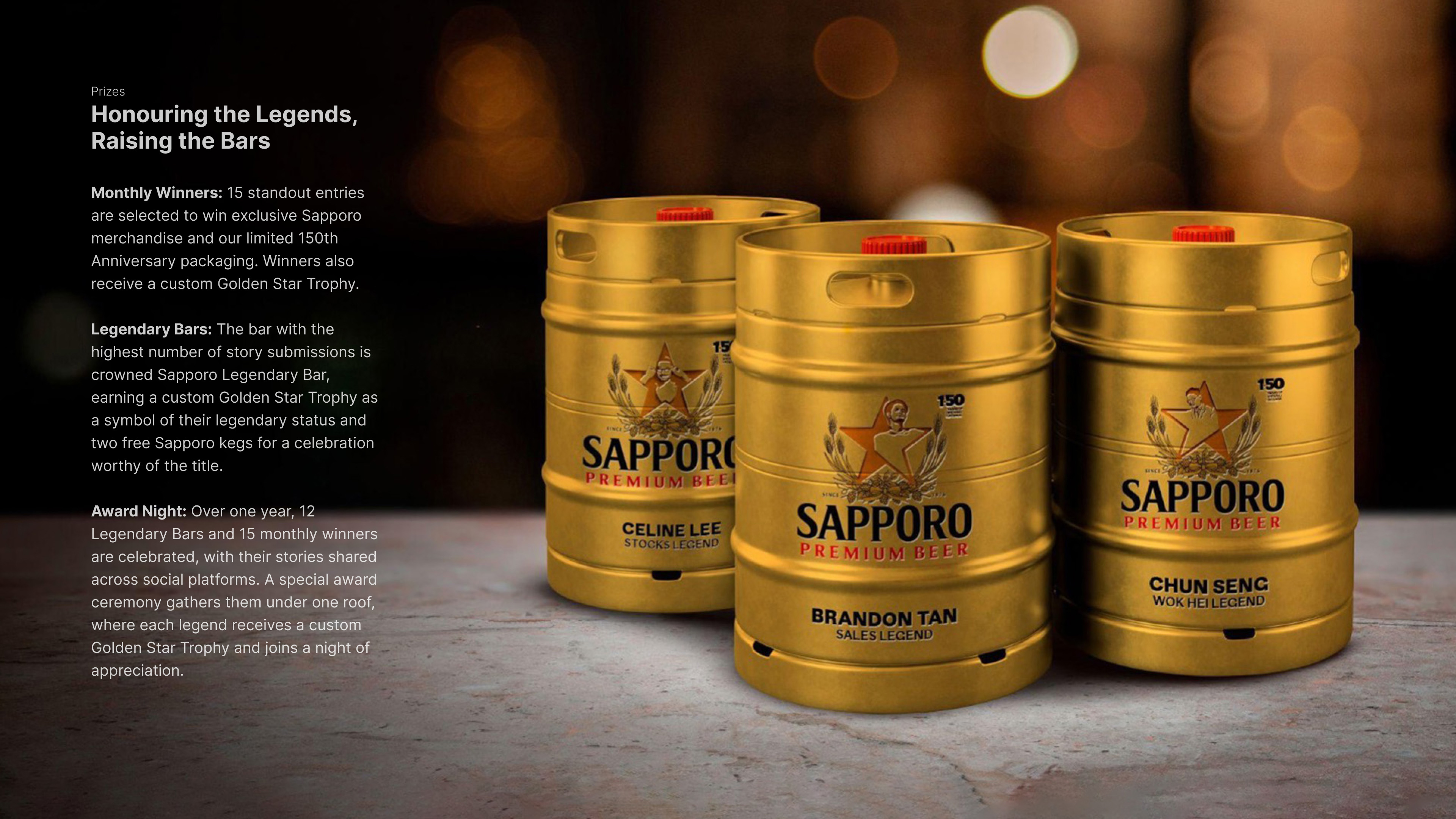
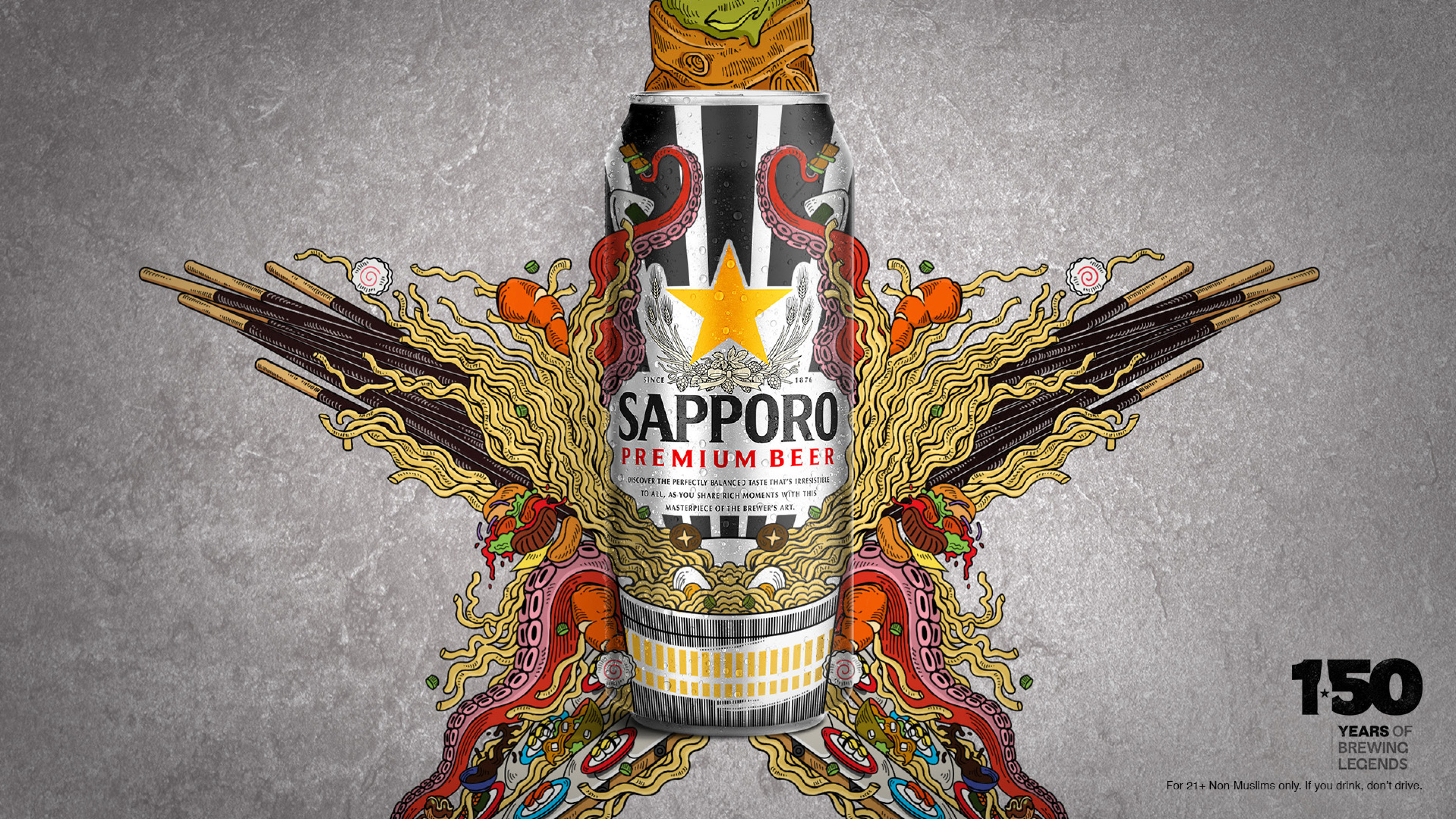
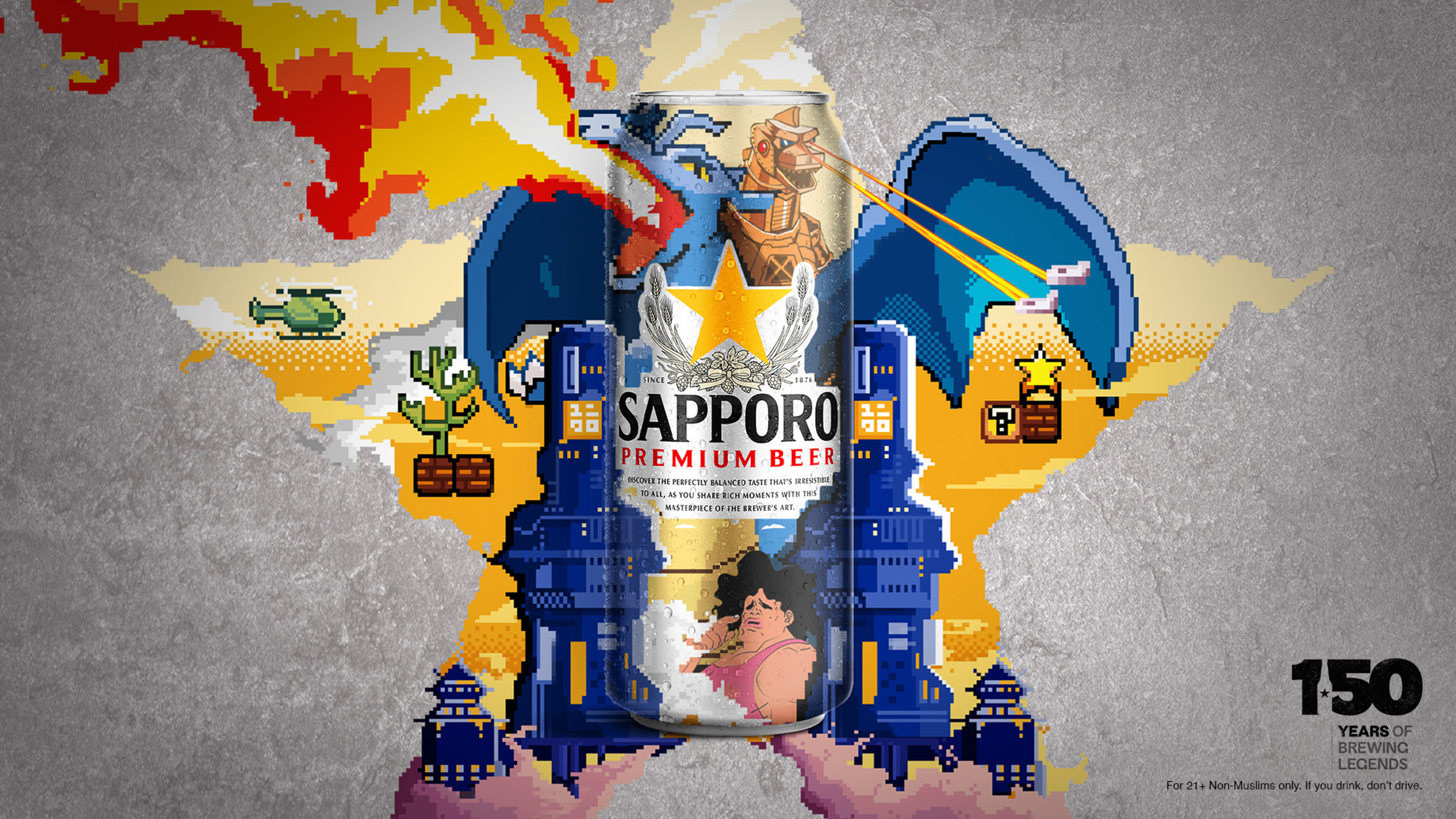
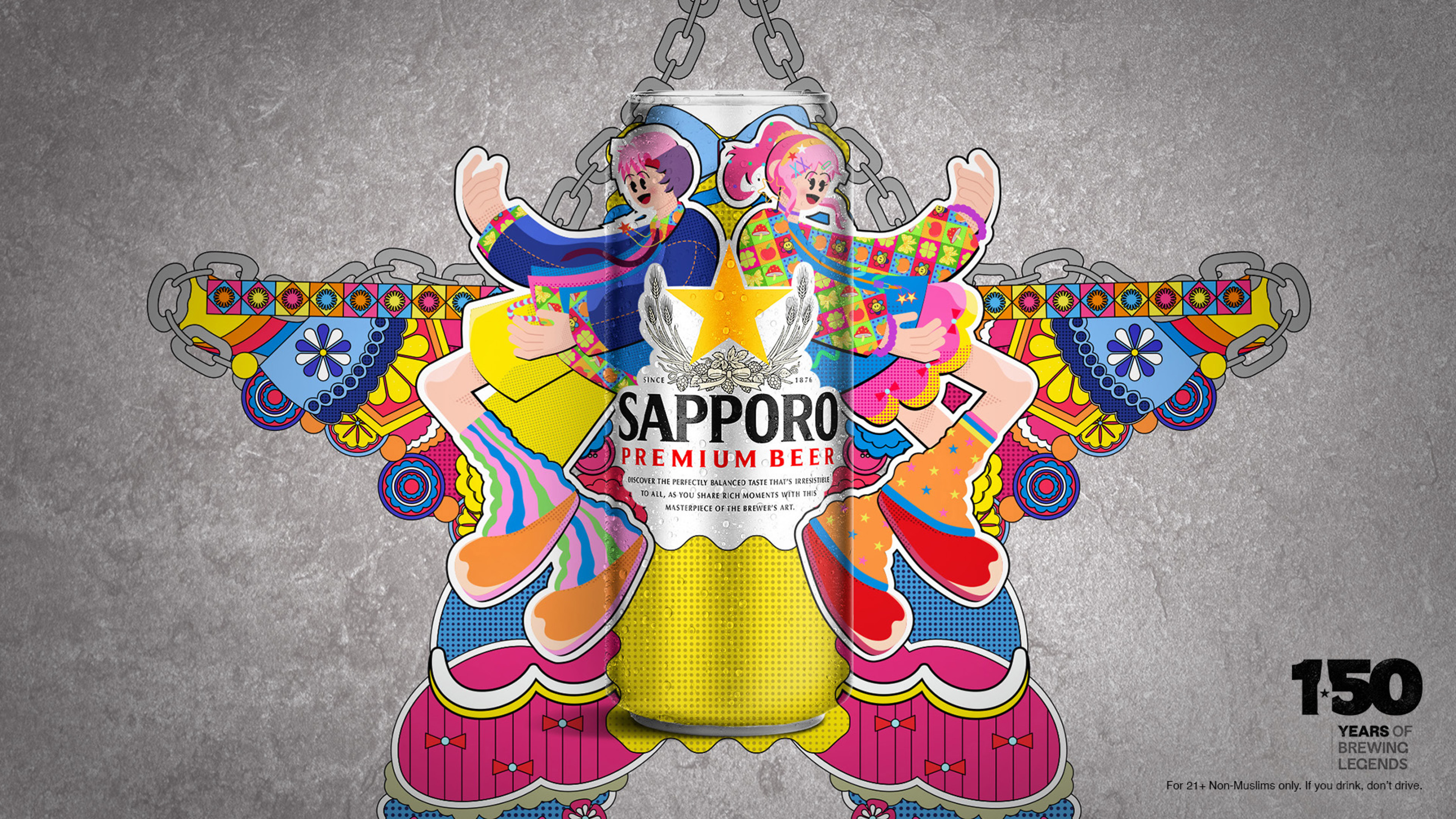
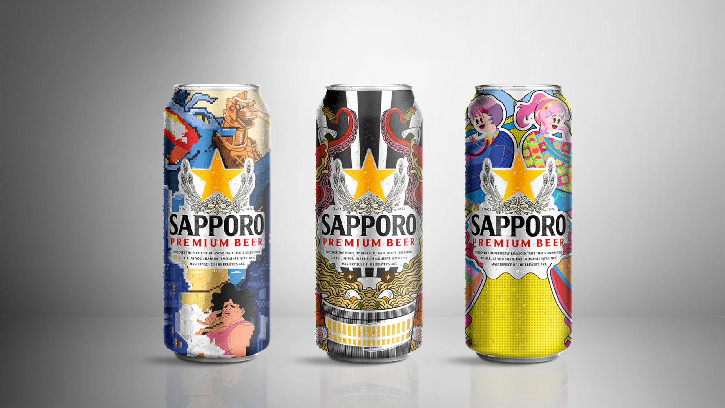
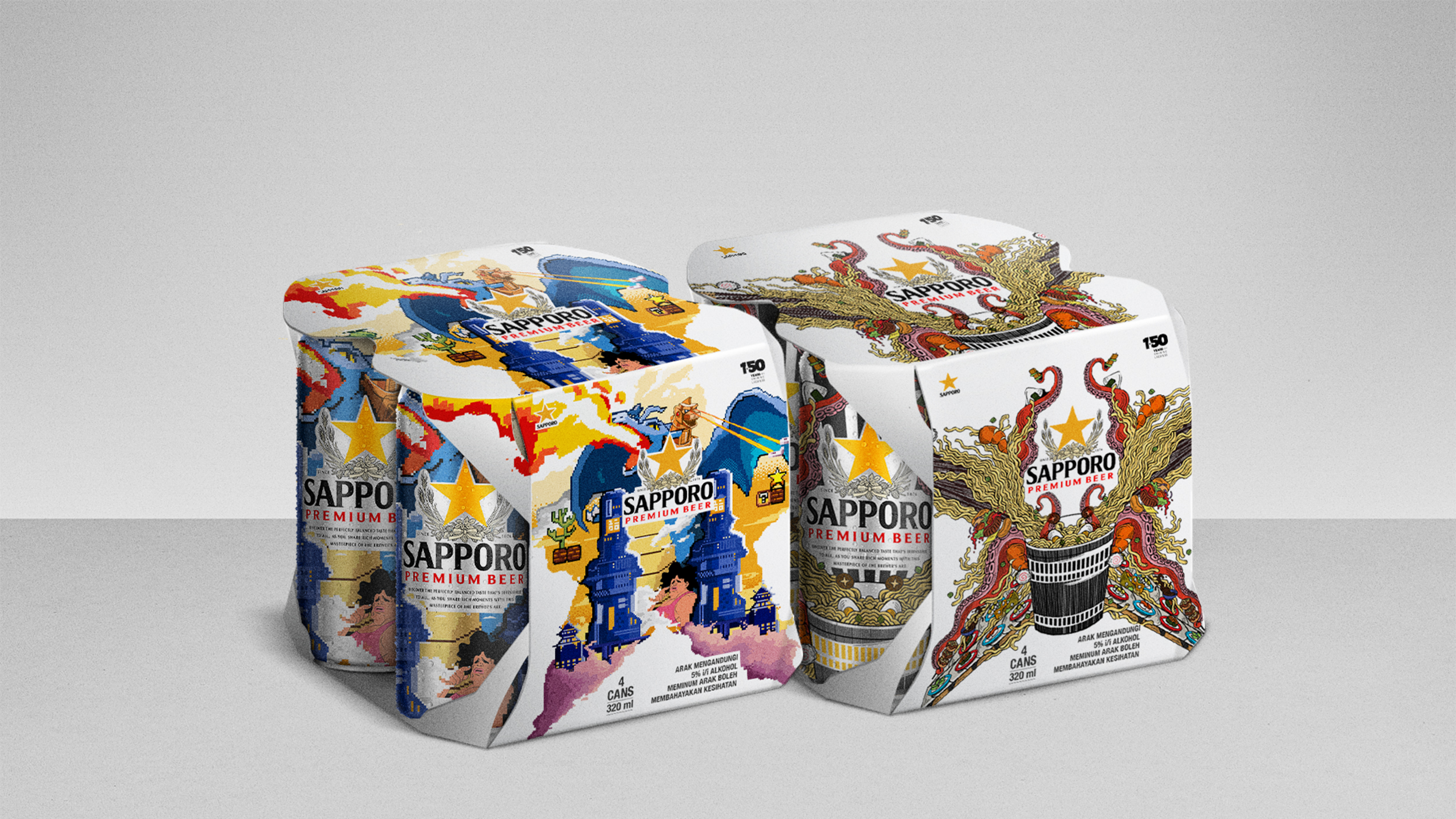
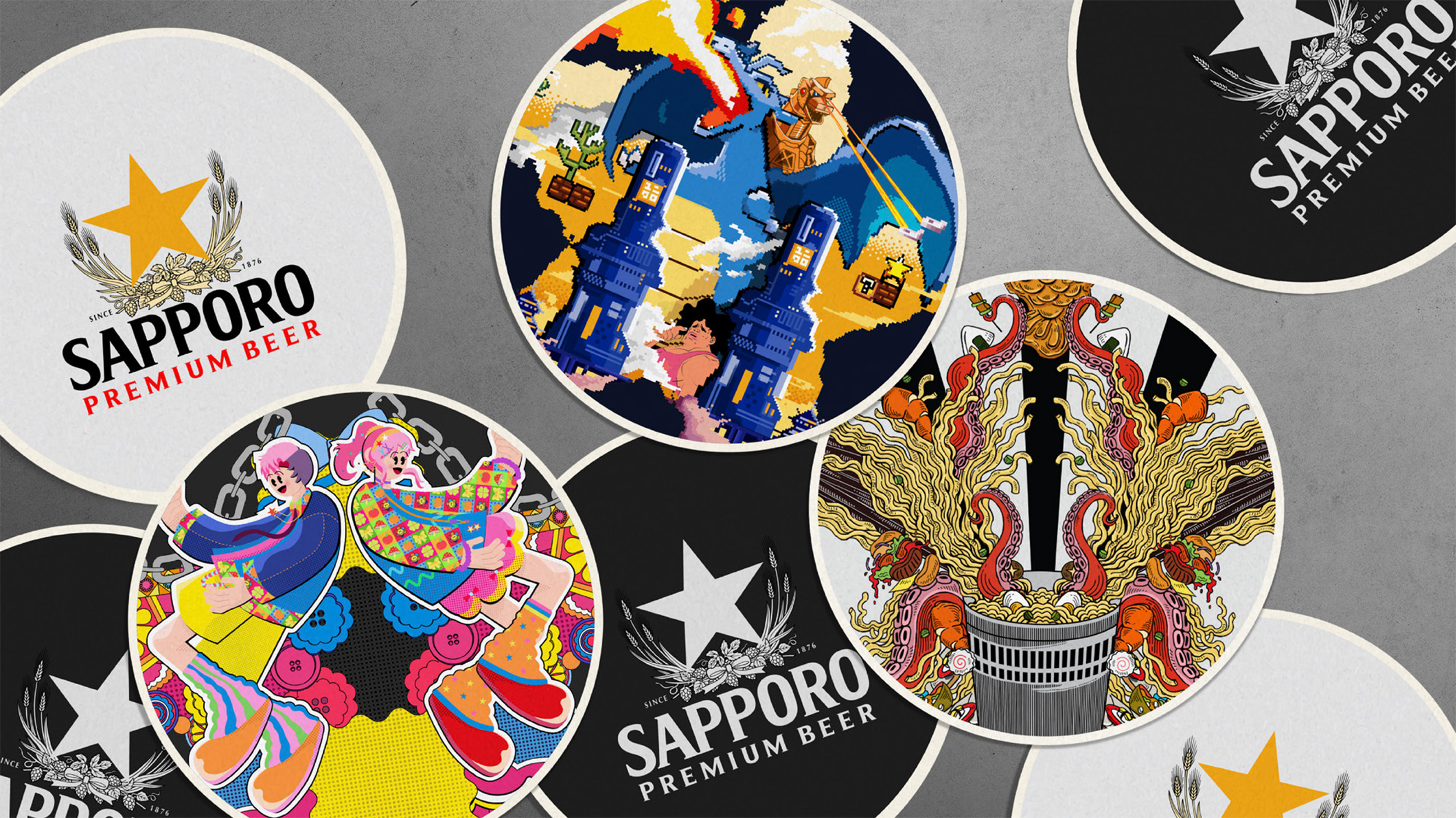
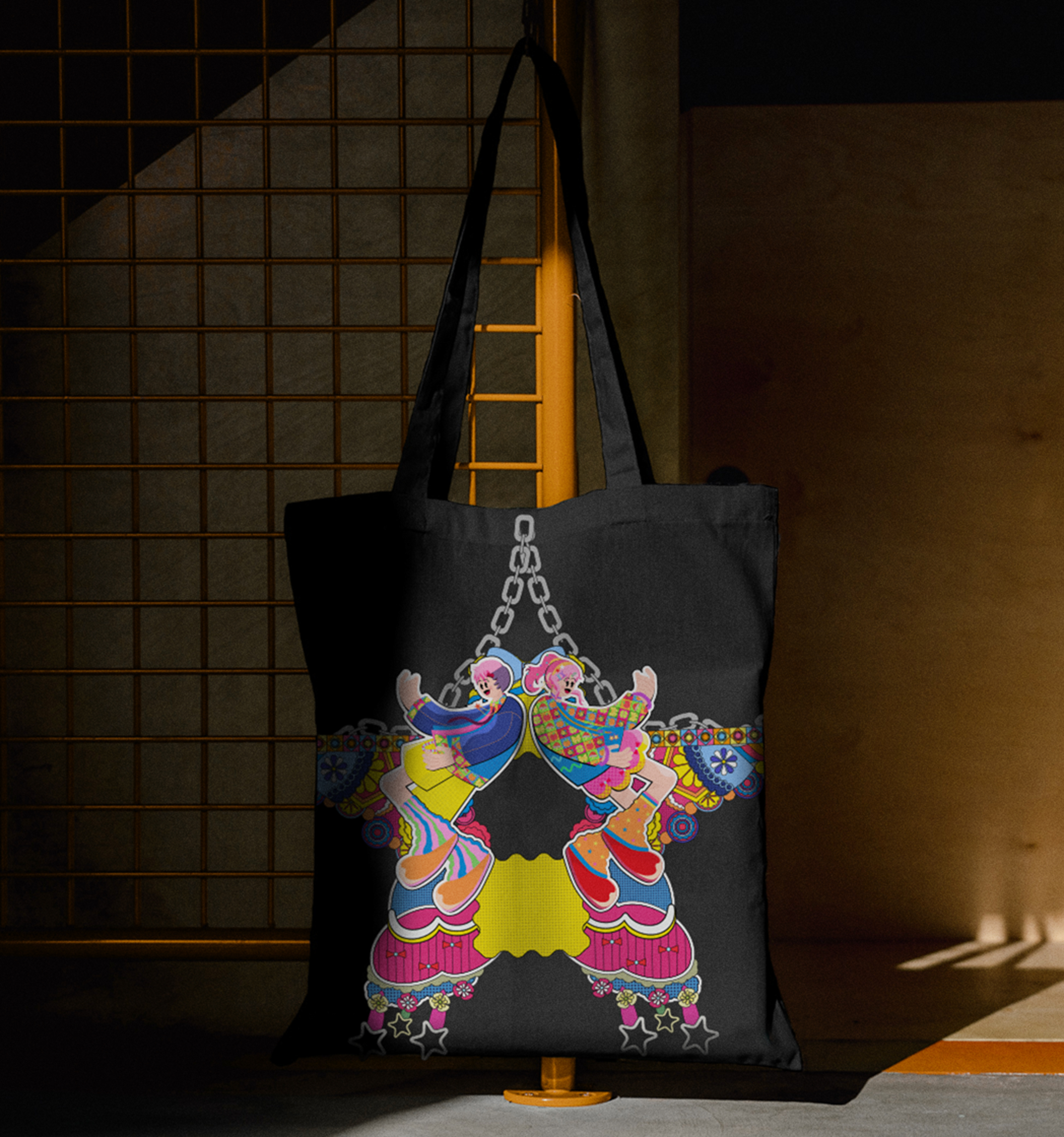
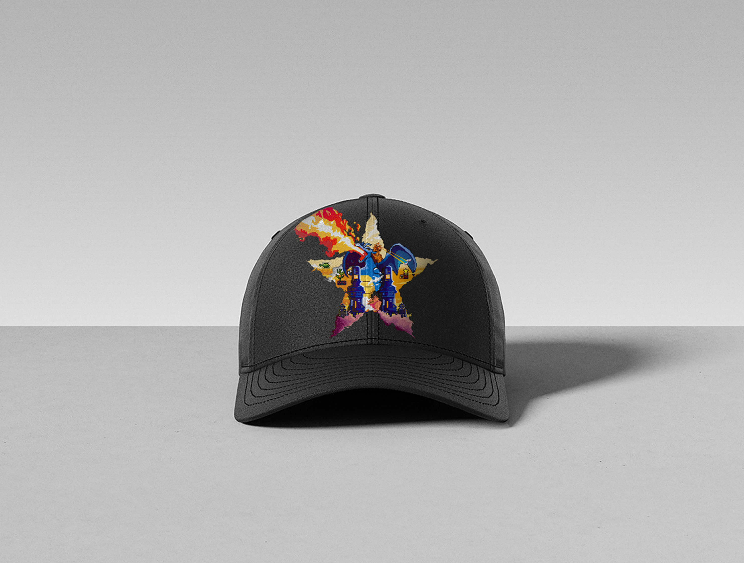
To celebrate Sapporo’s 150th anniversary, this regional campaign introduced the brand to Malaysia while strengthening its position in the premium beer market across Malaysia, Singapore, and Hong Kong. The goal was to highlight Sapporo’s rich heritage and iconic golden star, encouraging consumers to see Sapporo as a new premium choice.
The design places the product at the center with subtle yet eye-catching visuals. Bold compositions and clean layouts connect heritage with modern storytelling, creating a premium and memorable brand experience.

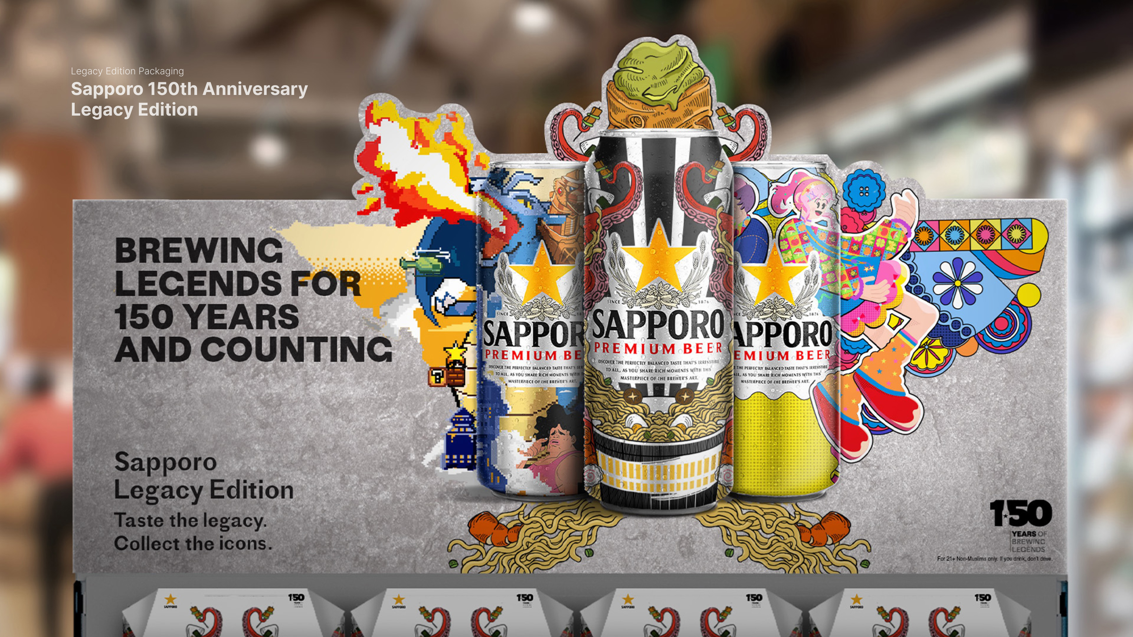
Sapporo was built on a spirit of courage and determination. Founded by Seibei Nakagawa in pursuit of brewing excellence, the brand has been shaped by passion, boldness, and an uncompromising commitment to quality. After 150 years, this spirit continues to live on, honoring a legacy of perseverance and perfection through every glass raised.

For 150 years, Sapporo has believed in perfecting craft through dedication and discipline. Rooted in the legacy of Seibei Nakagawa, this limited edition packaging draws inspiration from Japan’s influence on global culture, paying tribute to iconic moments in food, entertainment, and fashion, while celebrating Sapporo’s uncompromising spirit after 150 years.


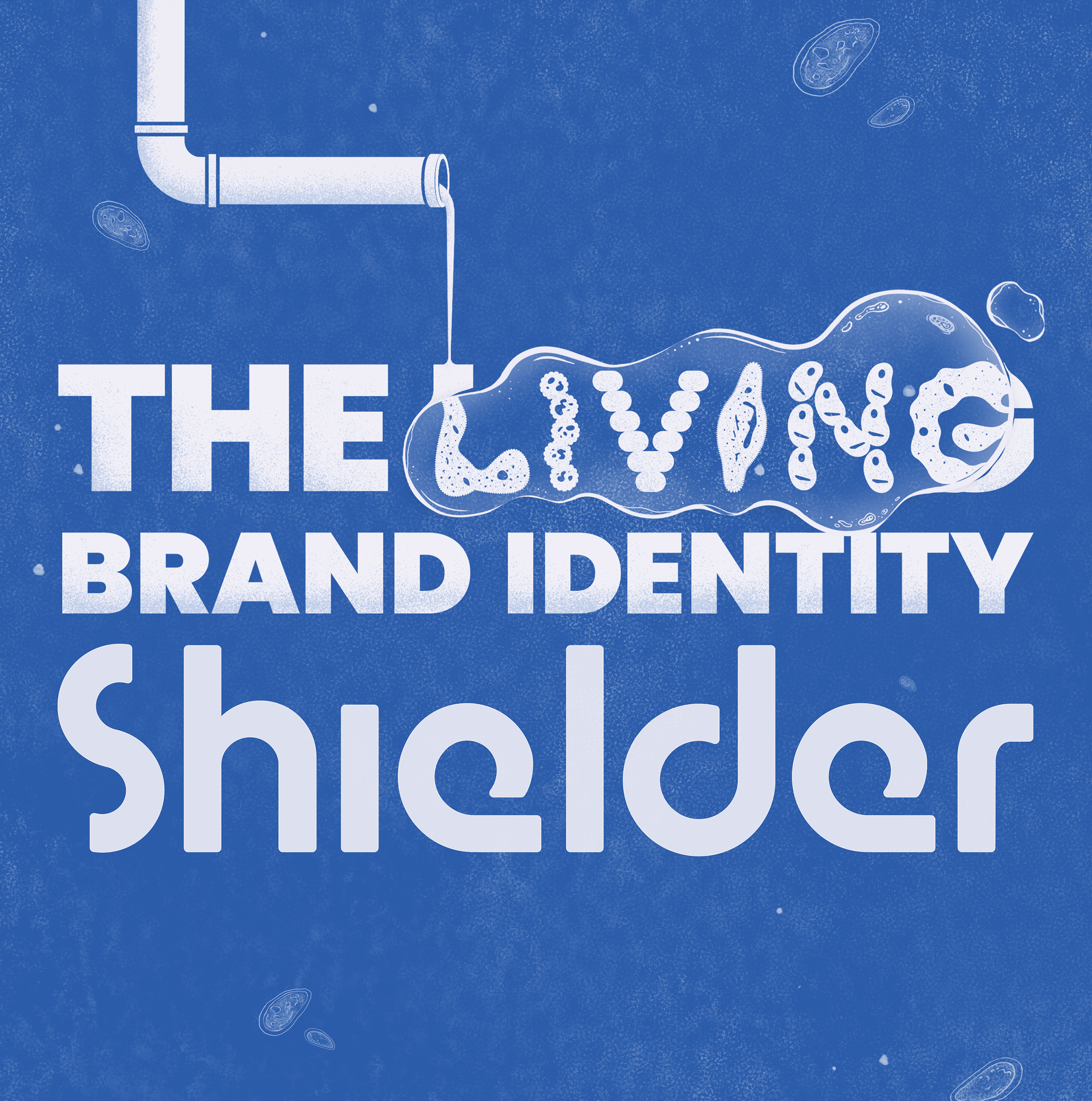
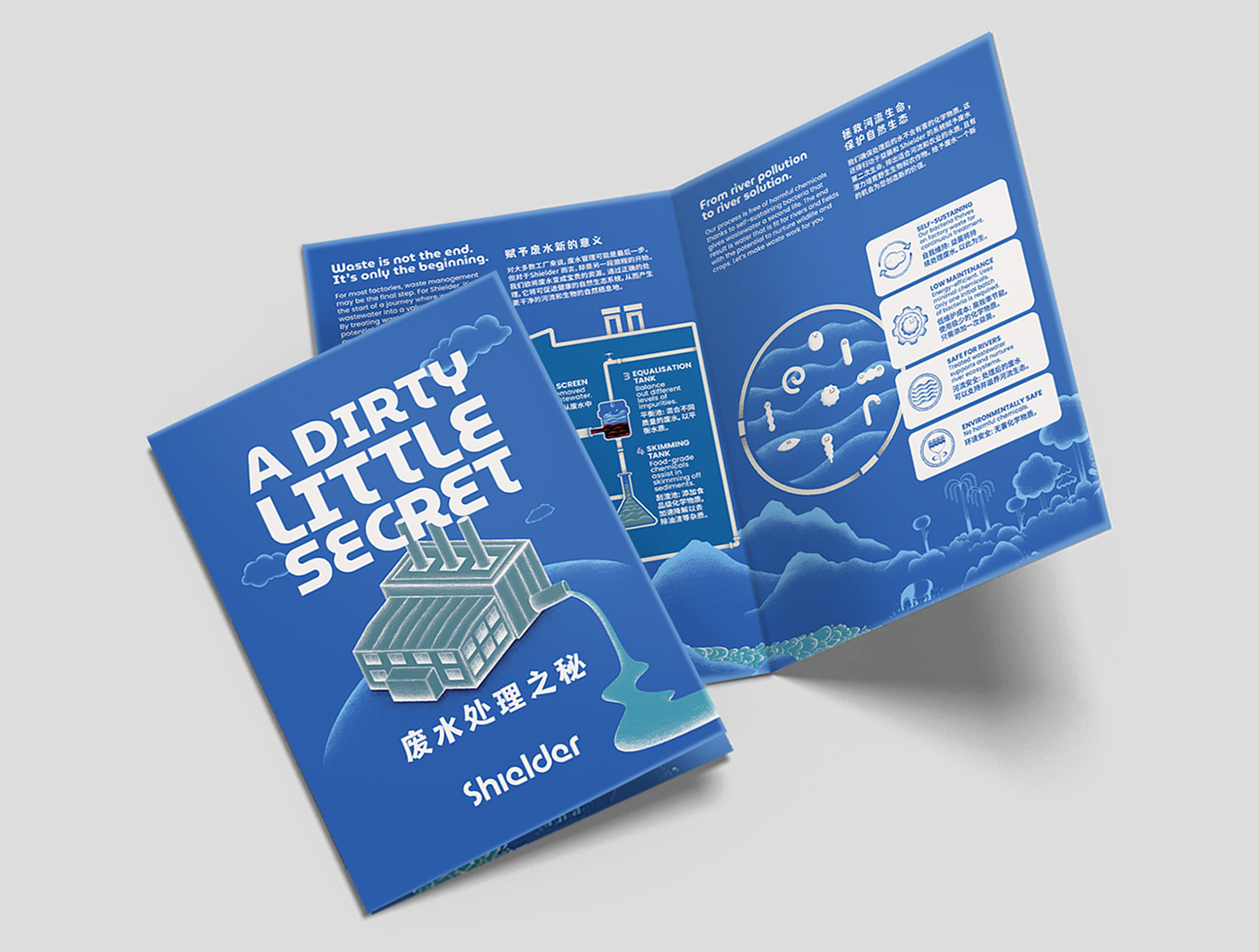
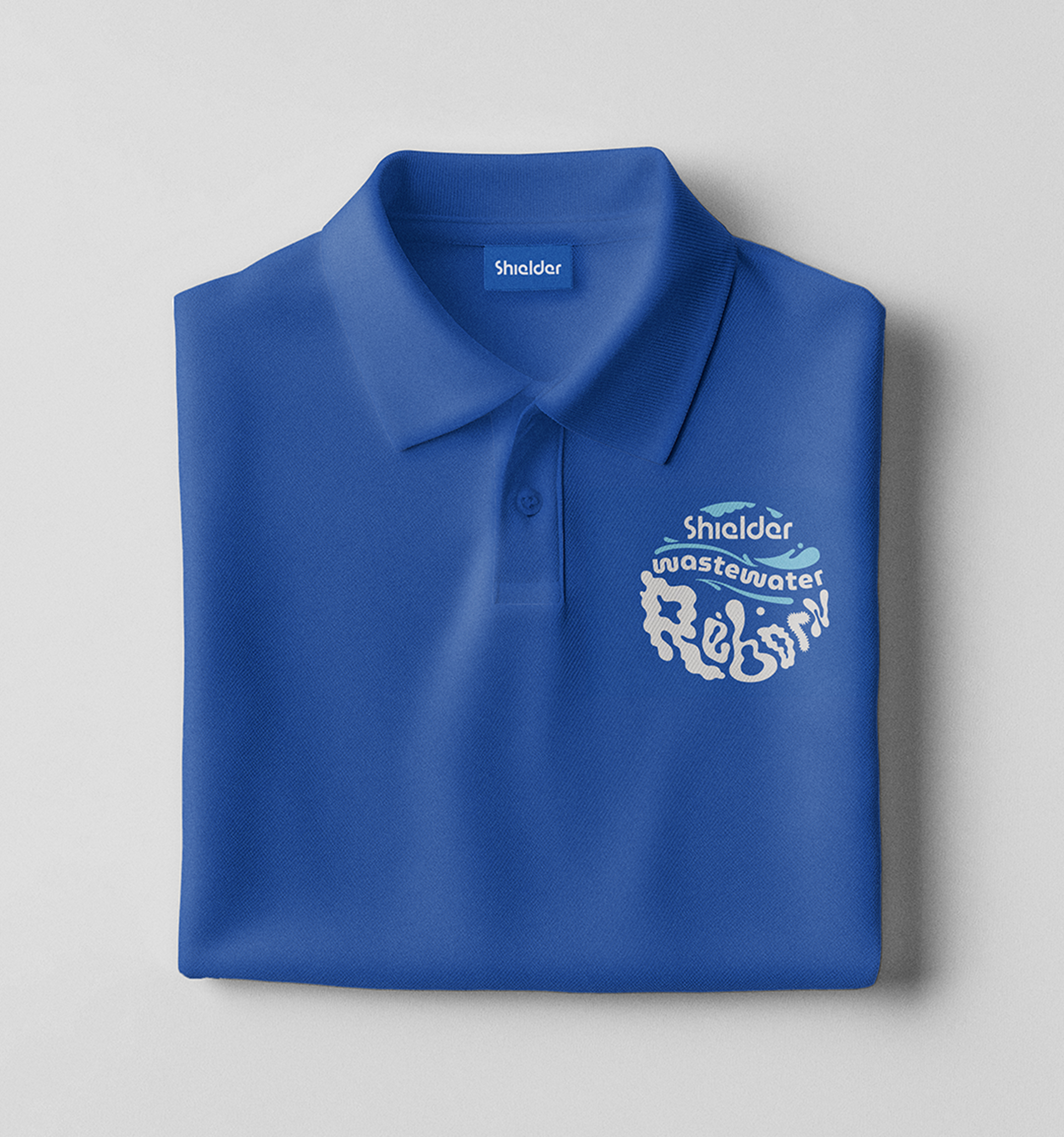
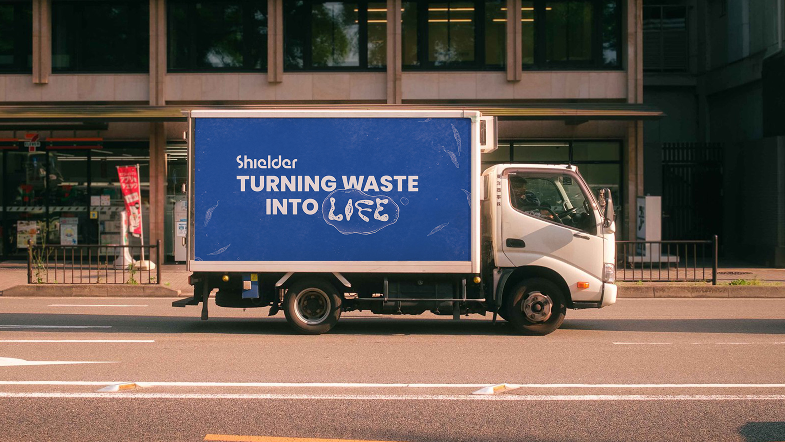
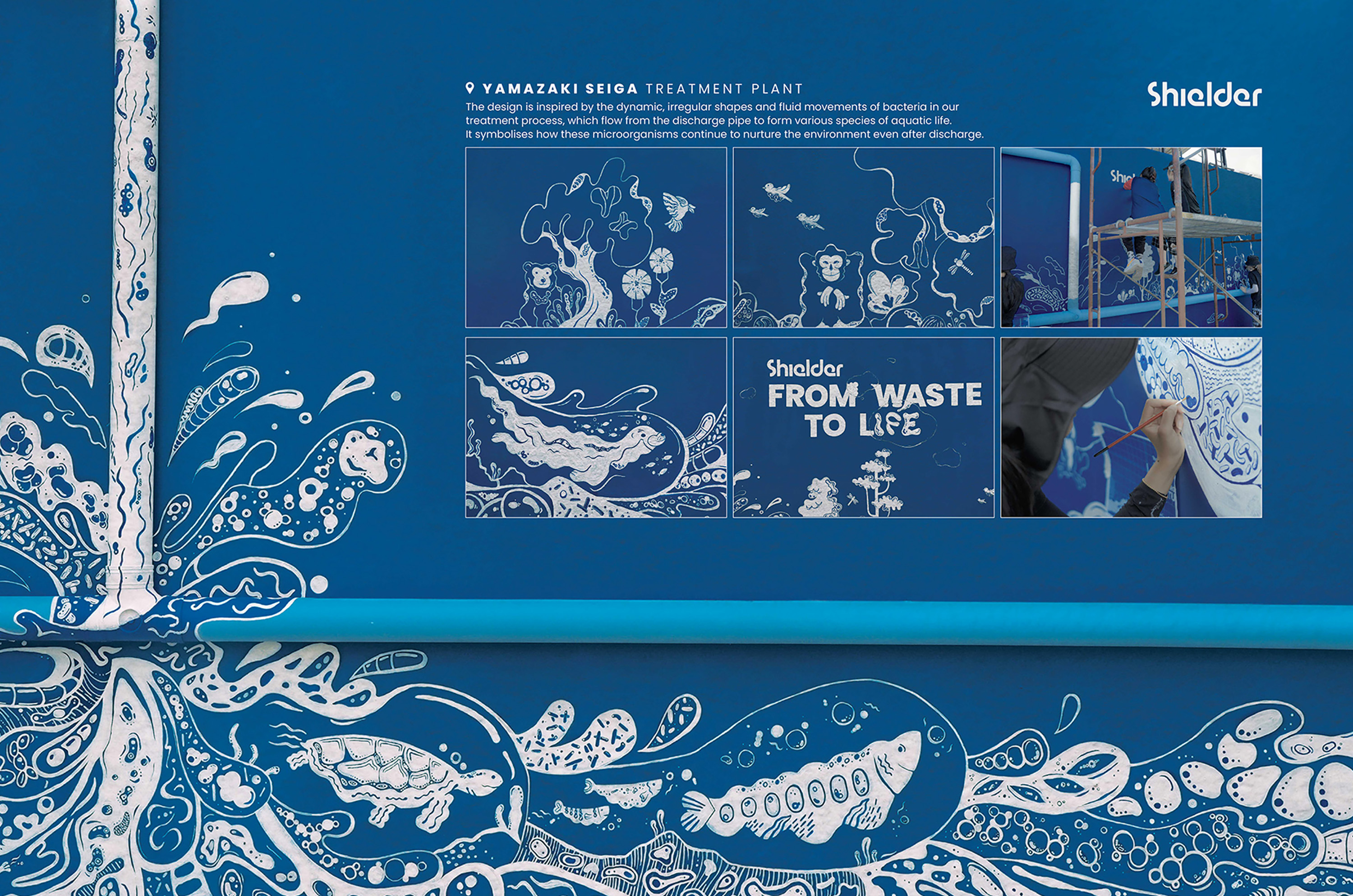
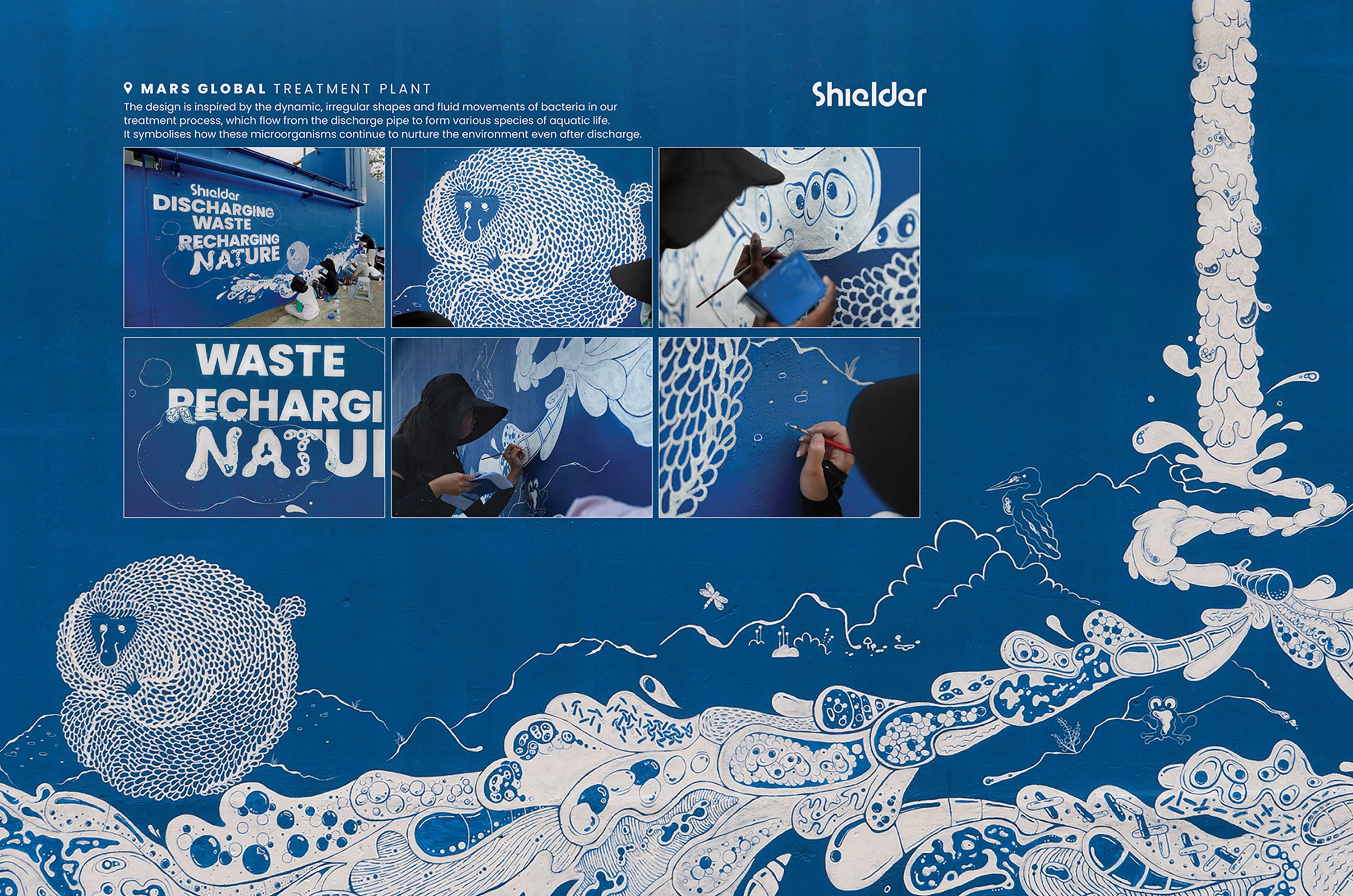
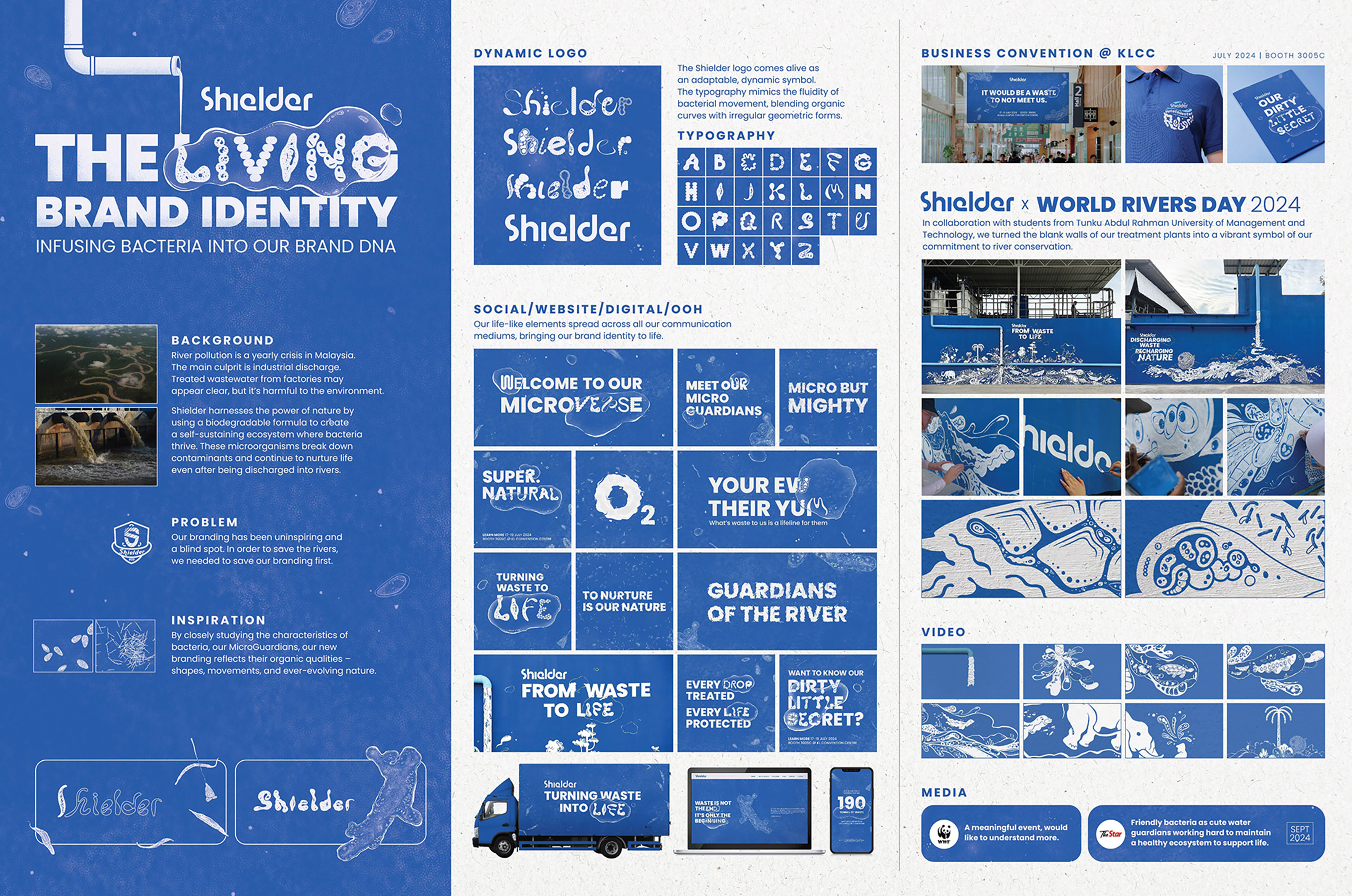
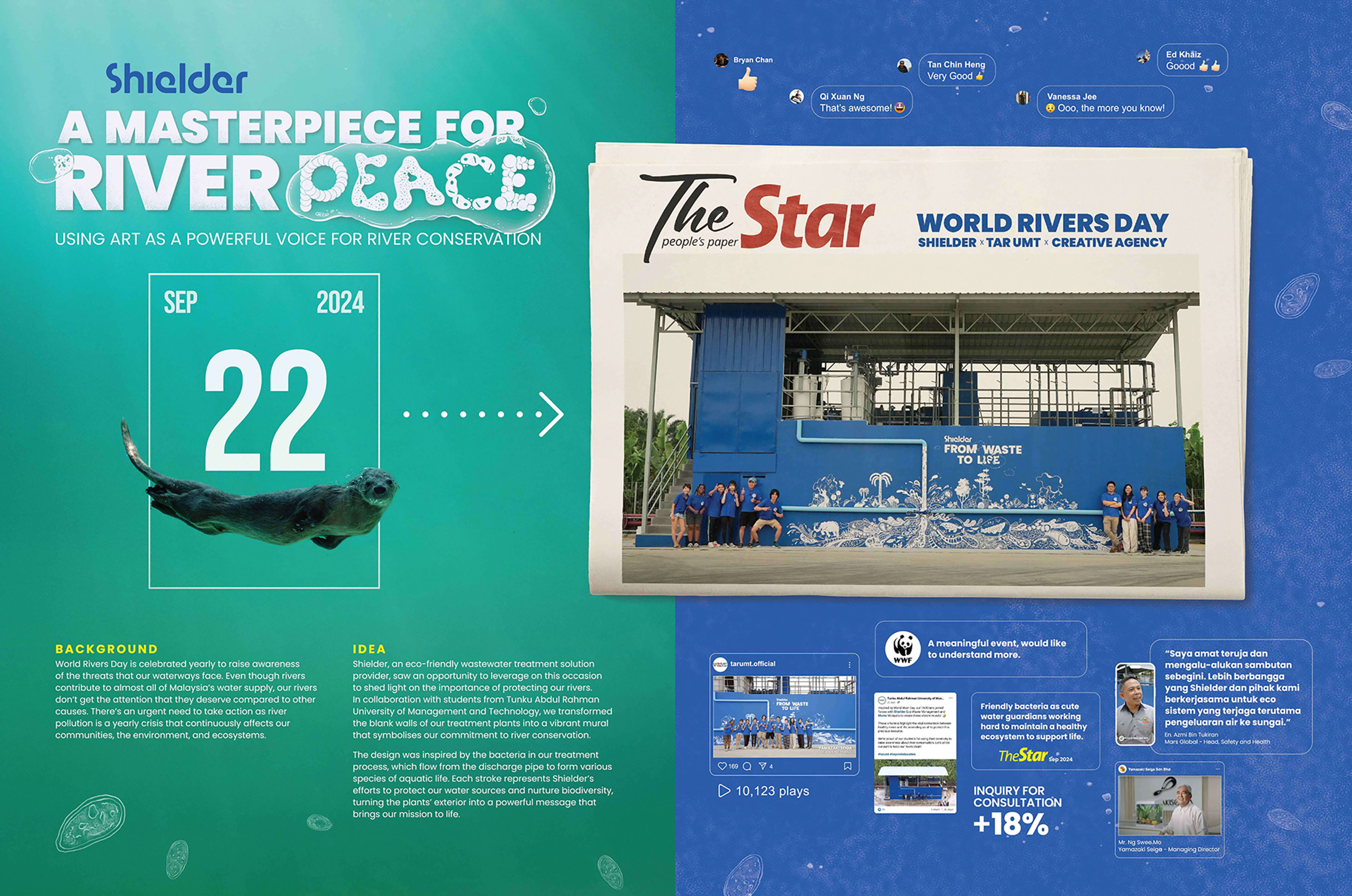
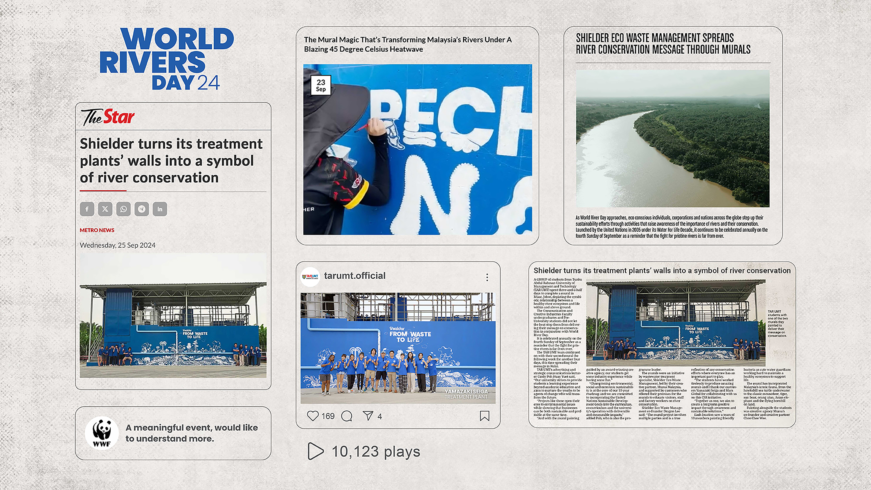
River pollution remains a serious issue in Malaysia, with industrial wastewater causing long-term environmental damage even after treatment. This project highlights the problem of hidden pollution while positioning Shielder as a sustainable, nature-based solution for long-term river protection.
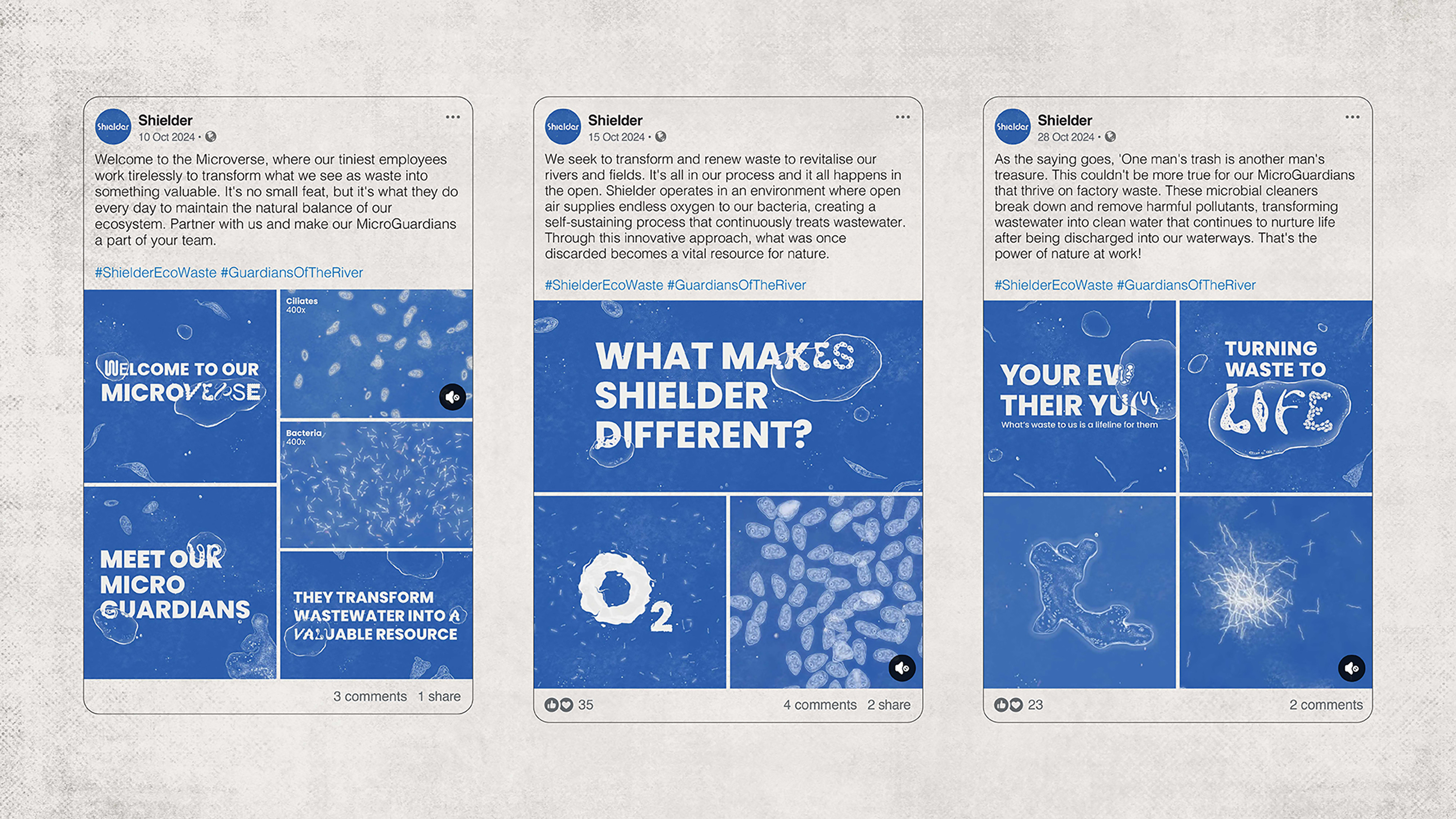
The visual direction emphasizes the contrast between clear water and unseen contamination, using clean yet striking imagery to communicate the message. Inspired by the organic forms of bacteria called MicroGuardians, the logo and design system reflect Shielder’s biodegradable formula and self-sustaining approach. The result is a clear, impactful visual language that reinforces the brand’s commitment to environmental responsibility.
The Shielder logo comes alive as a dynamic and adaptable symbol, capturing the spirit of nature in motion. Its typography flows with the fluidity of bacterial movement, blending organic curves and irregular geometric forms into a mark that feels alive and endlessly evolving.
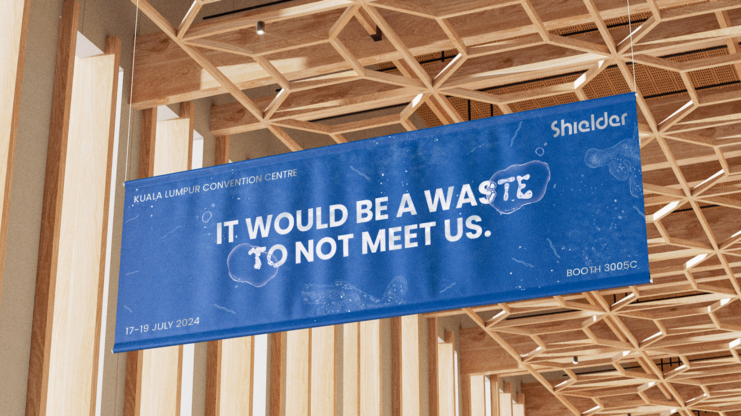
In collaboration with students from Tunku Abdul Rahman University of Management and Technology, we turned the blank walls of our treatment plants into a vibrant symbol of our commitment to river conservation.
Silver
Typography
Bronze
Best Use of Ambient
Art Direction
Illustration
Merit
Brand Experience
& Retail Design
Brand Experience
& Activation

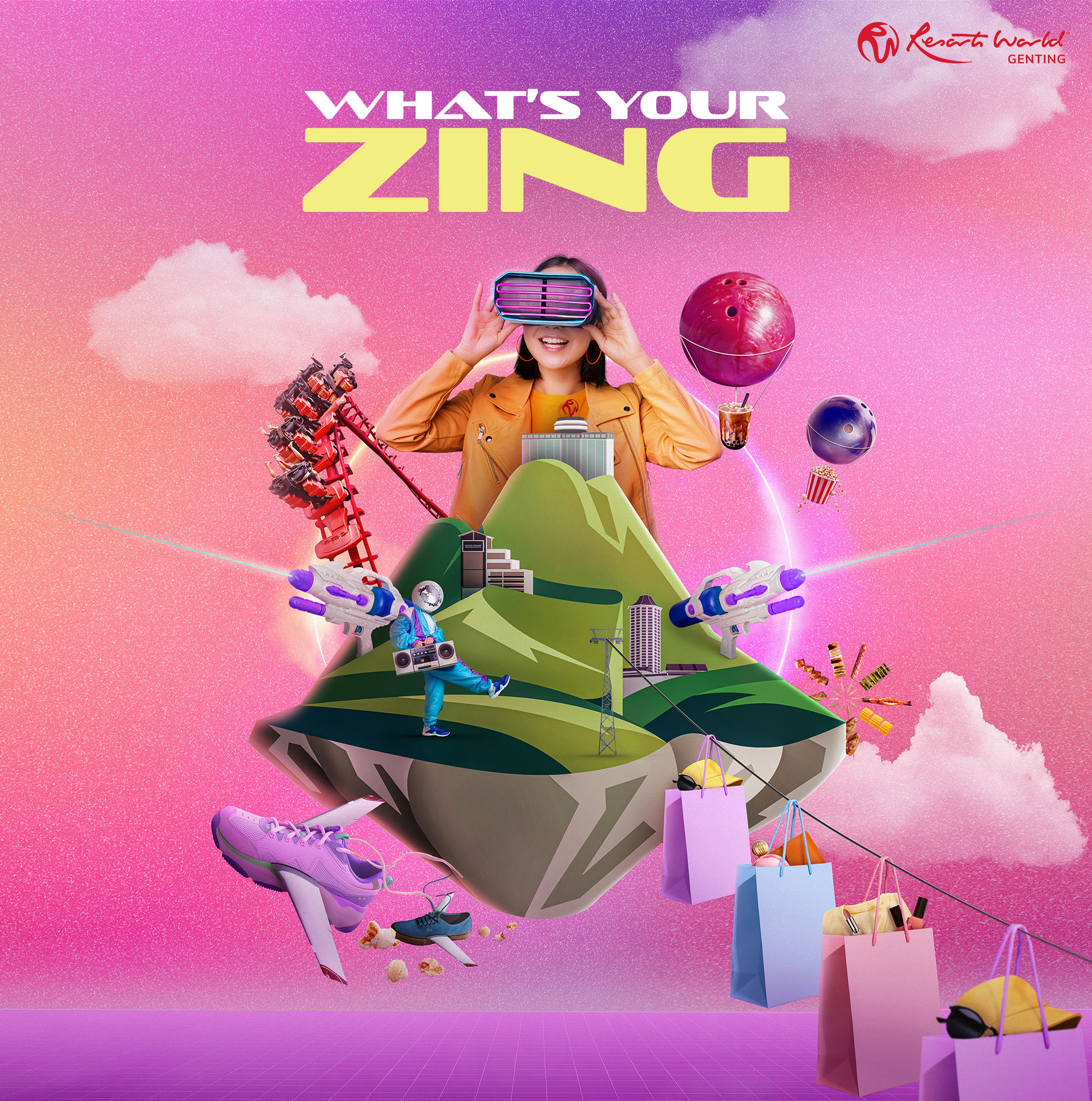
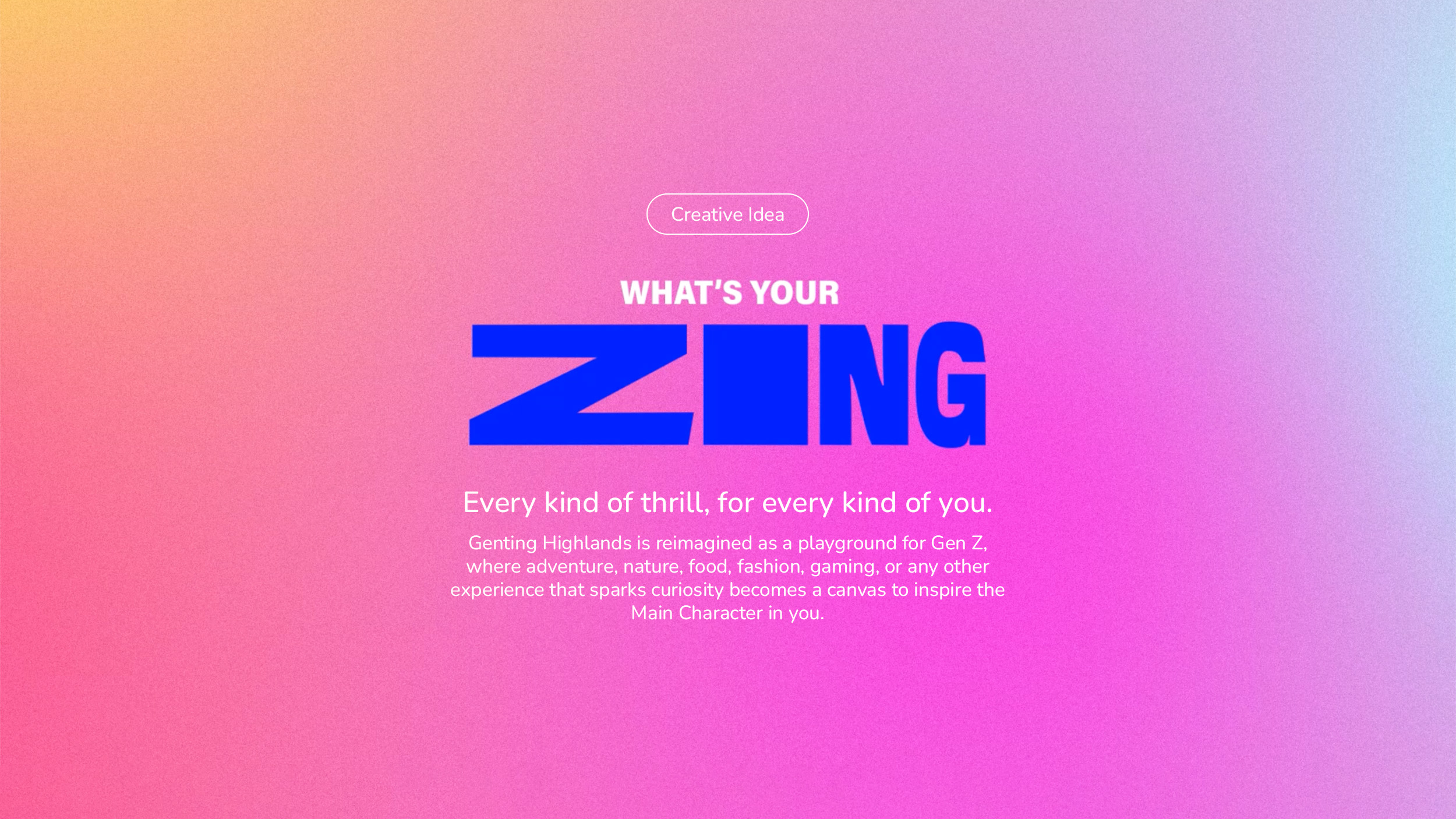
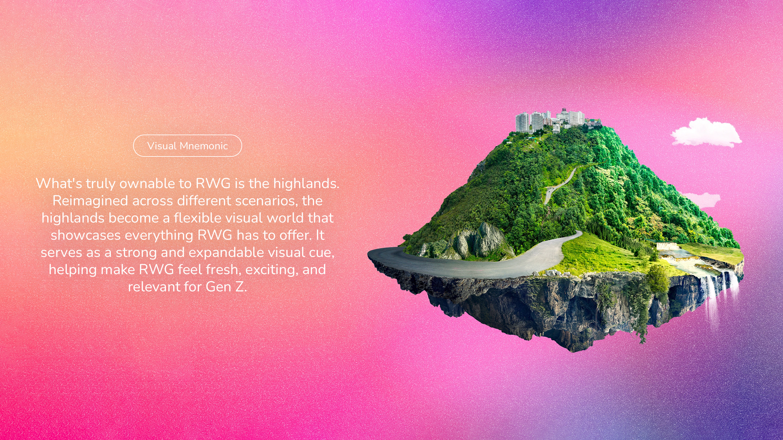
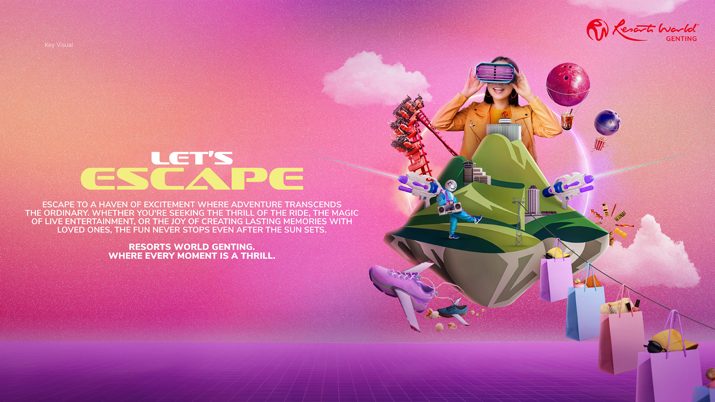
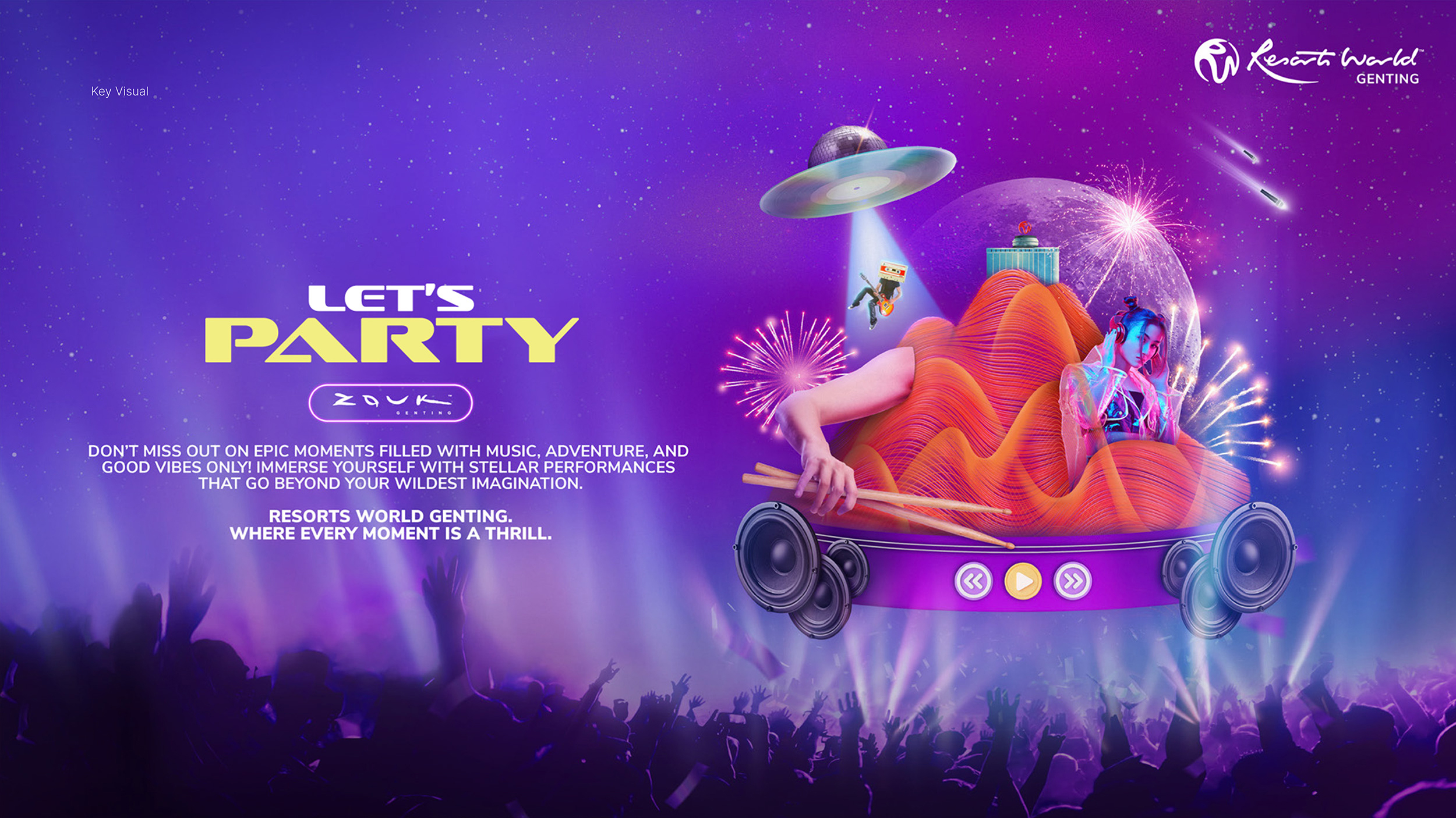
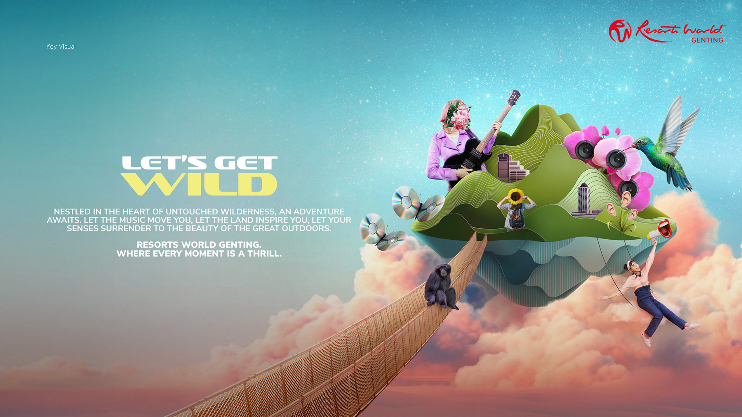
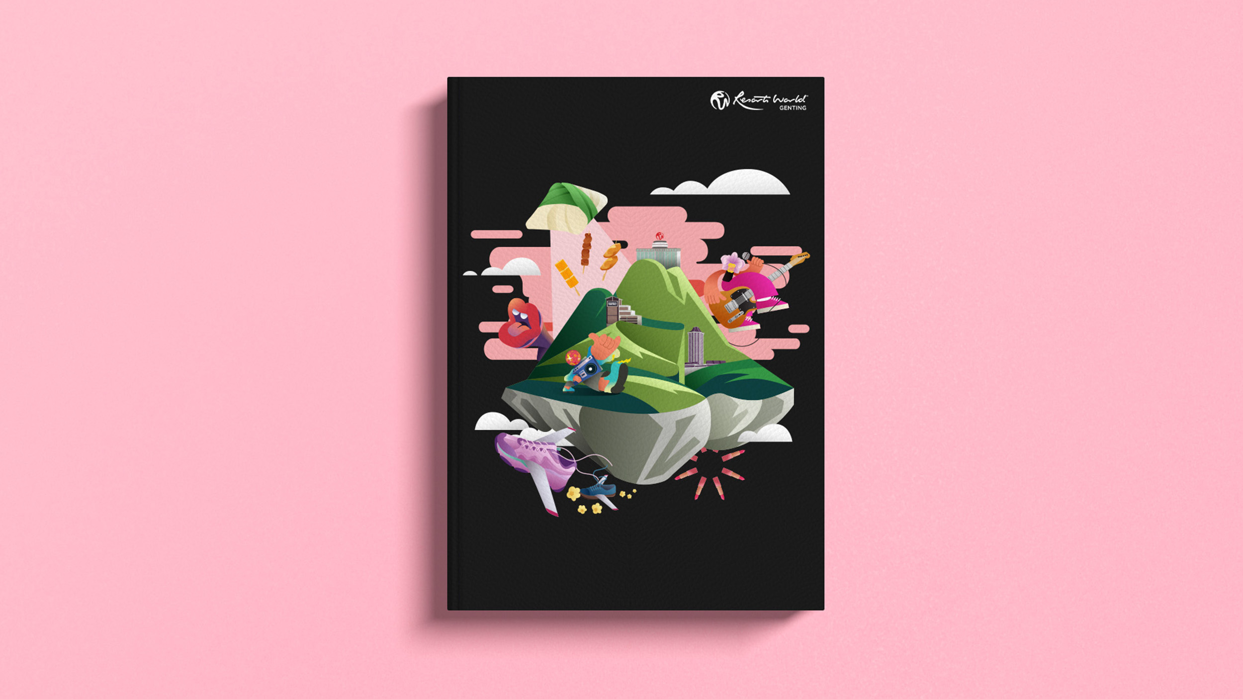
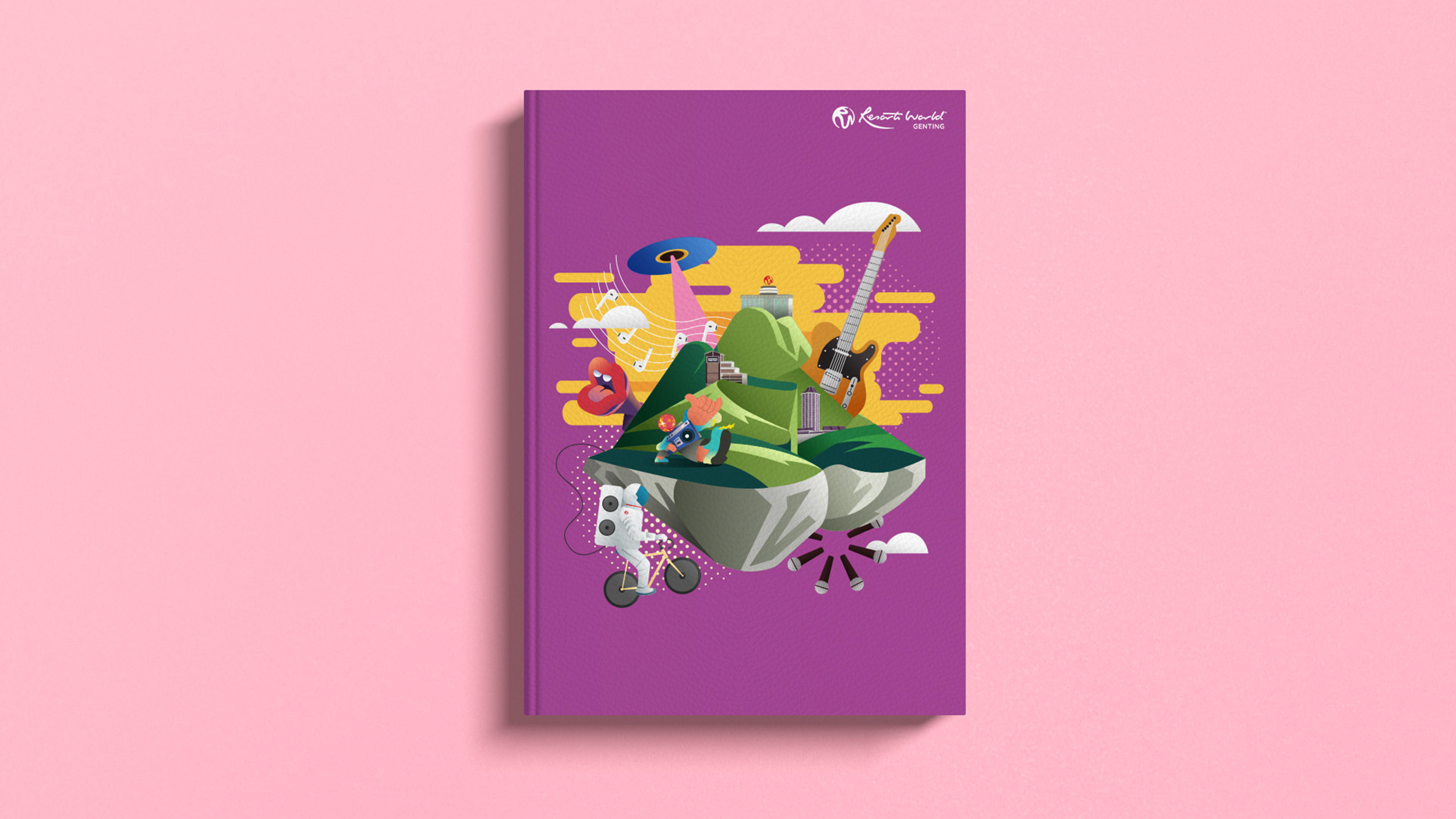
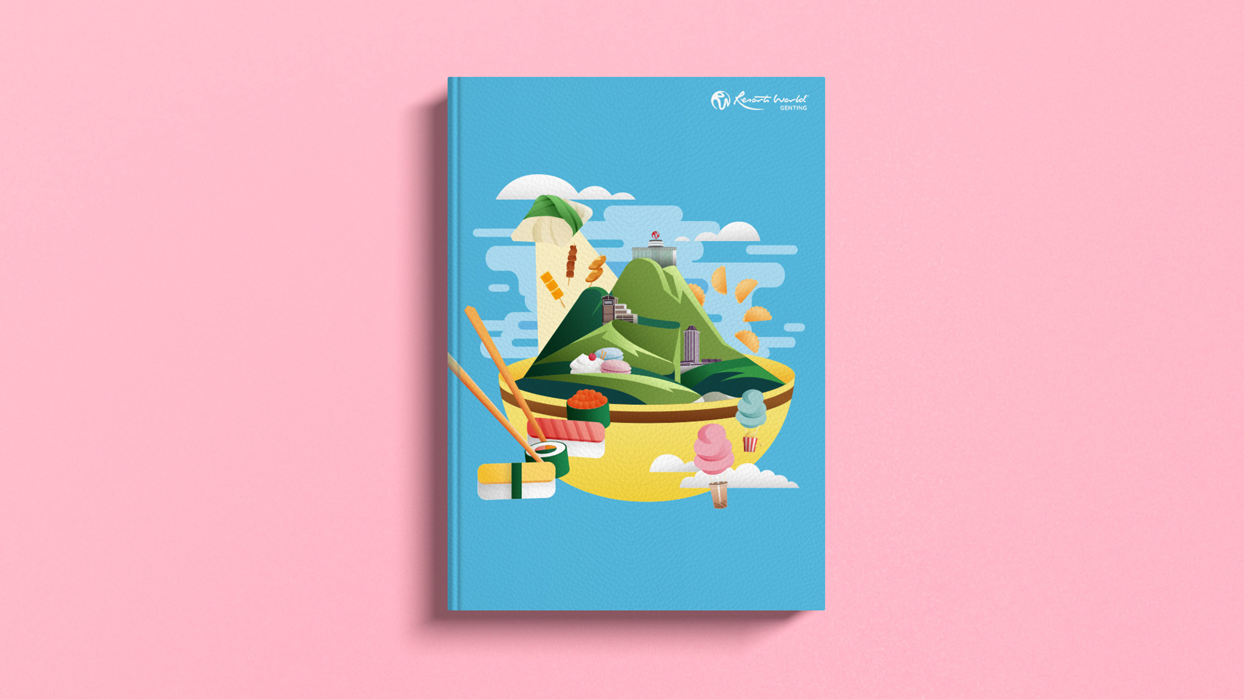
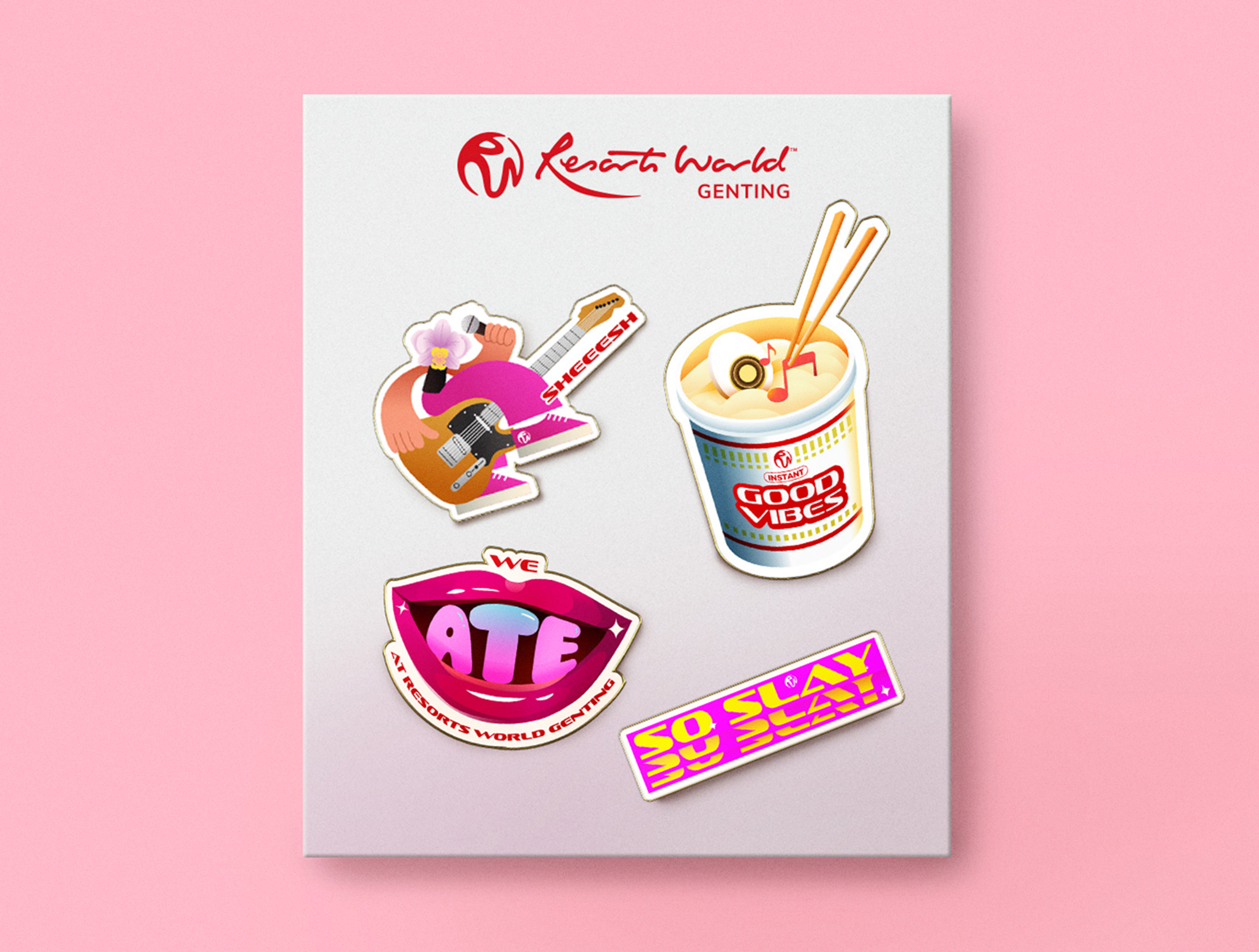
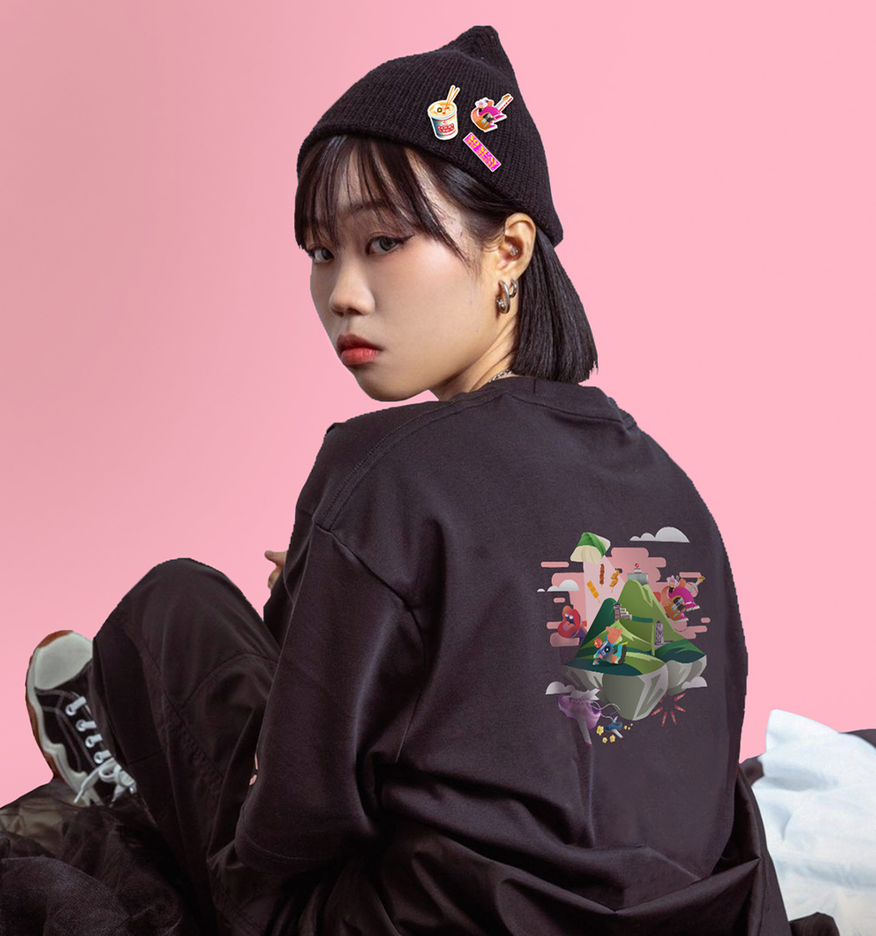
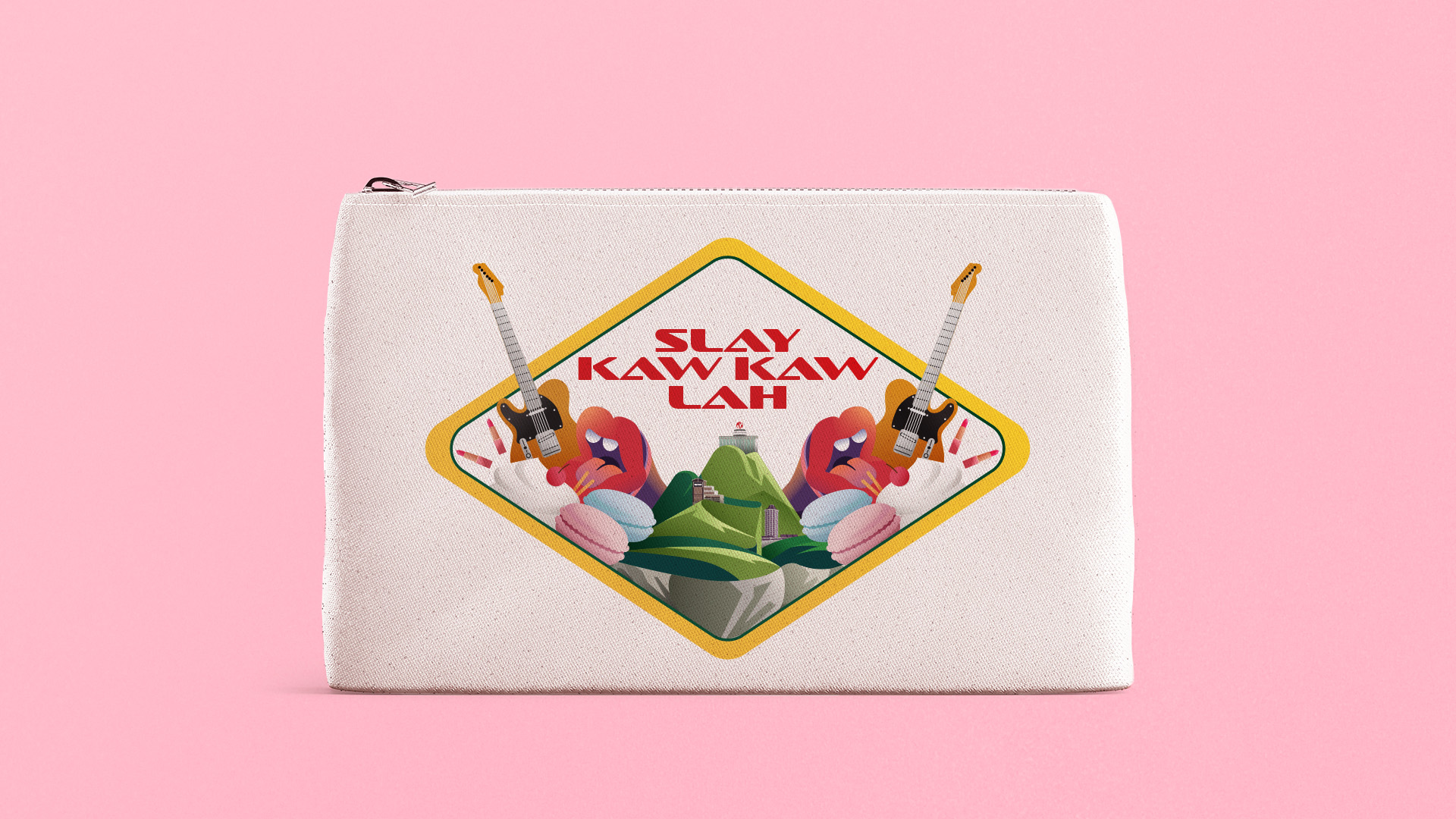
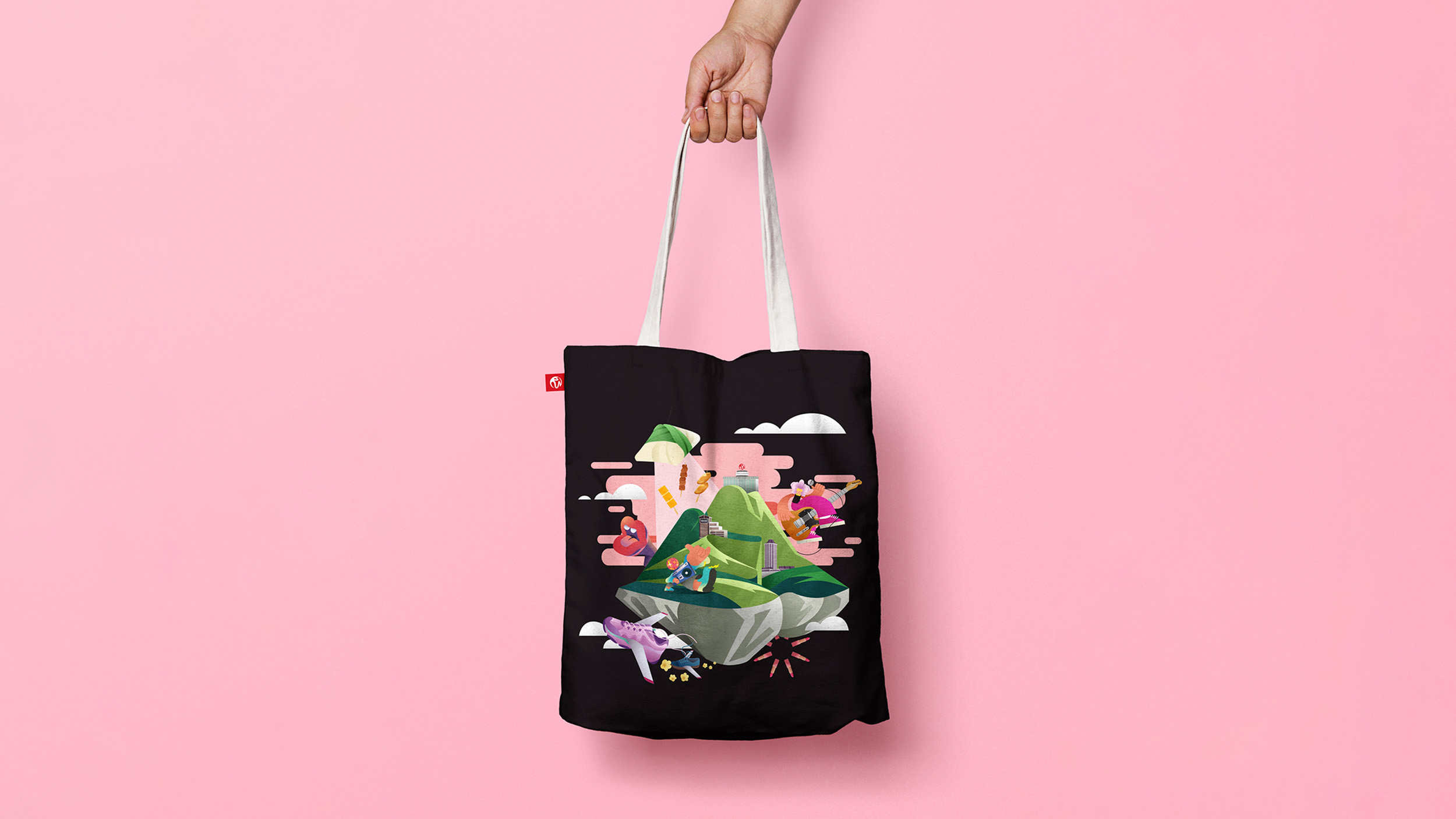
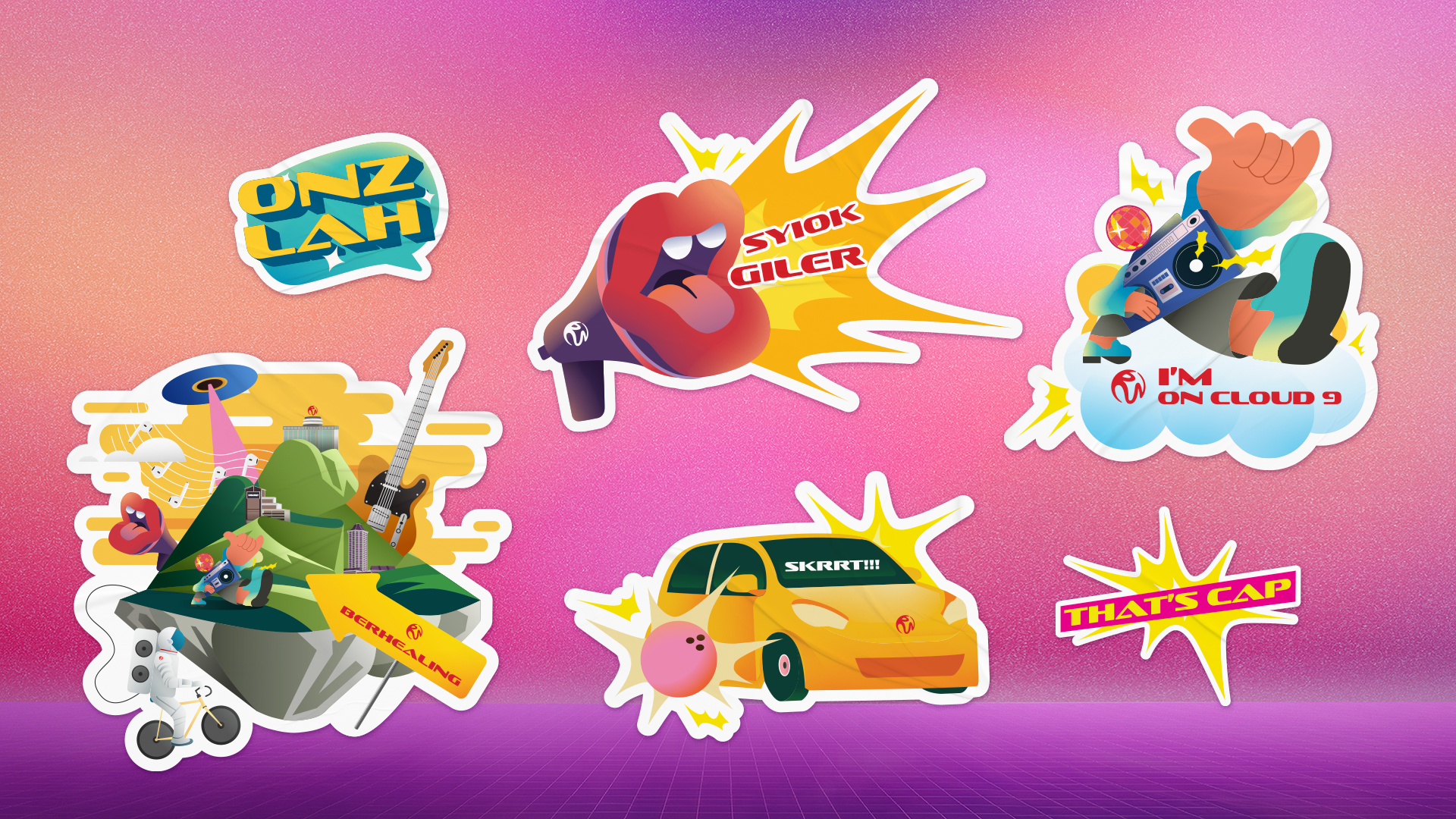
Resorts World Genting wanted to reconnect with Gen Z, who often don’t see it as a top choice for dining, shopping, entertainment, or weekend getaways. Visually, the focus was on the highlands, RWG’s most unique feature, applied across different scenarios to highlight the variety of experiences the resort offers.

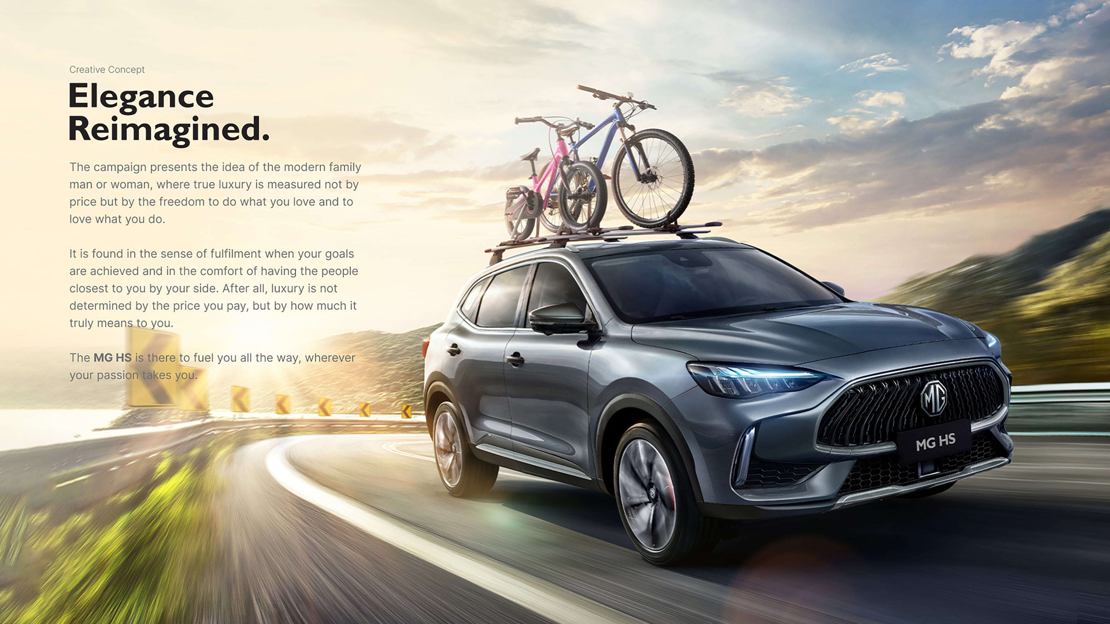
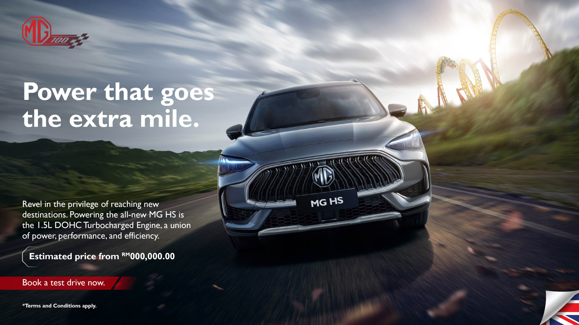
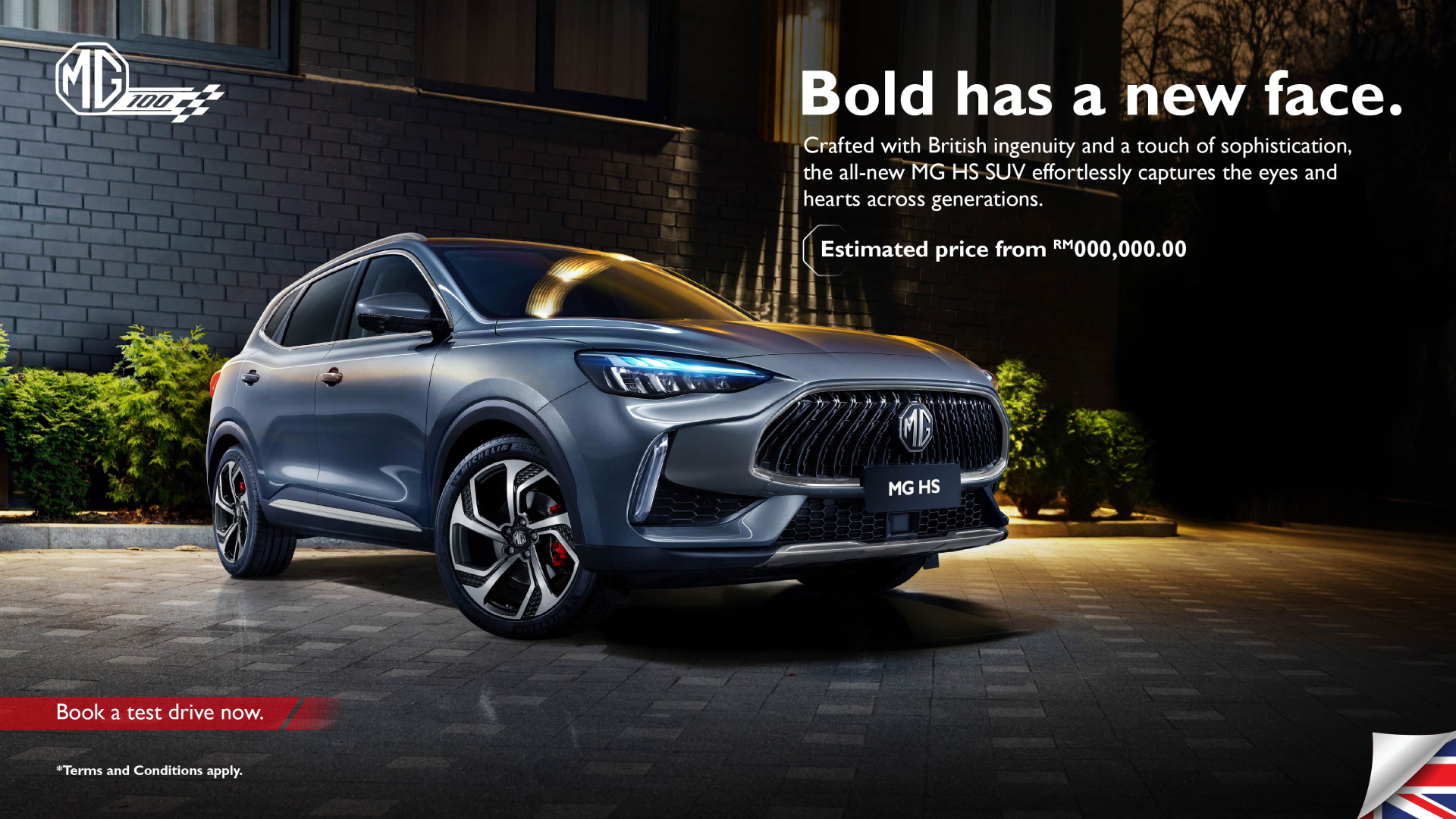
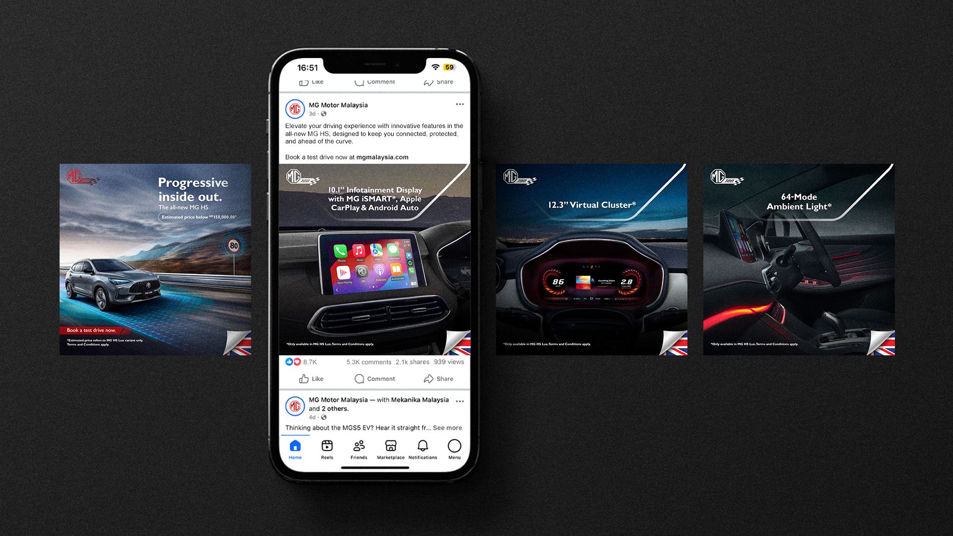
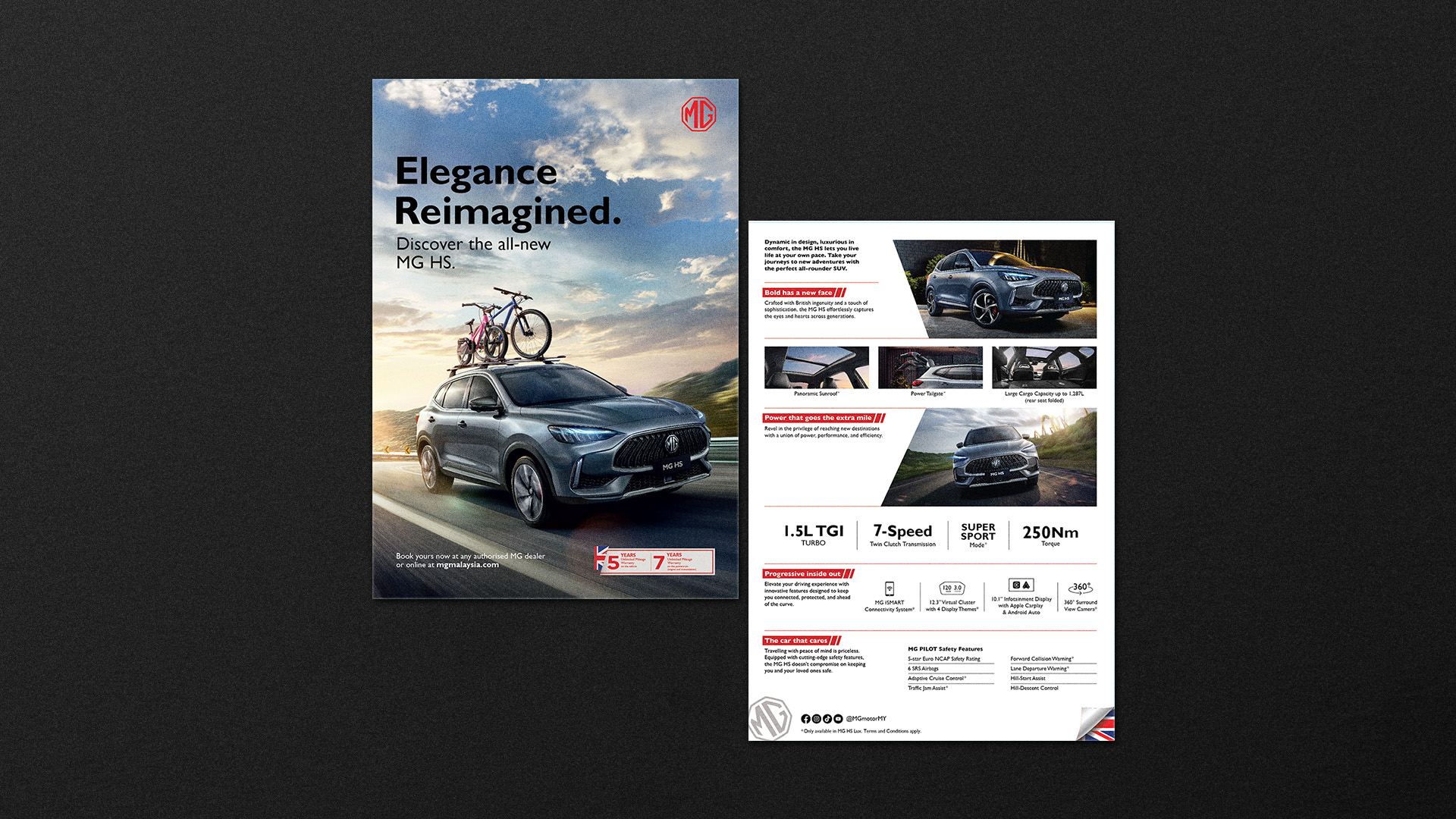
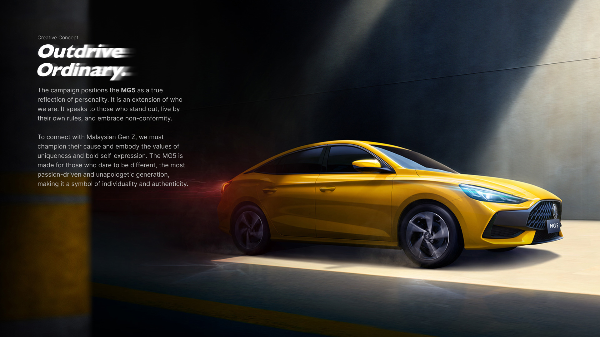
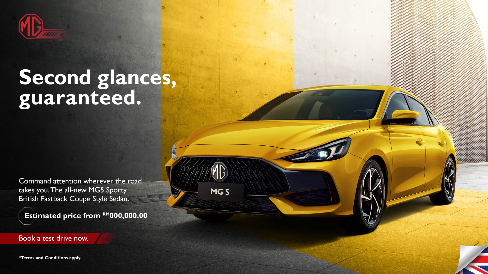
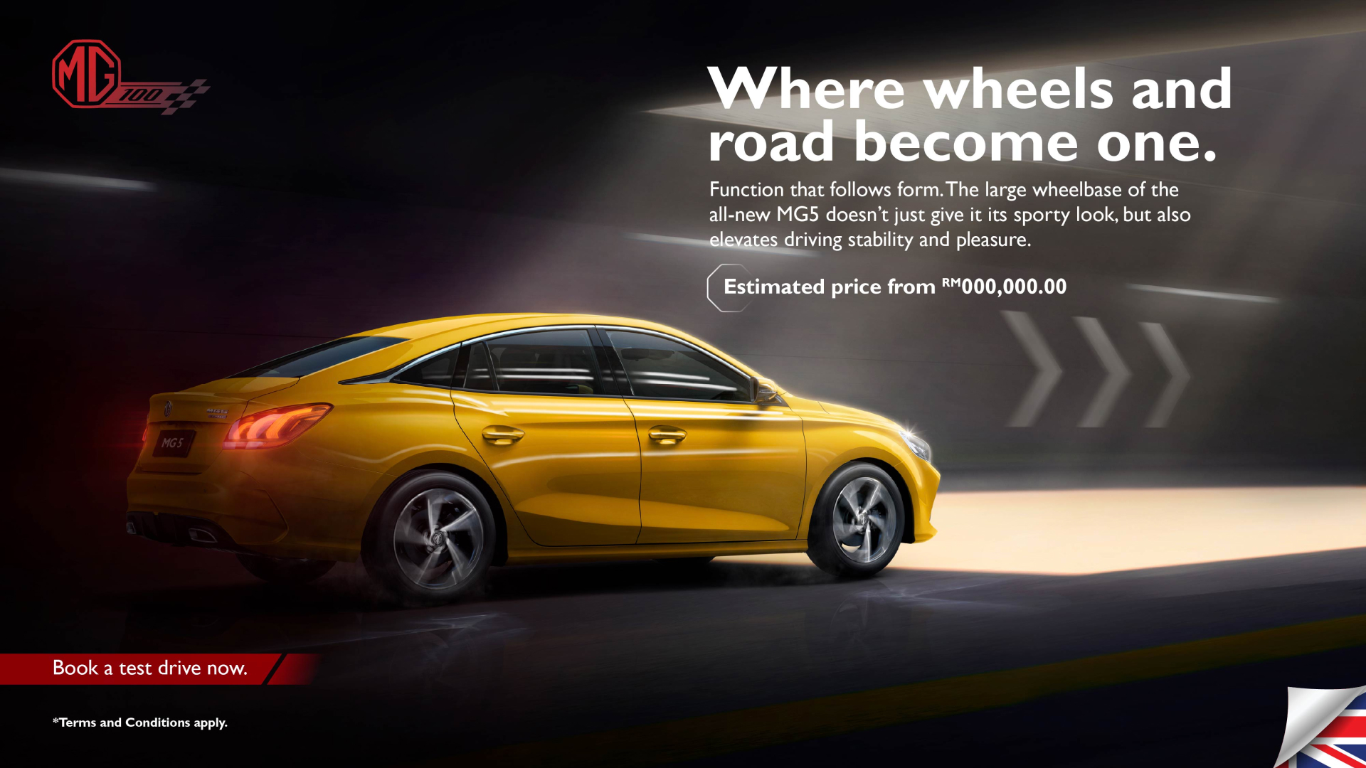
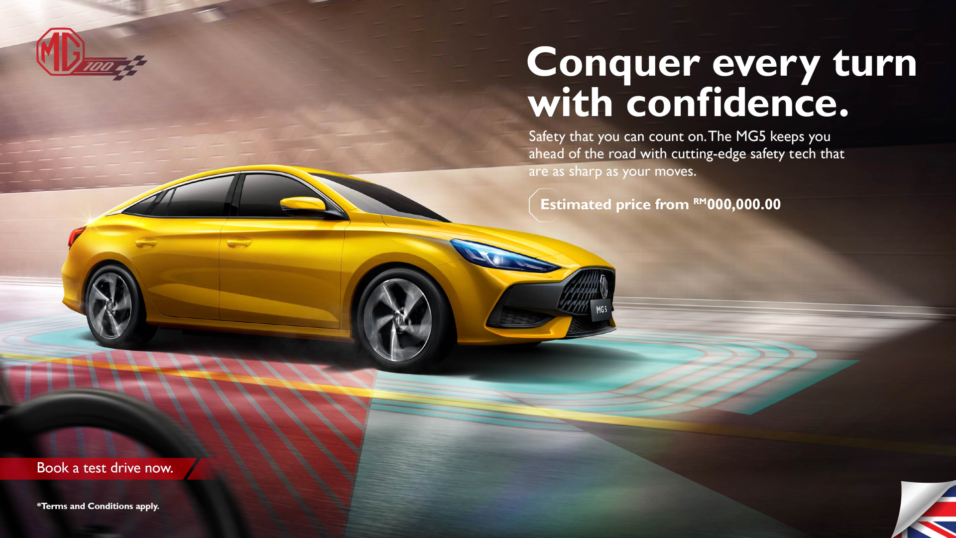
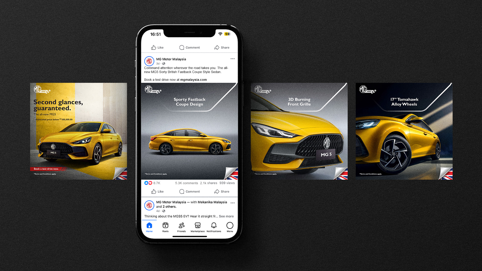
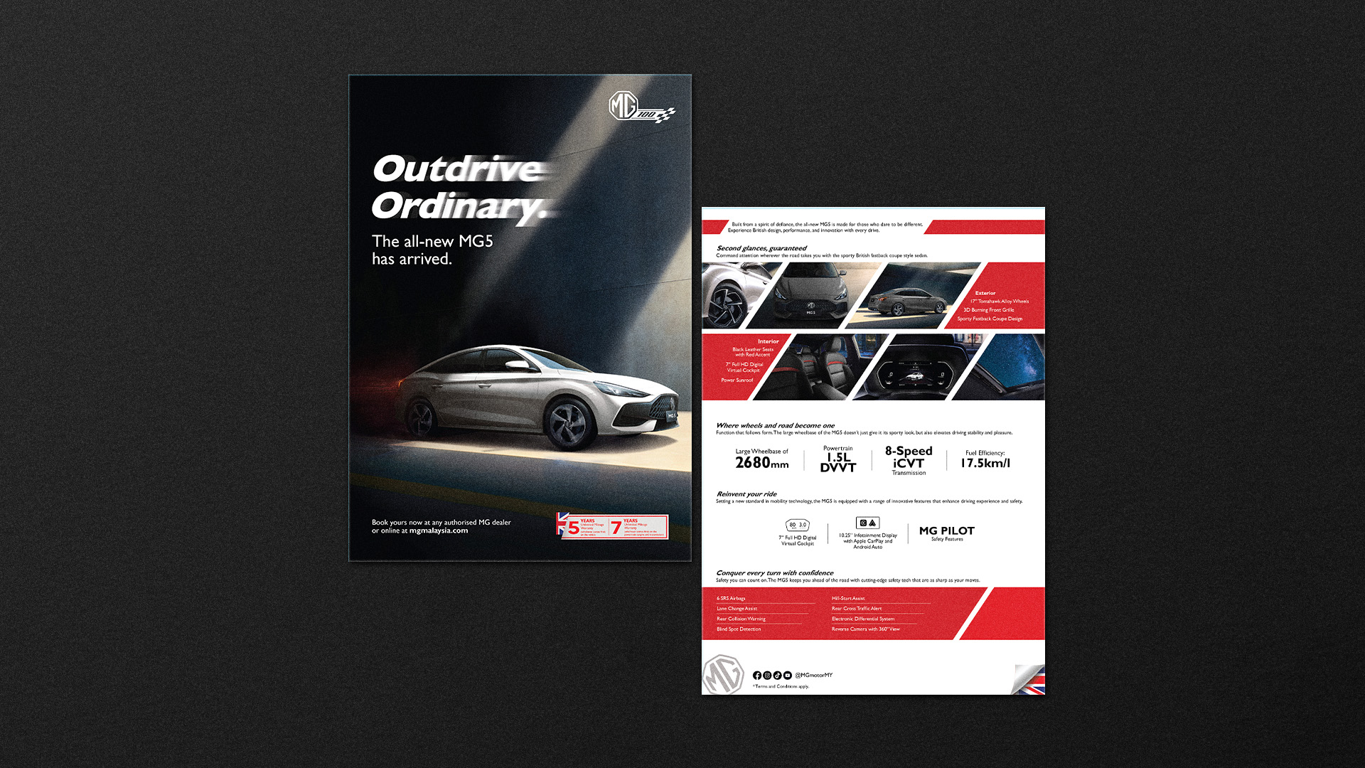
Founded in 1924, MG has a strong legacy of British innovation, style, and driving spirit. This campaign supported the launch of the MG HS and MG5 in July, with a focus on building the MG brand rather than simply selling cars. The goal was to create an emotional connection with consumers and strengthen long-term brand value.
The campaign moves away from traditional car advertising and uses storytelling to highlight the MG Community. By placing real people at the center of the visuals, the design presents MG as a brand built around shared passion and connection. This approach creates a human and memorable brand story that engages both the heart and mind.
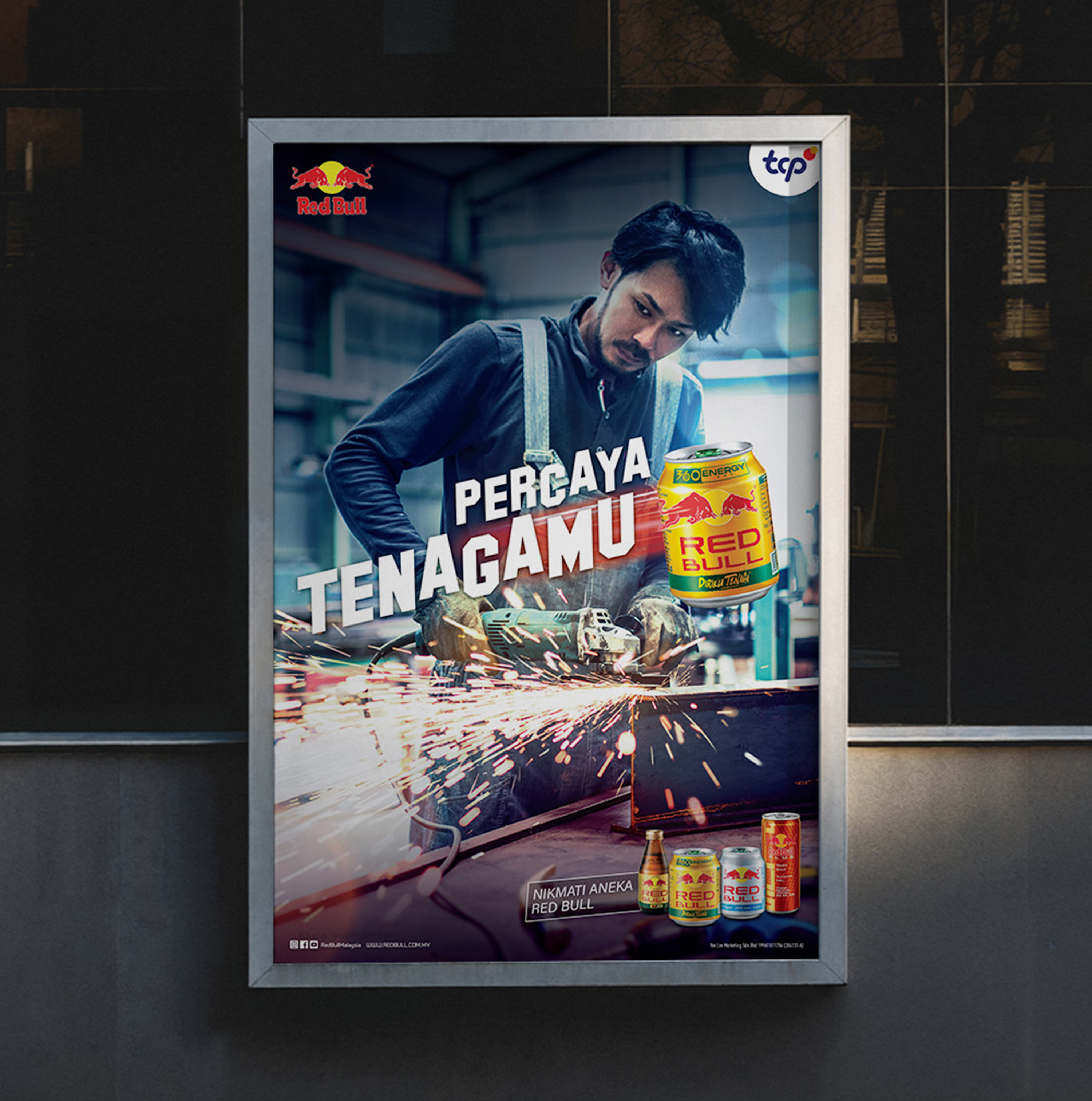
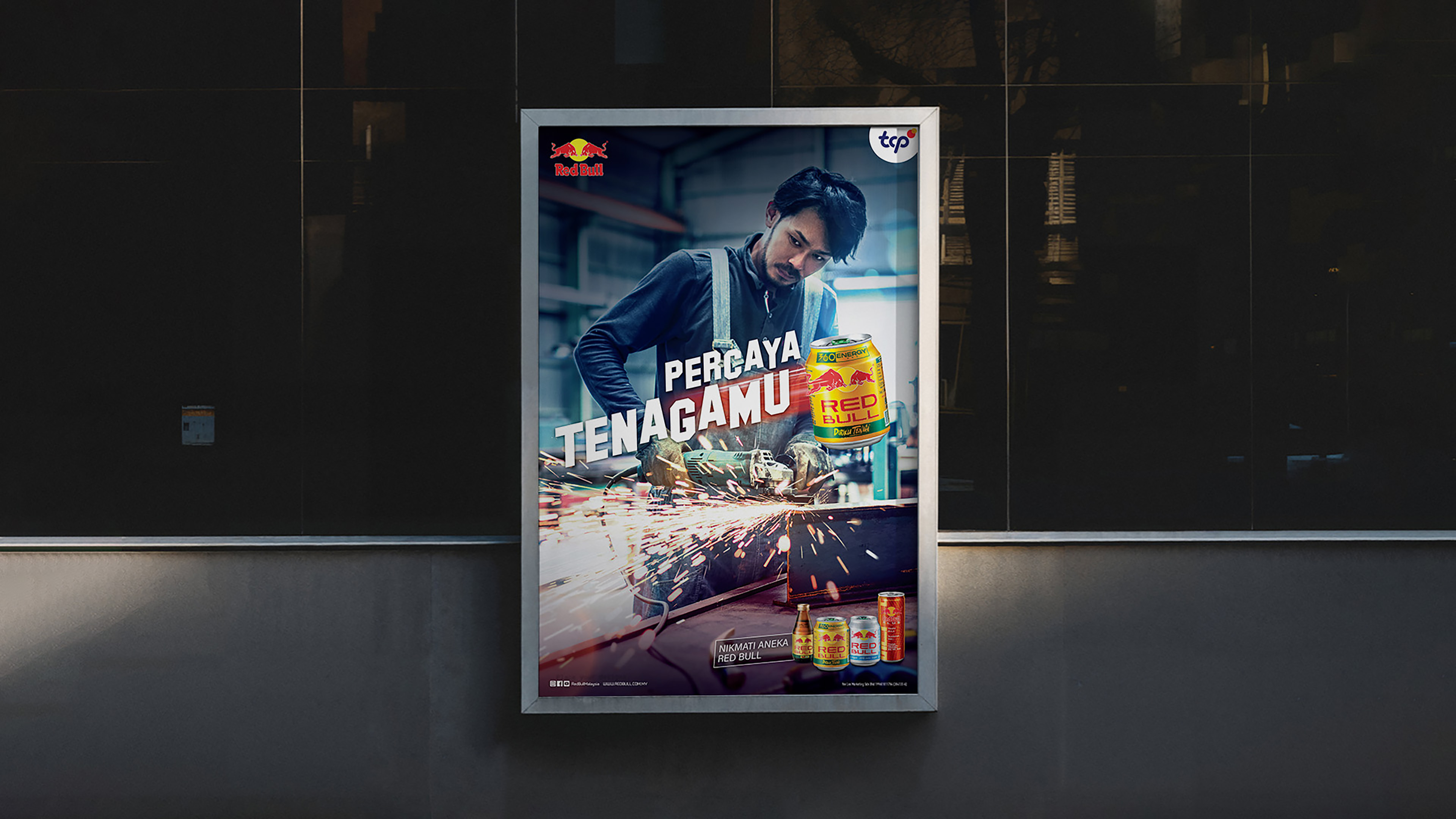
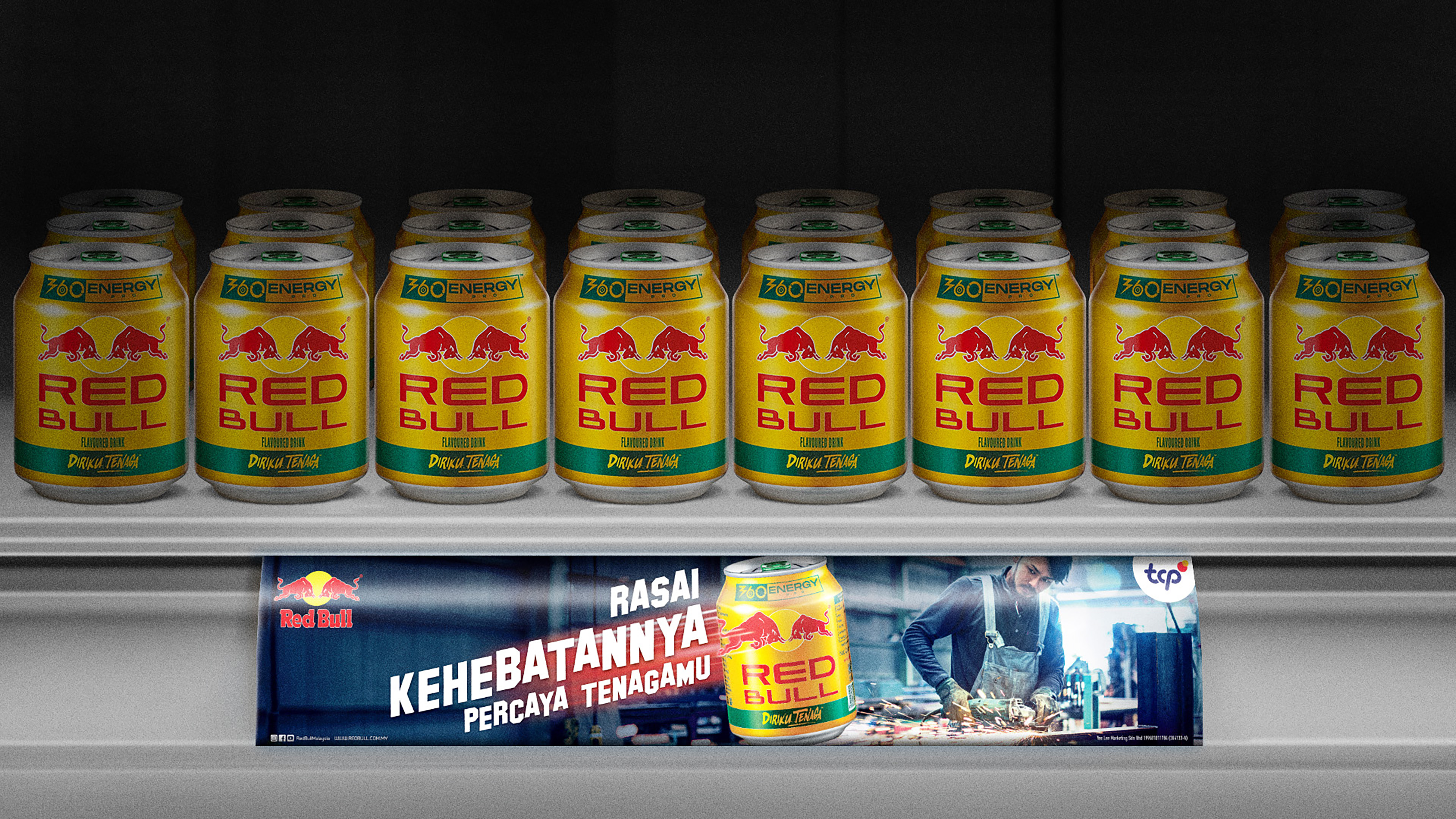
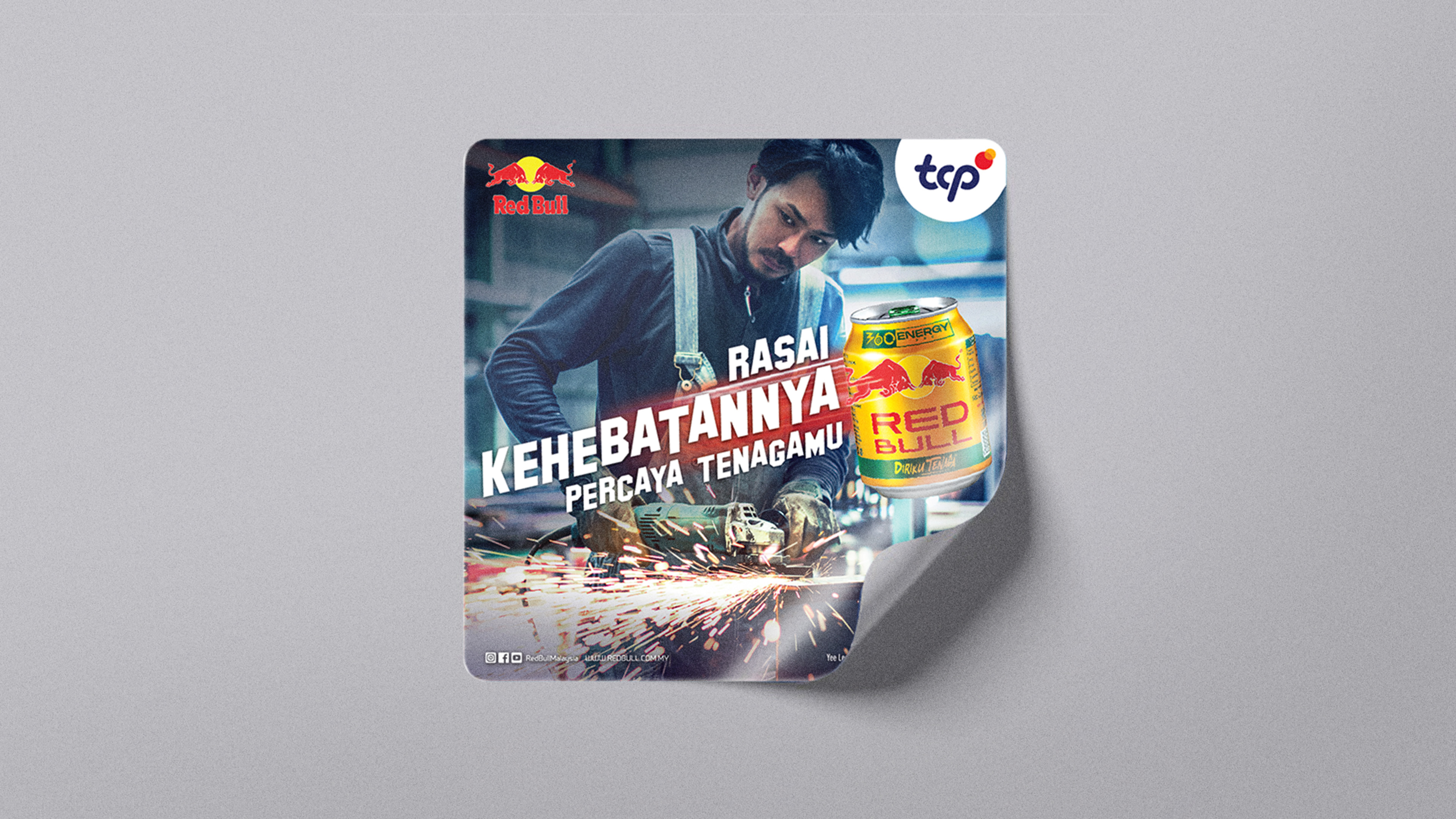
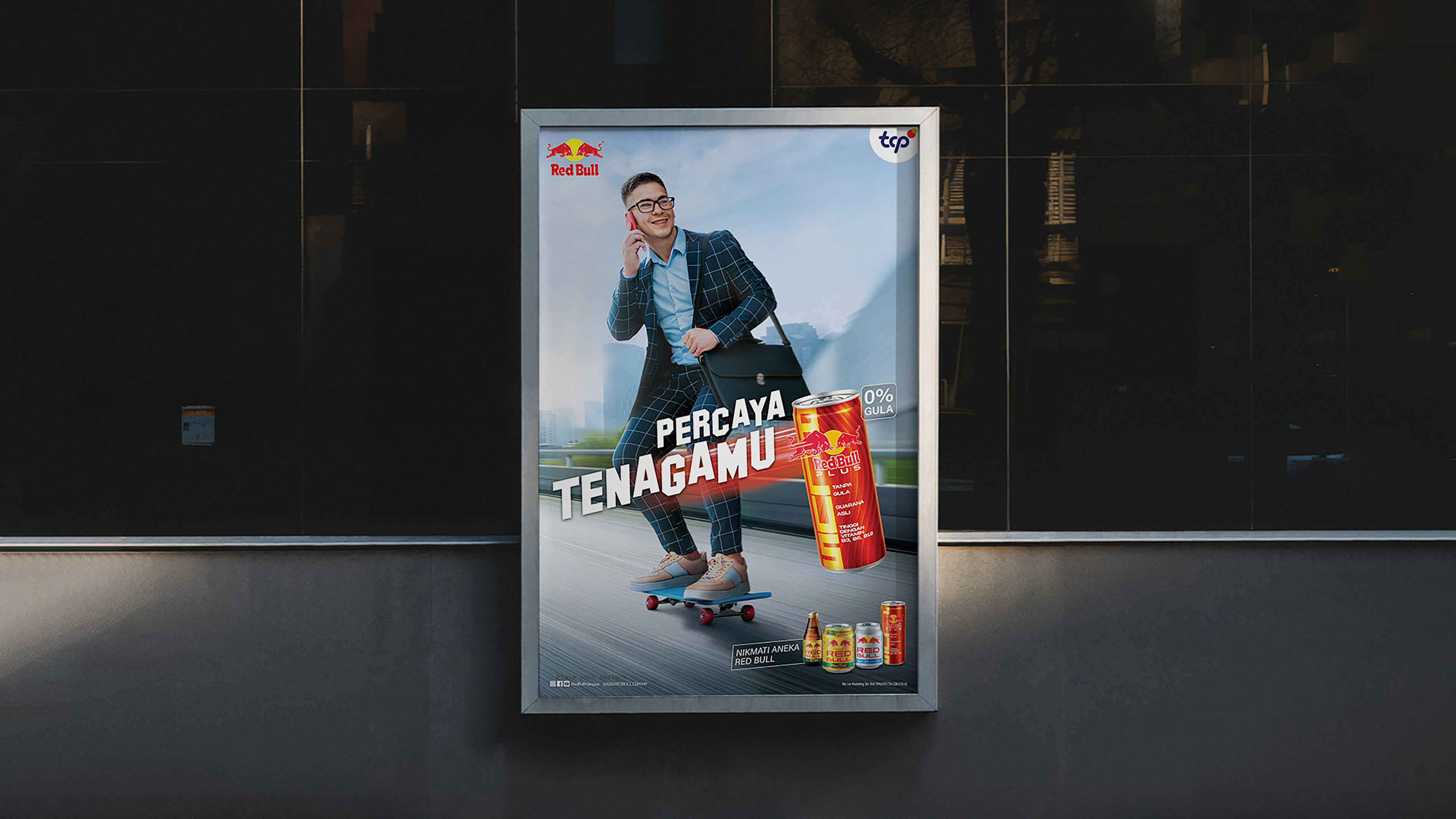
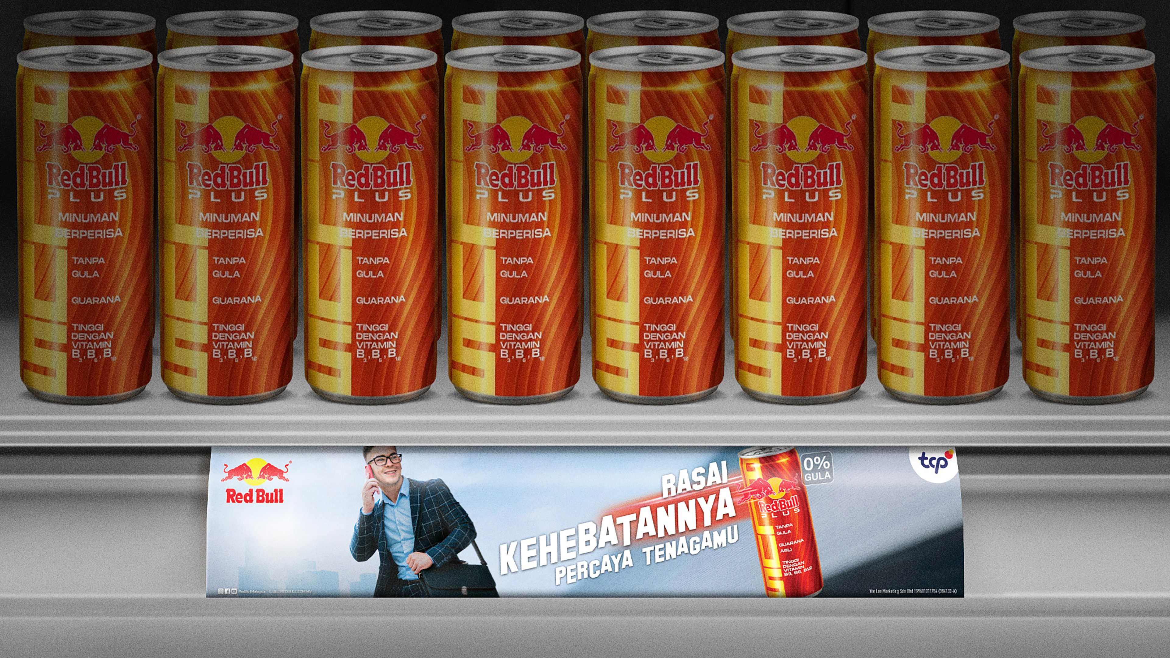
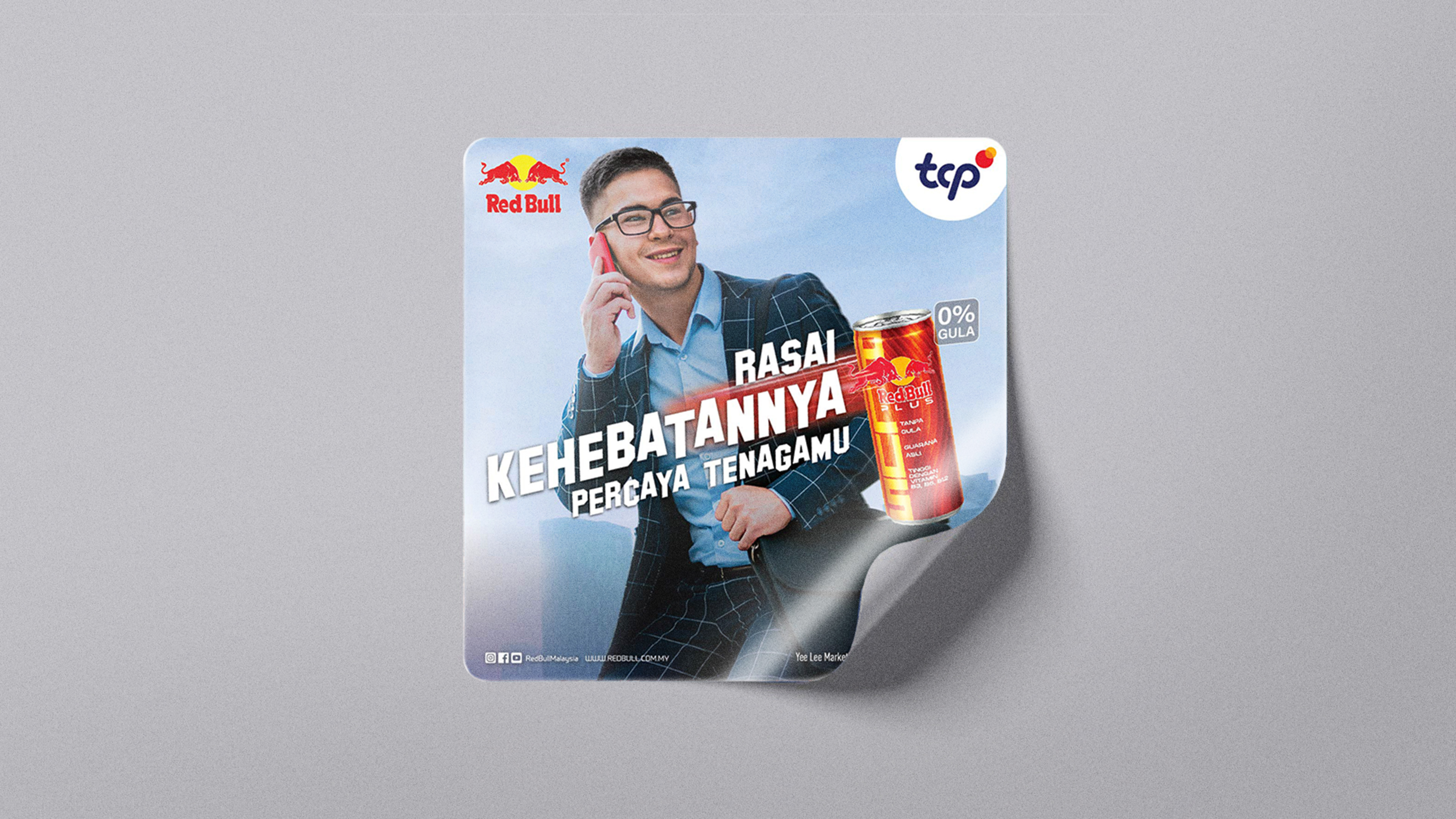
The poster series for Red Bull Malaysia’s "Believe in Your Power" campaign inspires people to trust their own strength. The visual direction emphasizes bold energy, movement, and determination, using dynamic compositions to convey confidence. The designs connect with Malaysians across work, driving, and sports, creating a strong and impactful presence.
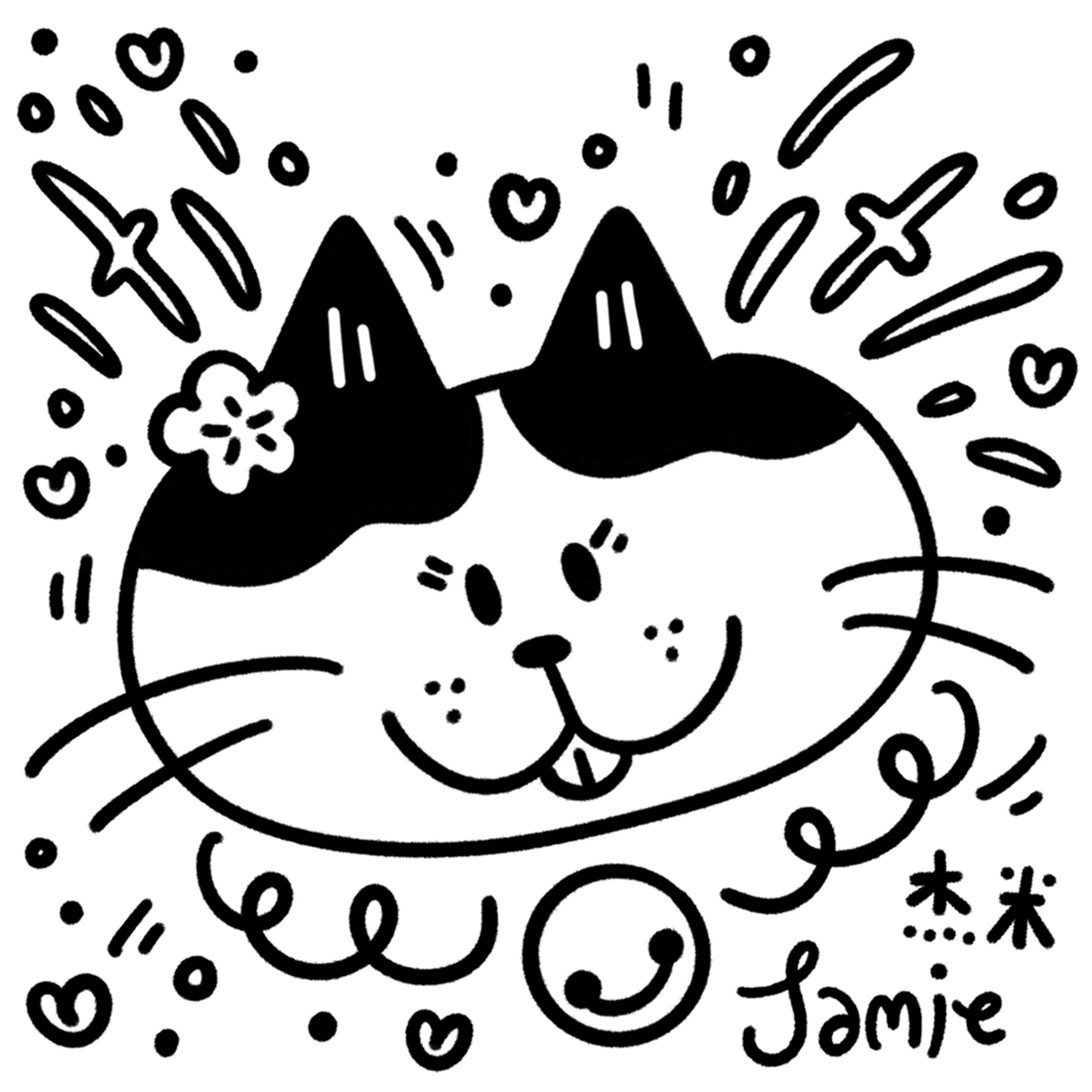
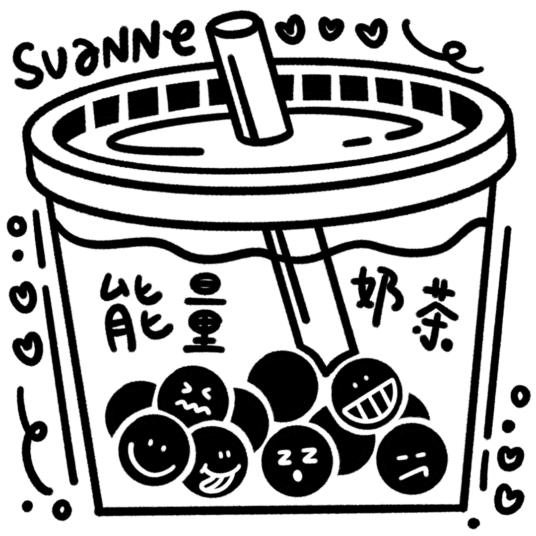
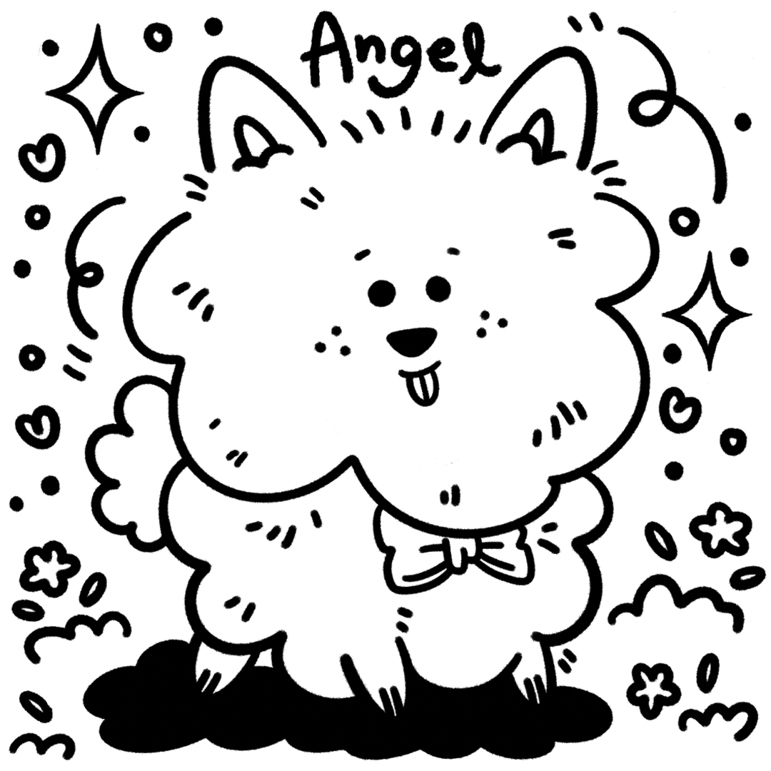
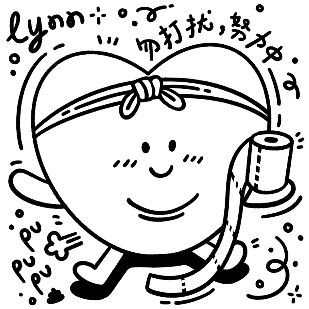
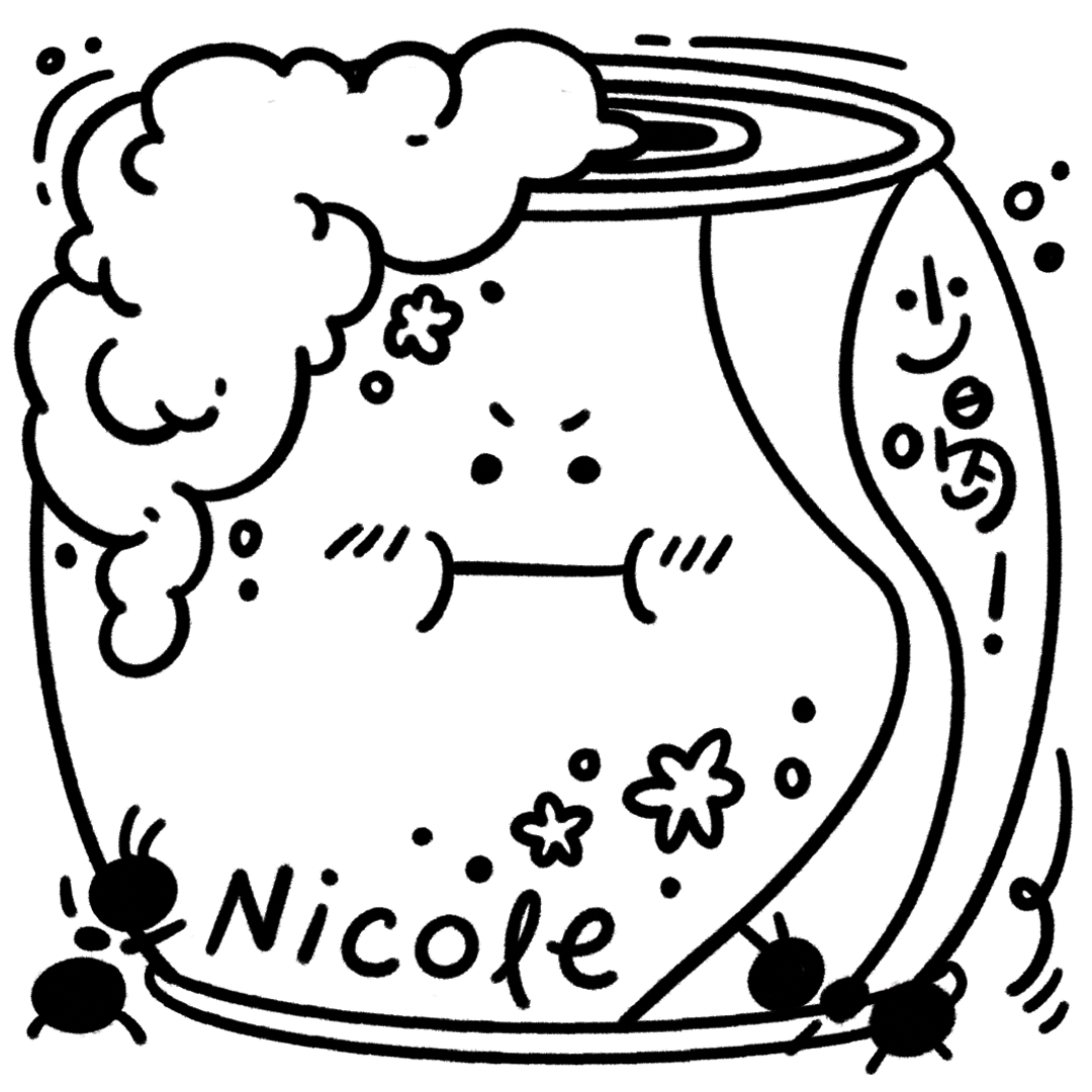
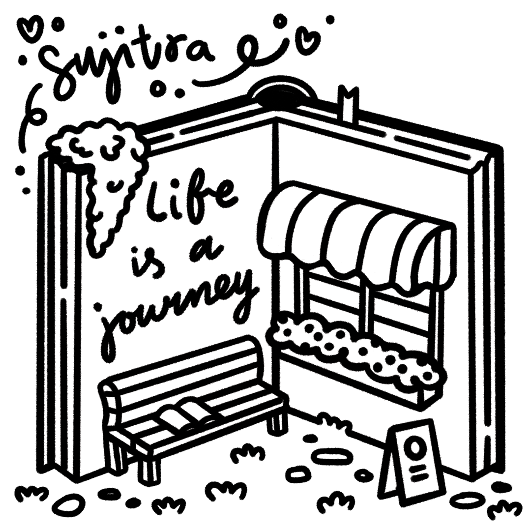
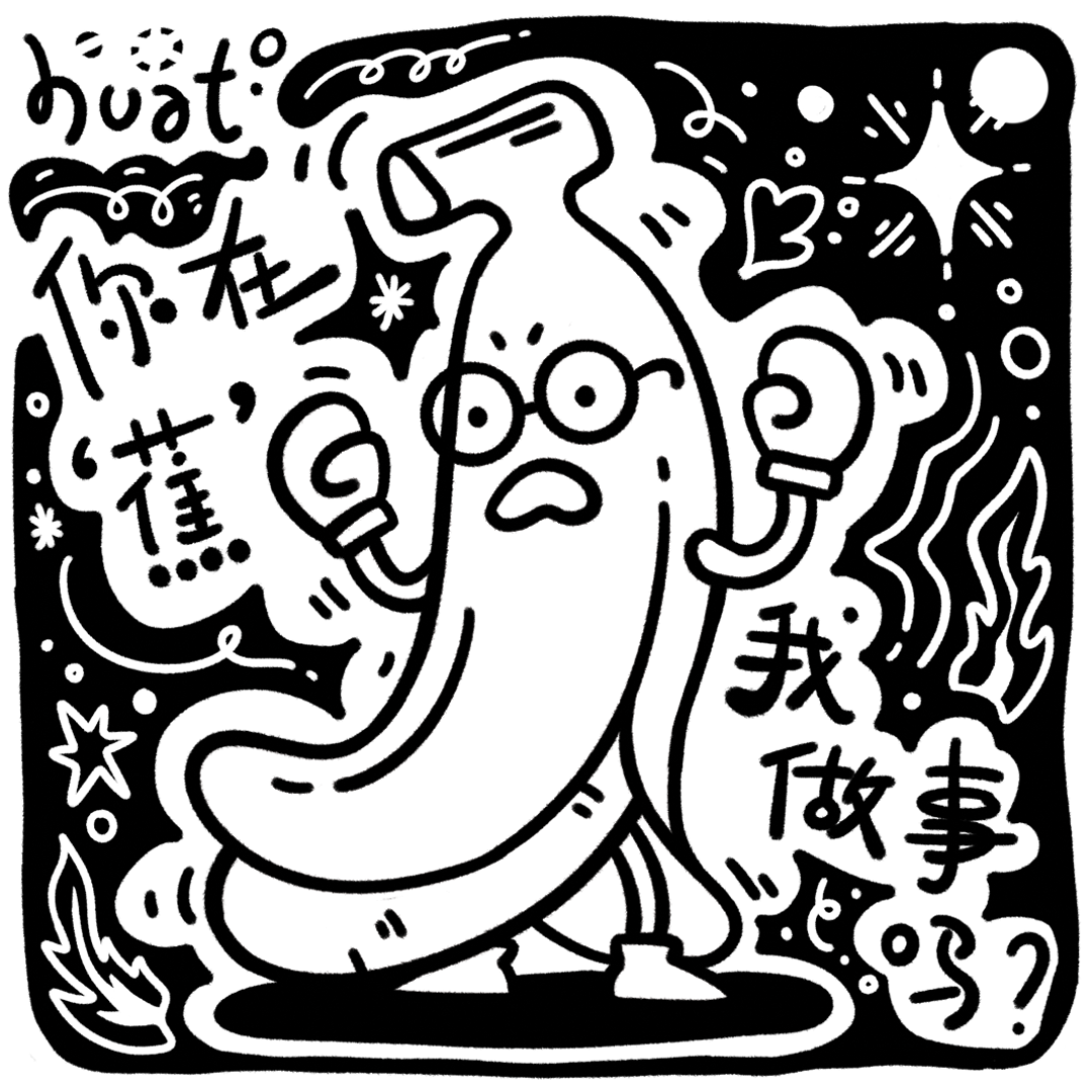
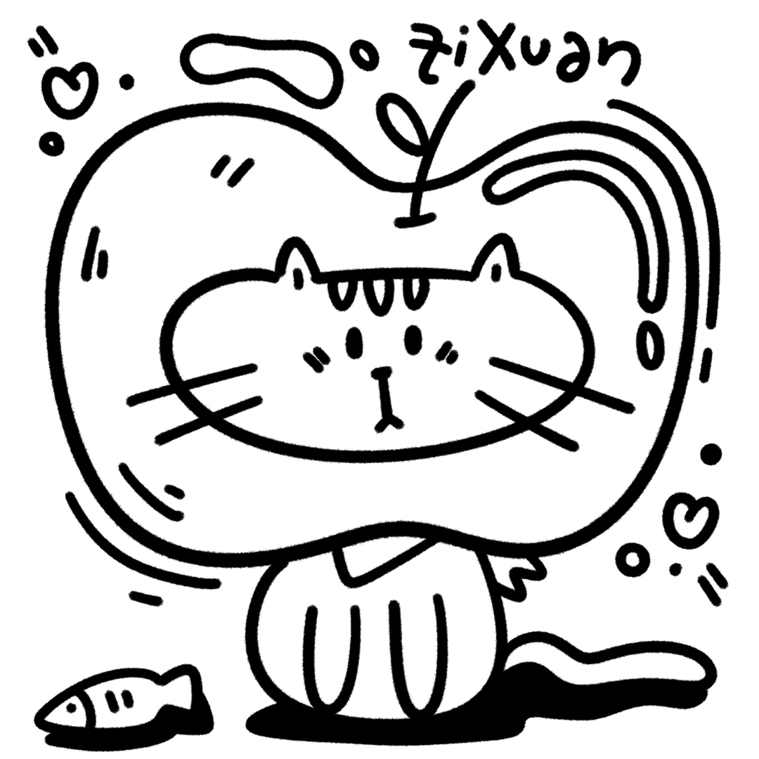
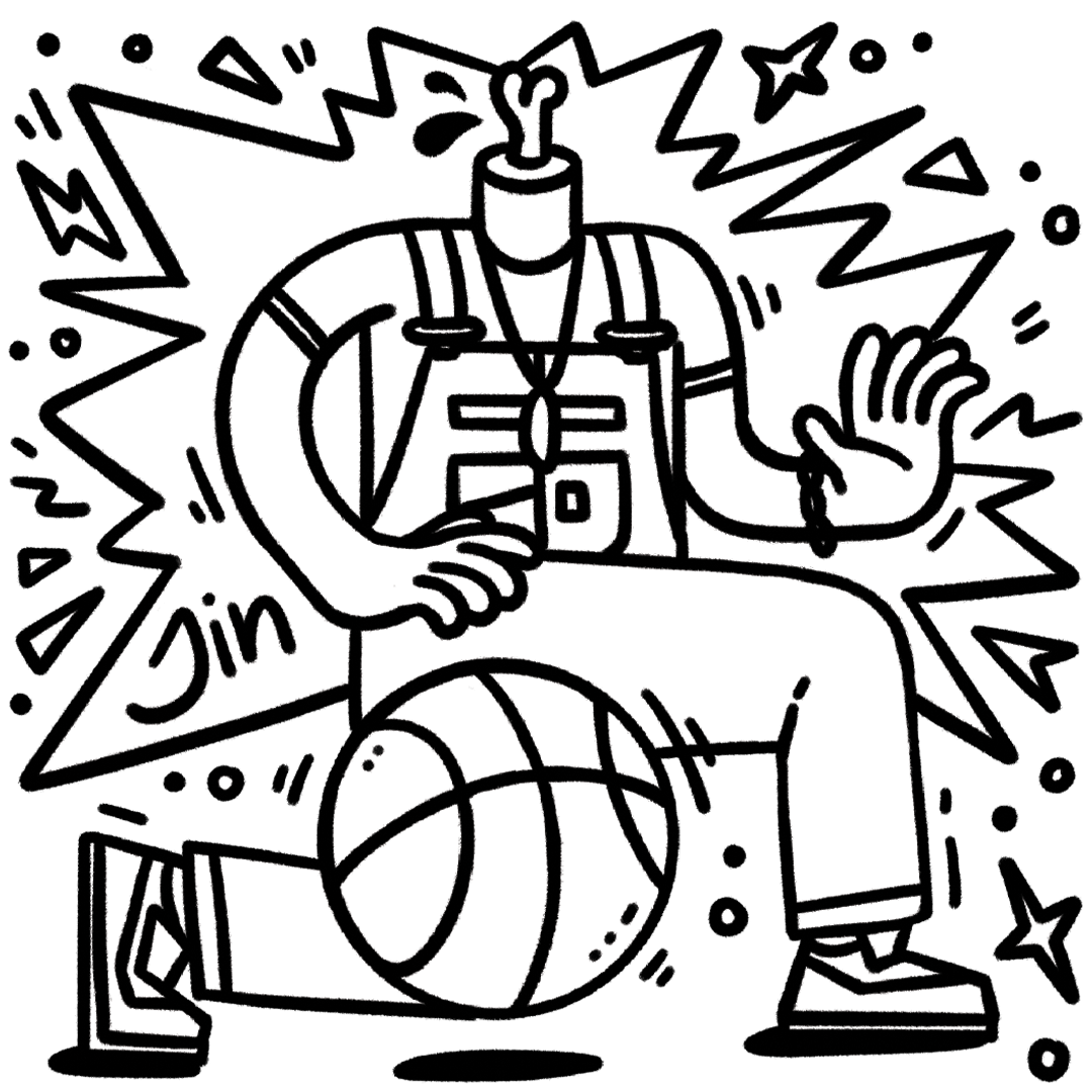
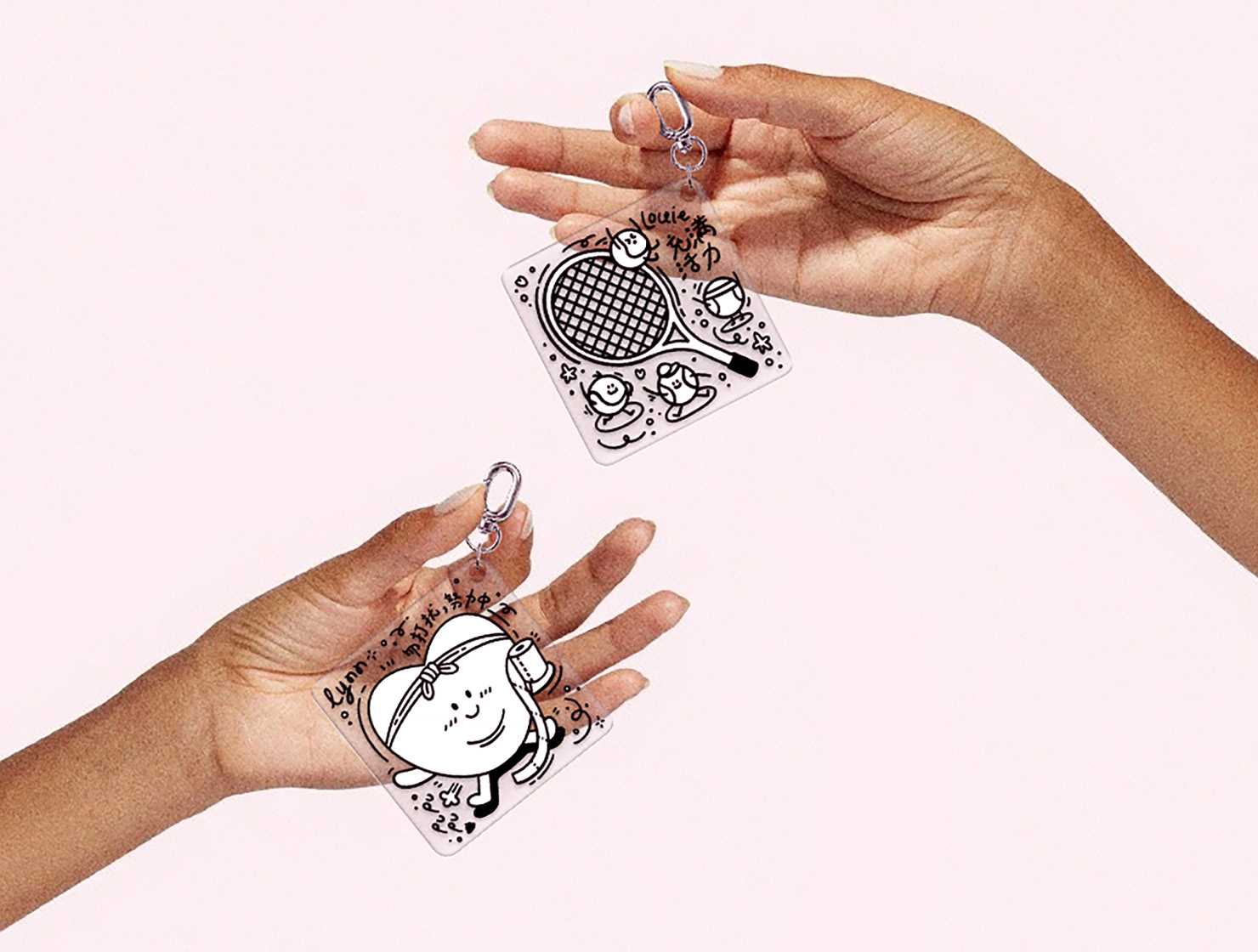
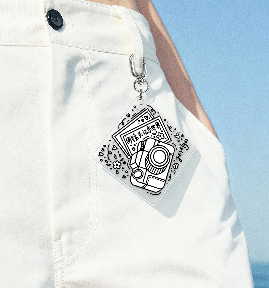
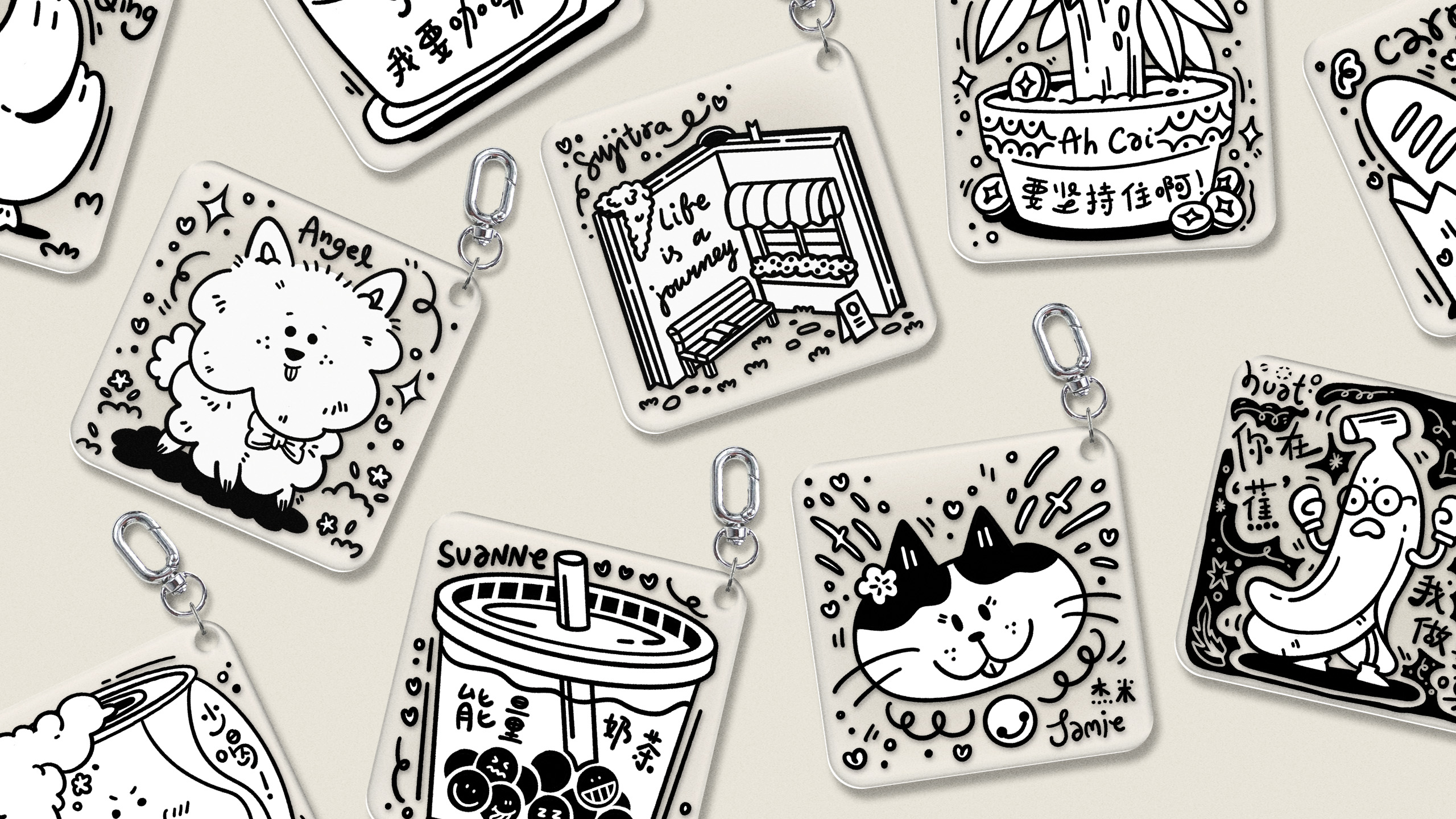
Each keychain in this series was inspired by my colleagues’ unique hobbies and personalities. I translated these traits into playful, custom illustrations, bringing each individual’s favorite things to life in a tangible and meaningful way.

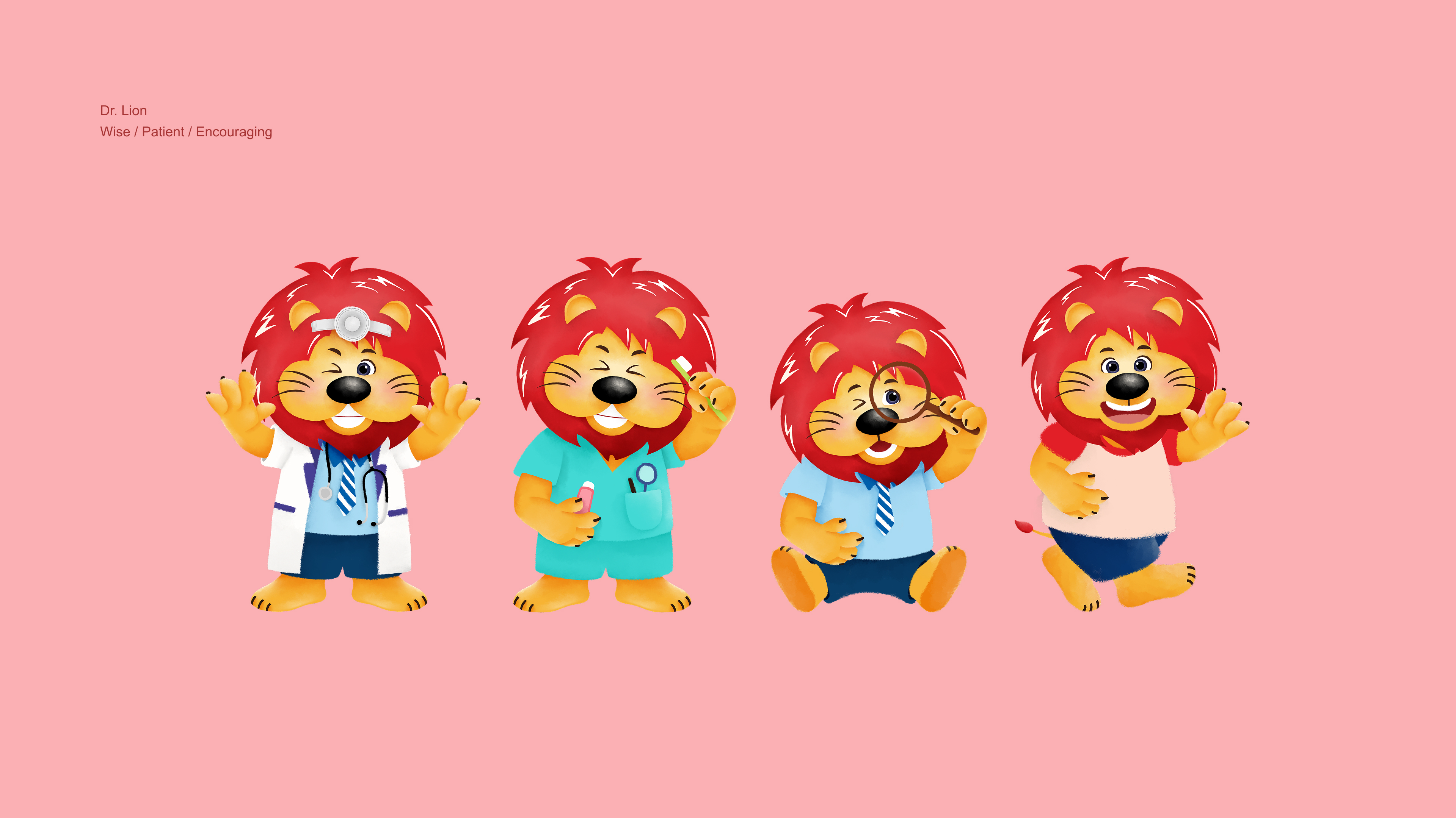
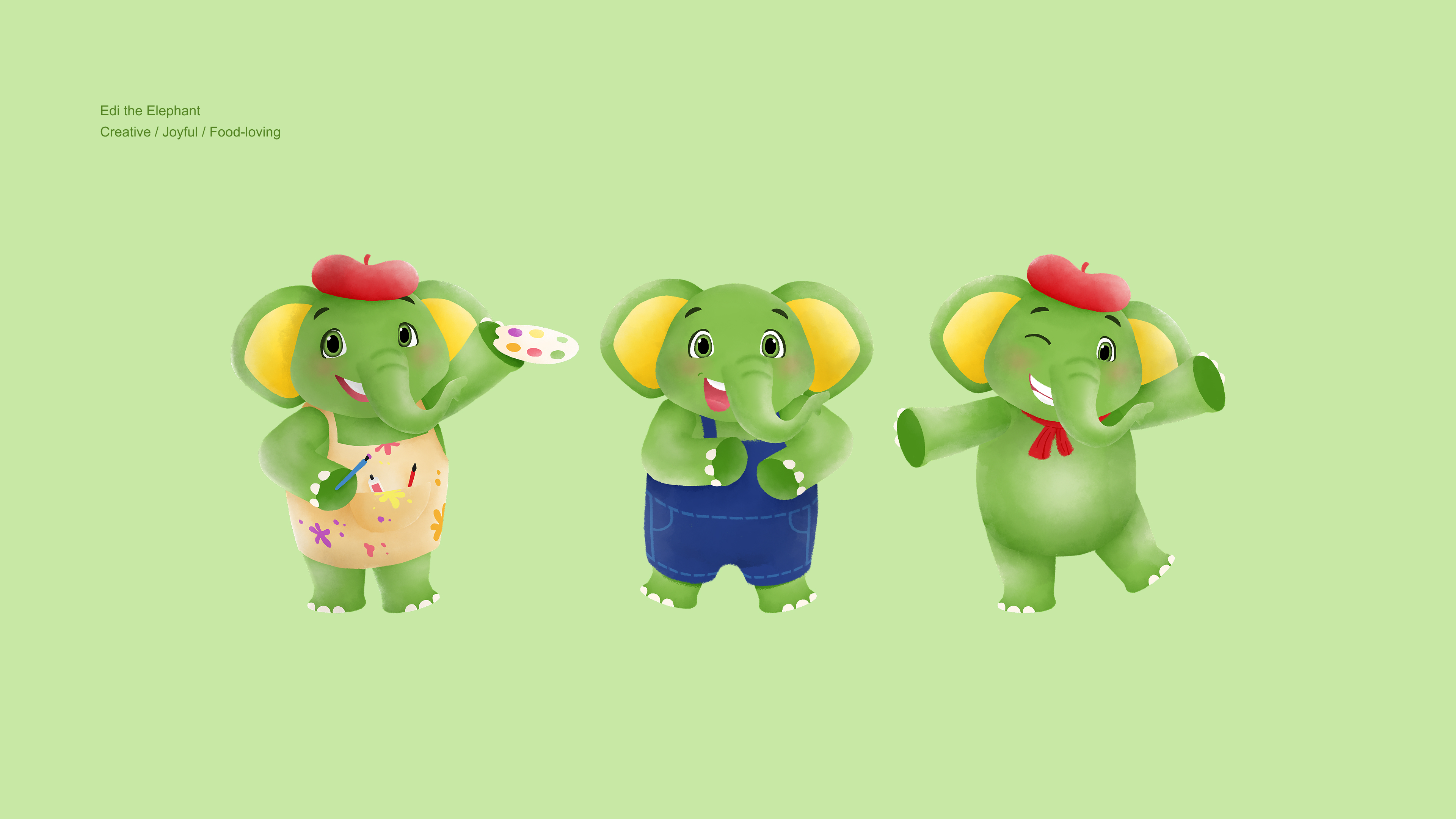
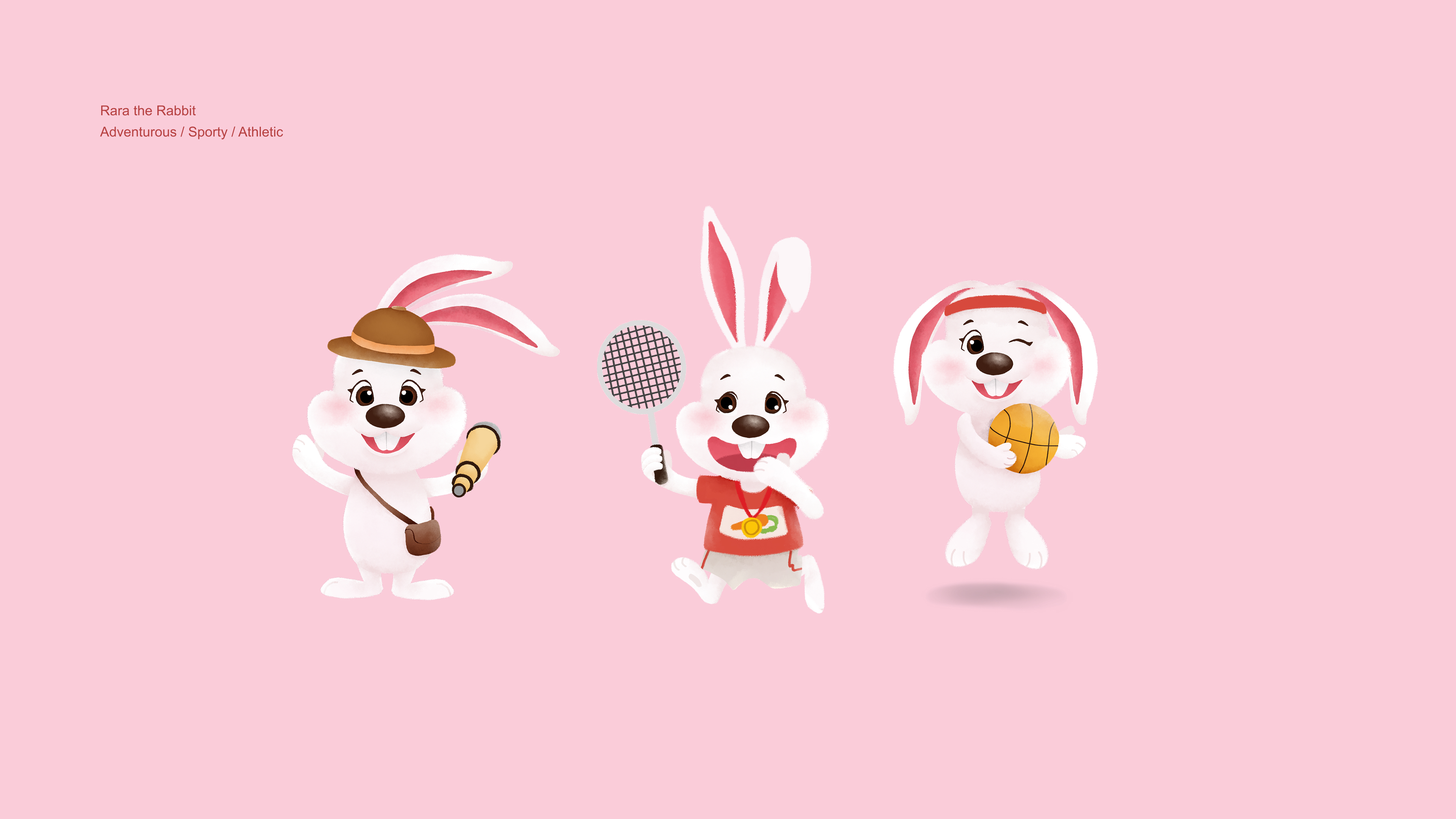
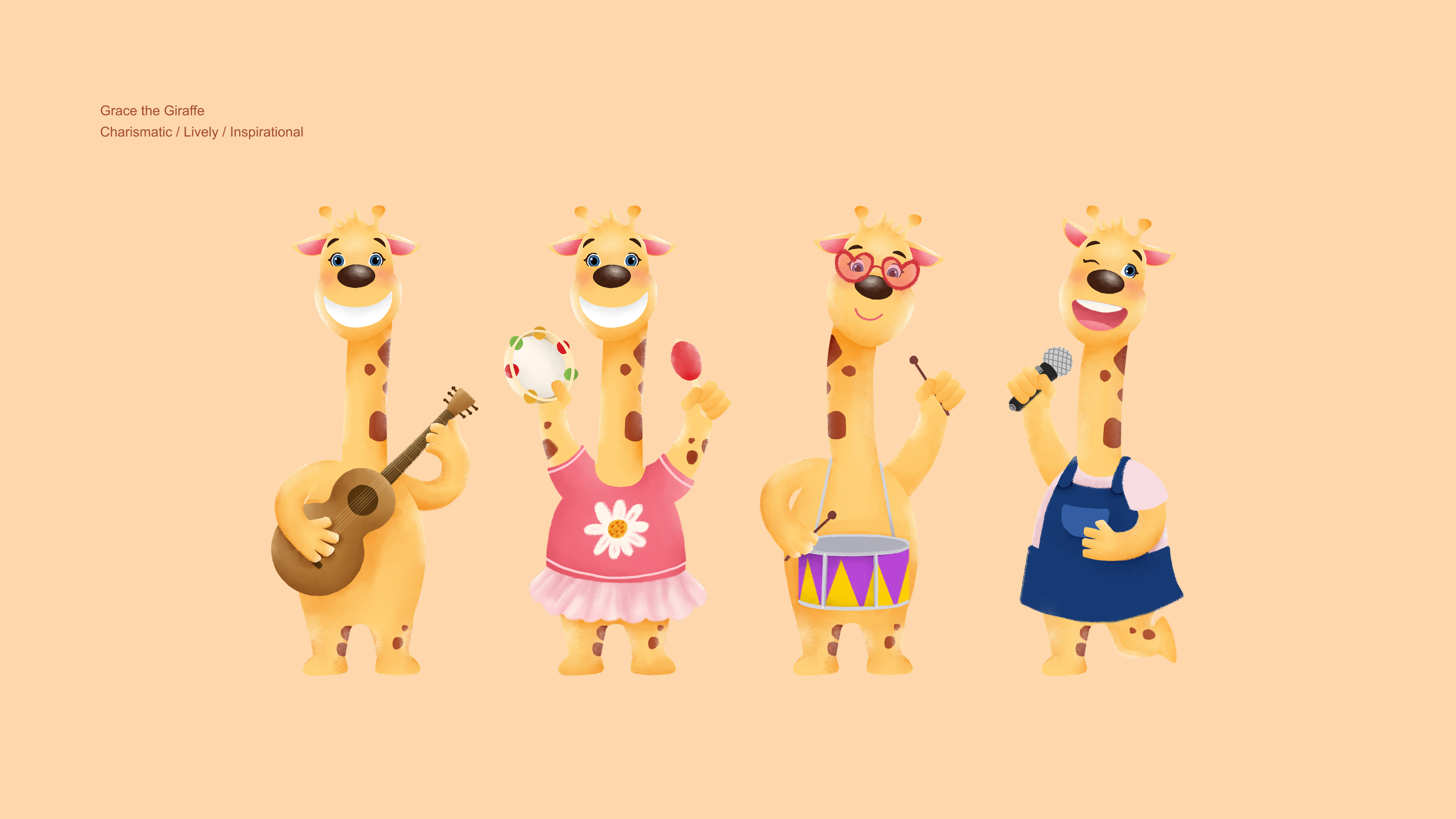
Kodomo faced two main challenges: the brand was perceived as outdated, and communication and audience engagement had been limited over the past two years. To address these issues, the brand imagery was refreshed, and consumer engagement was strengthened to reinforce Kodomo’s core belief.
As a trusted specialist in children’s oral care, Kodomo believes brushing should be both fun and effective. Through this brand direction, the characters were brought to life, highlighting how the new USPs make brushing fun, enjoyable, and meaningful for children everywhere.
The all-new Kodomo toothpaste packaging transforms brushing into a colorful, interactive experience. Playful Kodomo characters guide children through vibrant scenes, turning each tube into a miniature world of fun and imagination.An accompanying animated video extends the visual story, bringing movement and personality to the characters, and making daily brushing an engaging and delightful adventure that encourages kids to look forward to it every day.

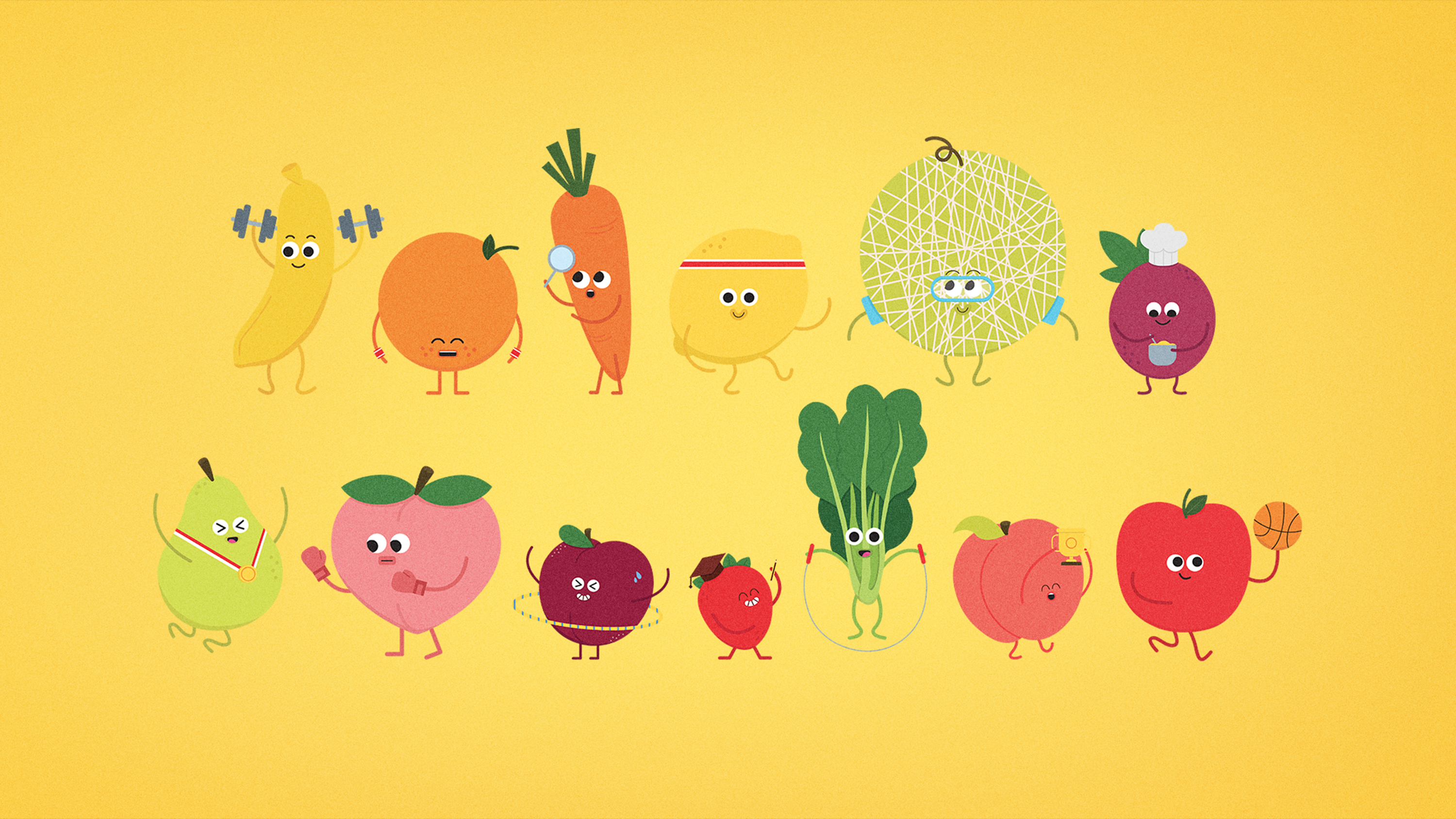
We added expressive actions and movements to each friend to show their unique personalities in life. This helps audiences connect with the characters, making them stand out and stay memorable long after the interaction.
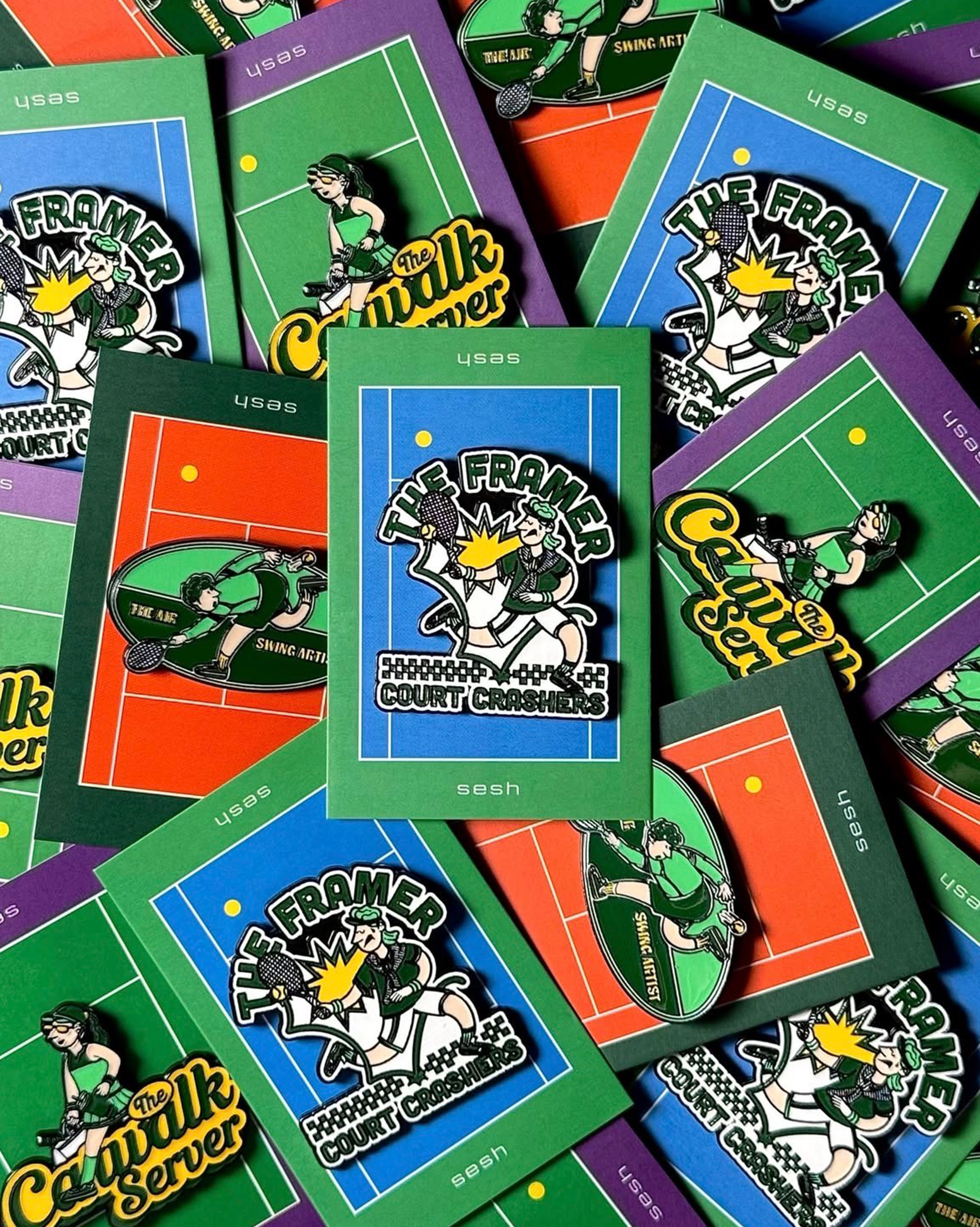
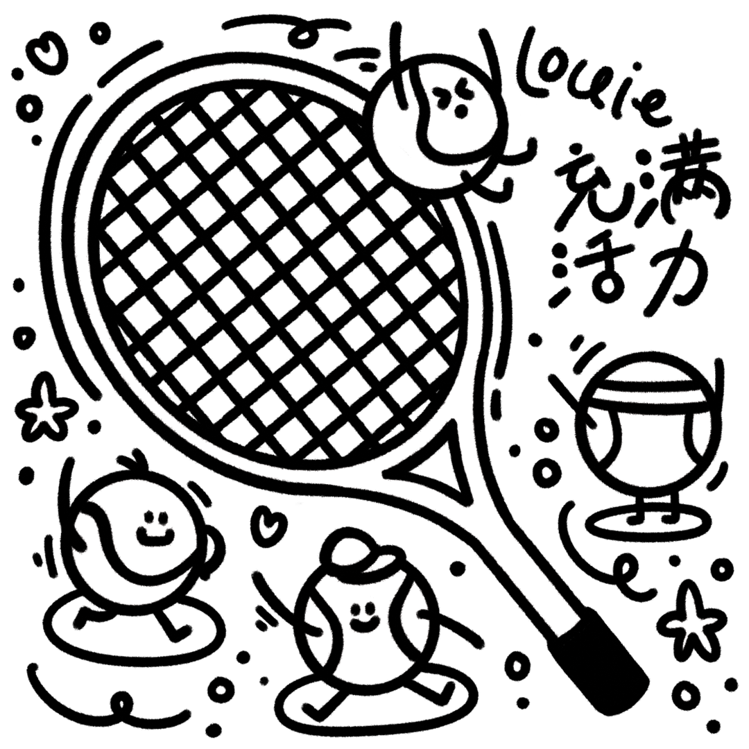
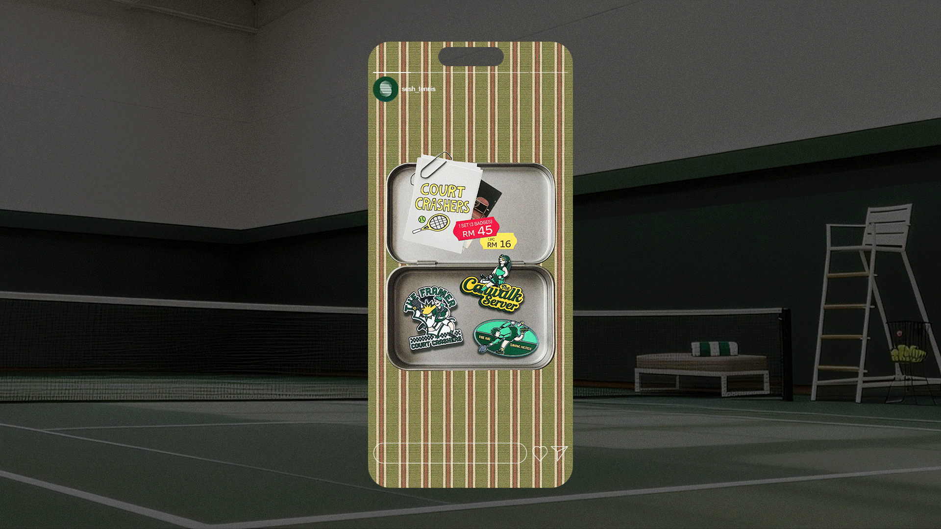
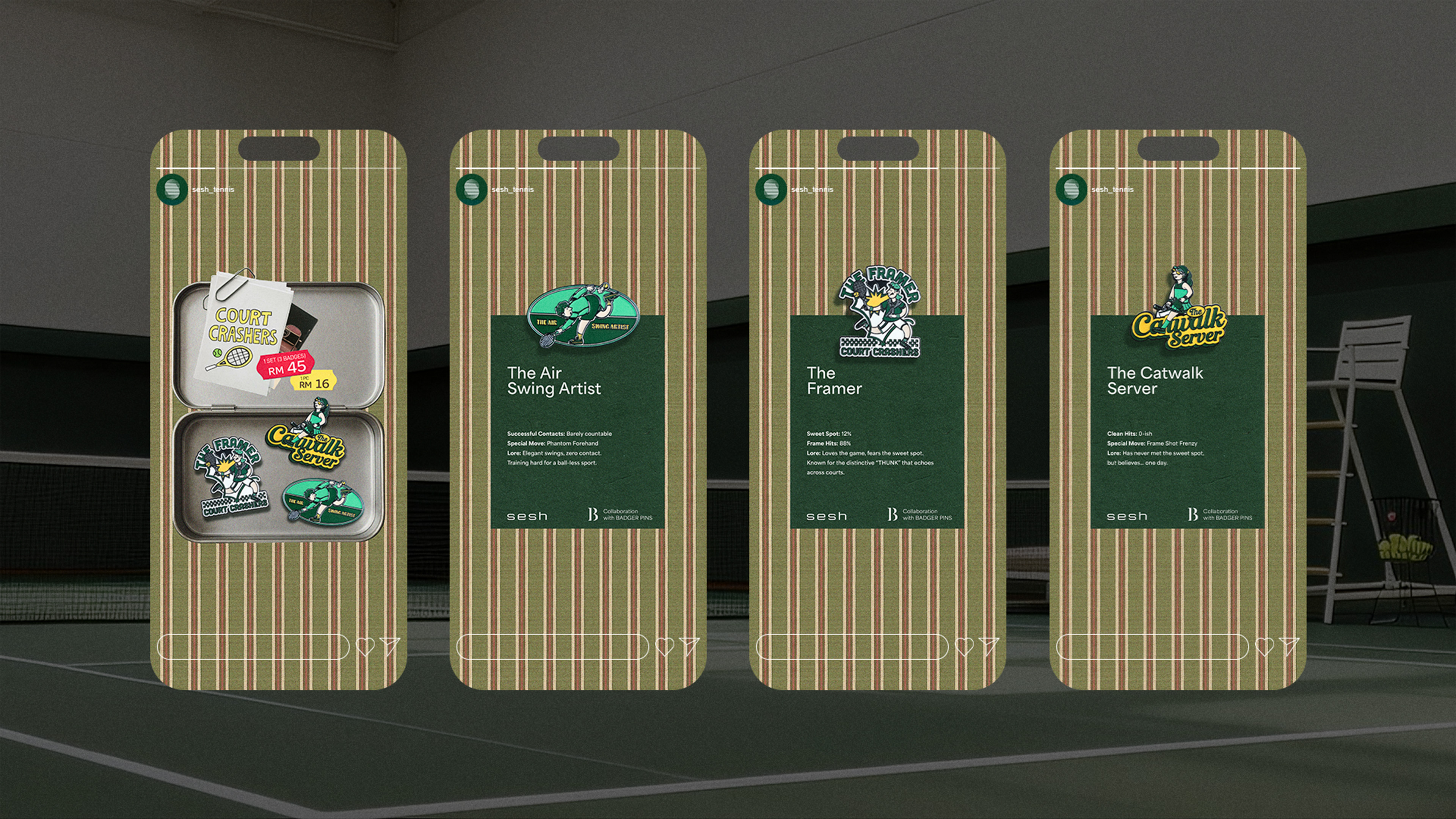
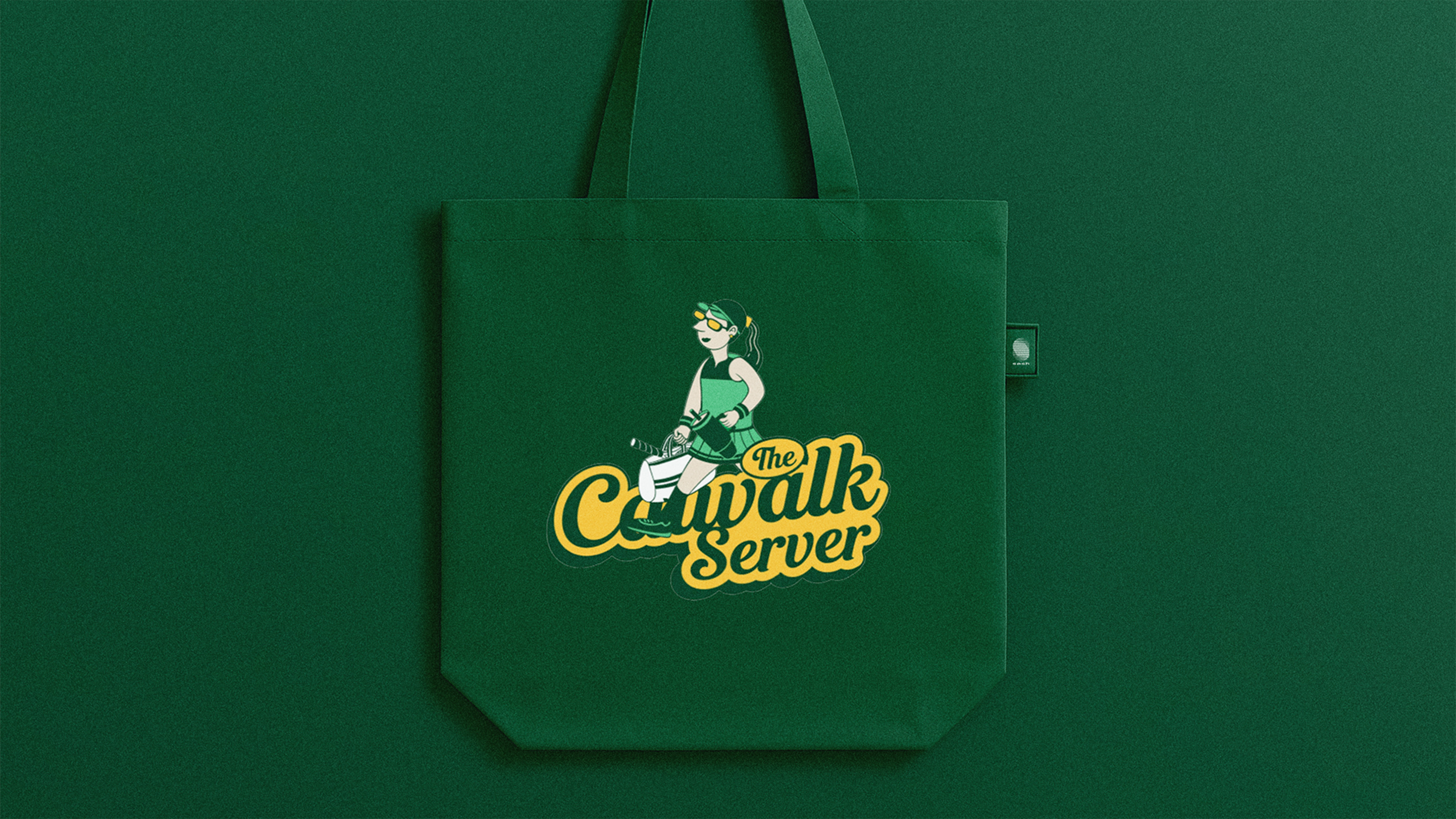
Sesh was born from a shared love of tennis. It is an indoor tennis experience for all skill levels, designed as a space to practice at your own pace, focus on your shots, and improve technique through targeted drills and focused practice.
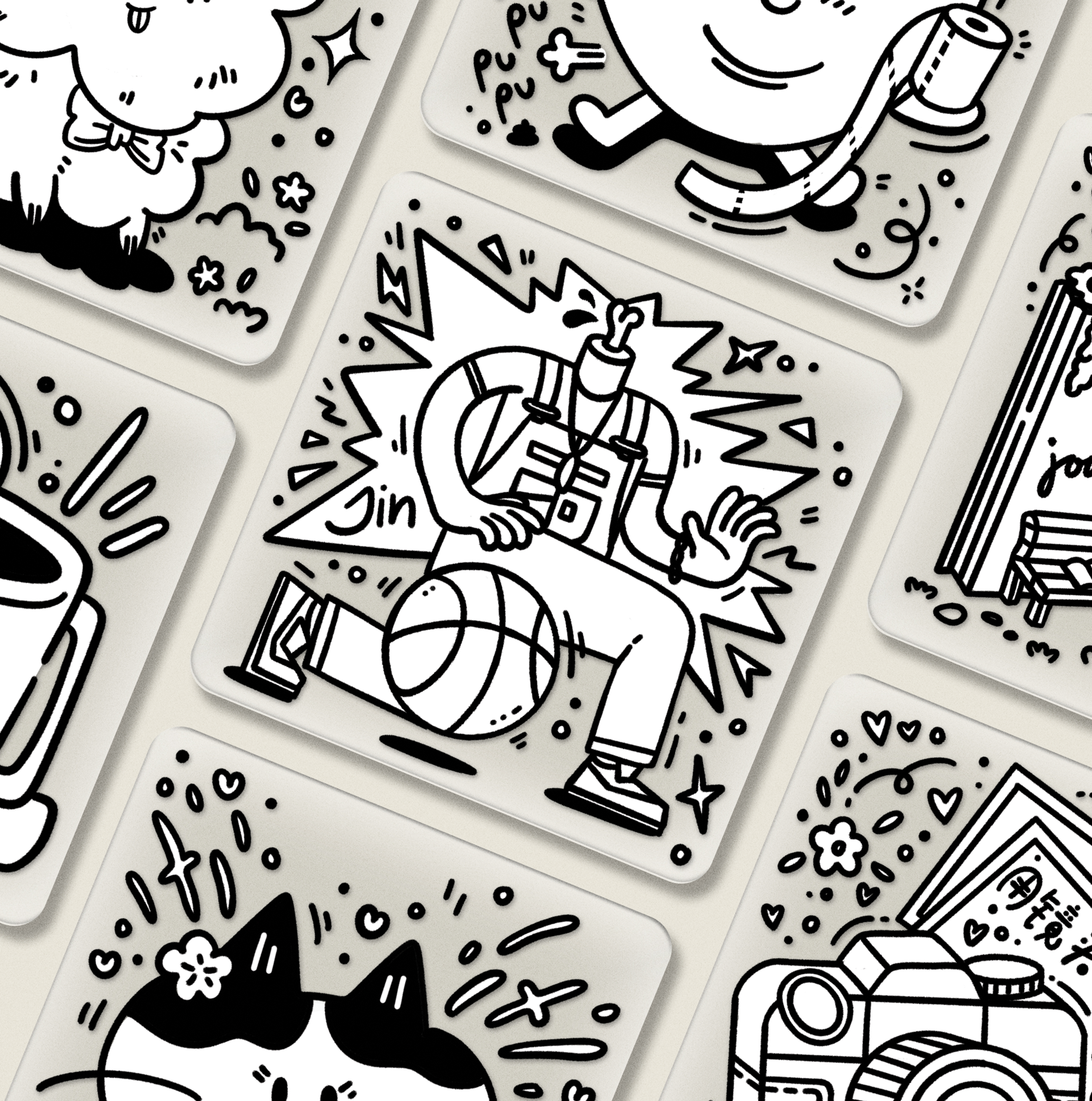
It was an honor to design their first-ever badge as the illustrator. The concept was inspired by the journey of every tennis player when they first start, full of fun mistakes that shape who they are today. The badge celebrates enjoying the journey, laughing along the way, and embracing the process.
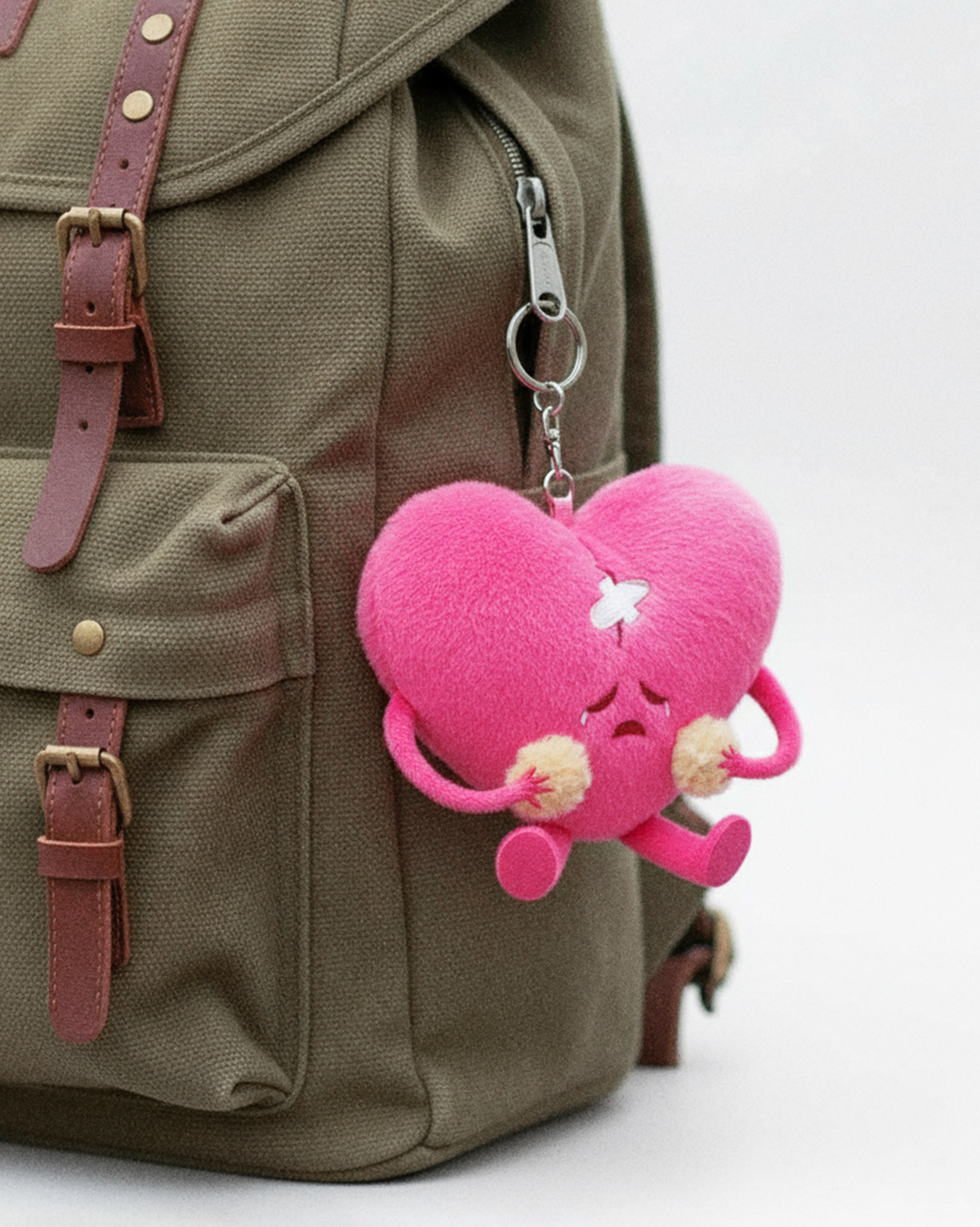
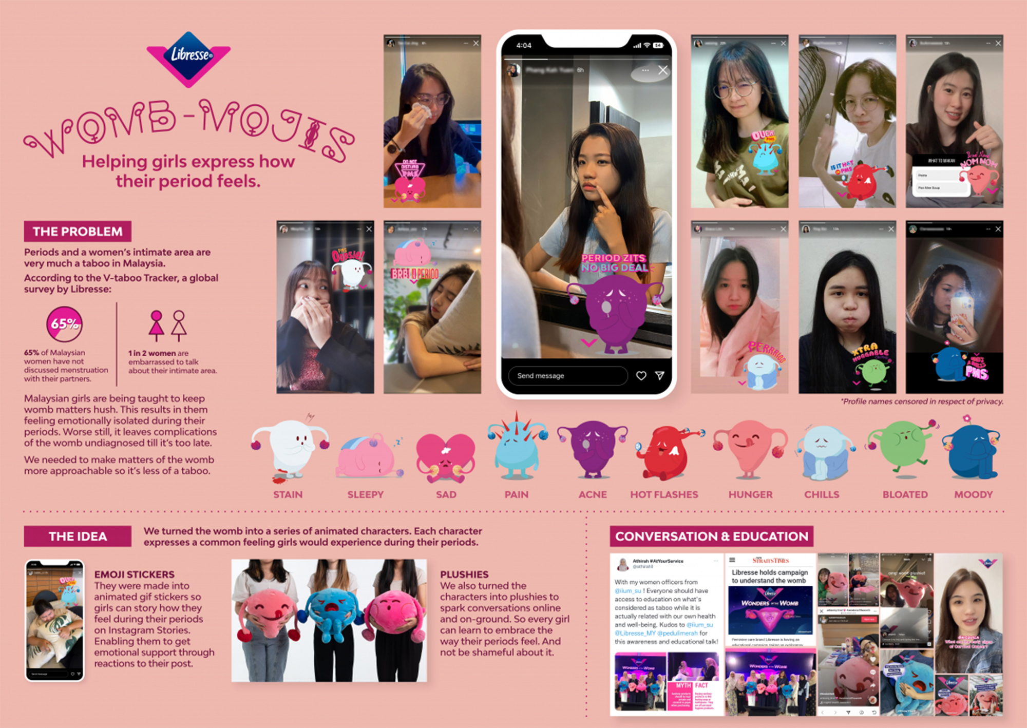
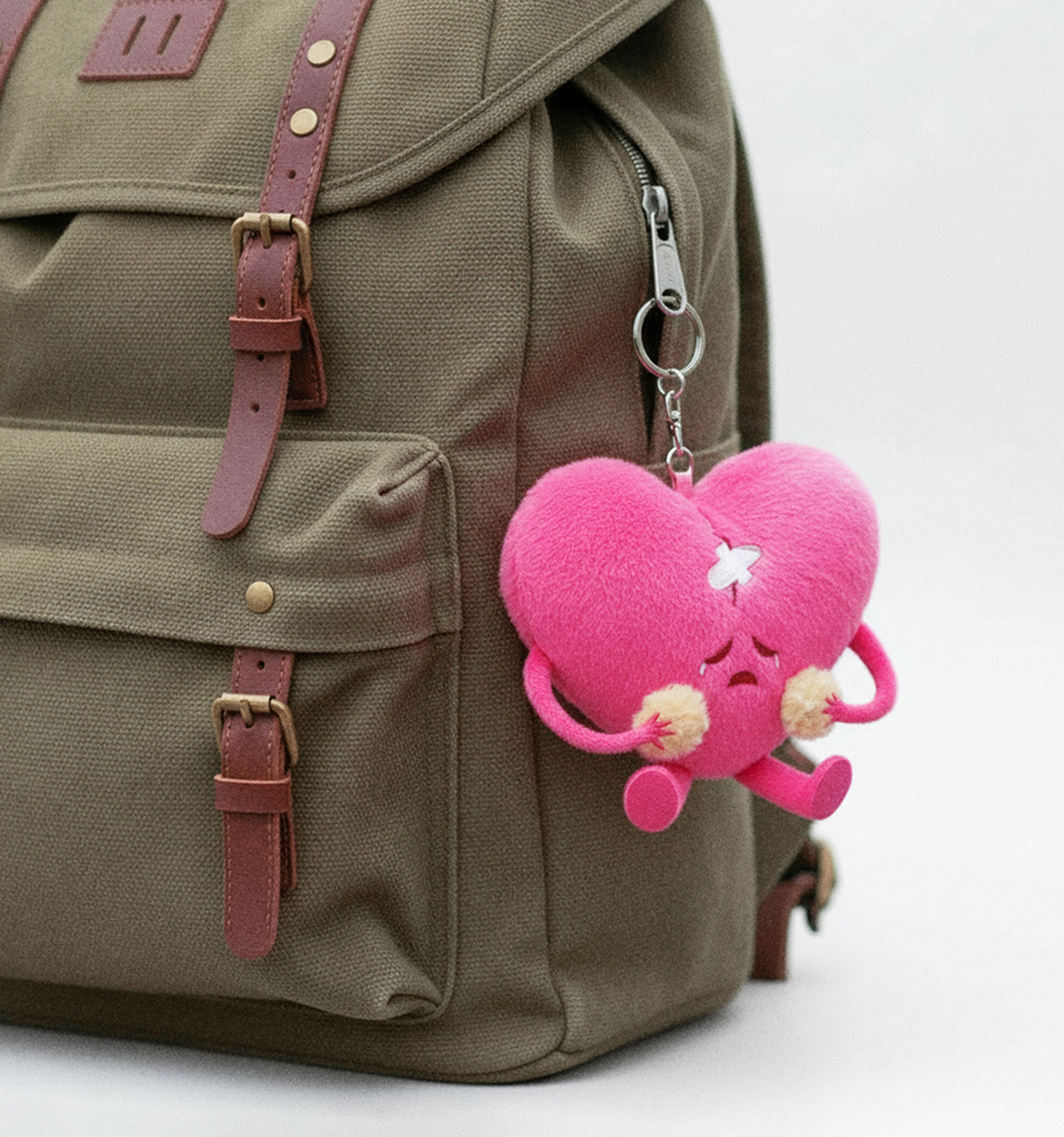
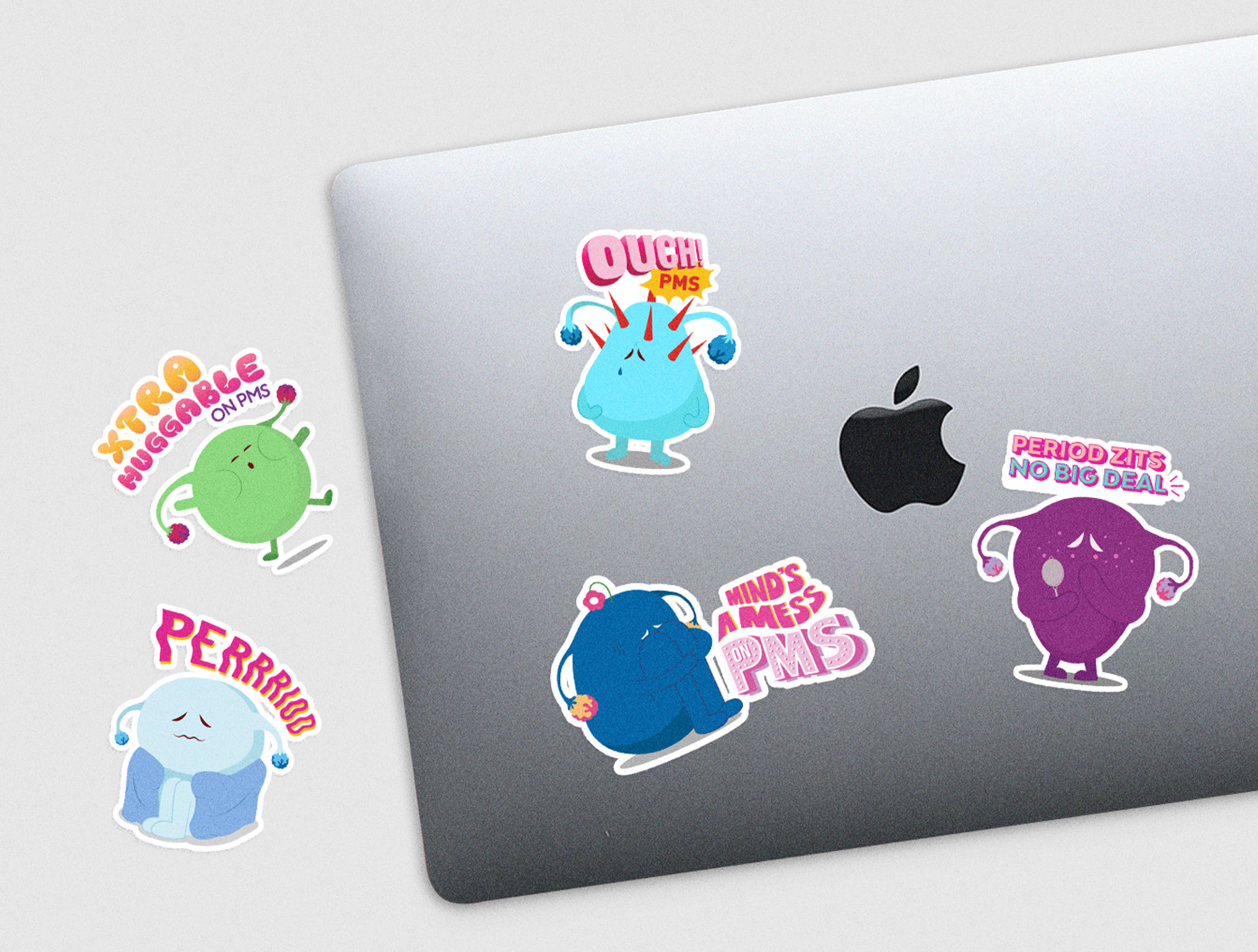
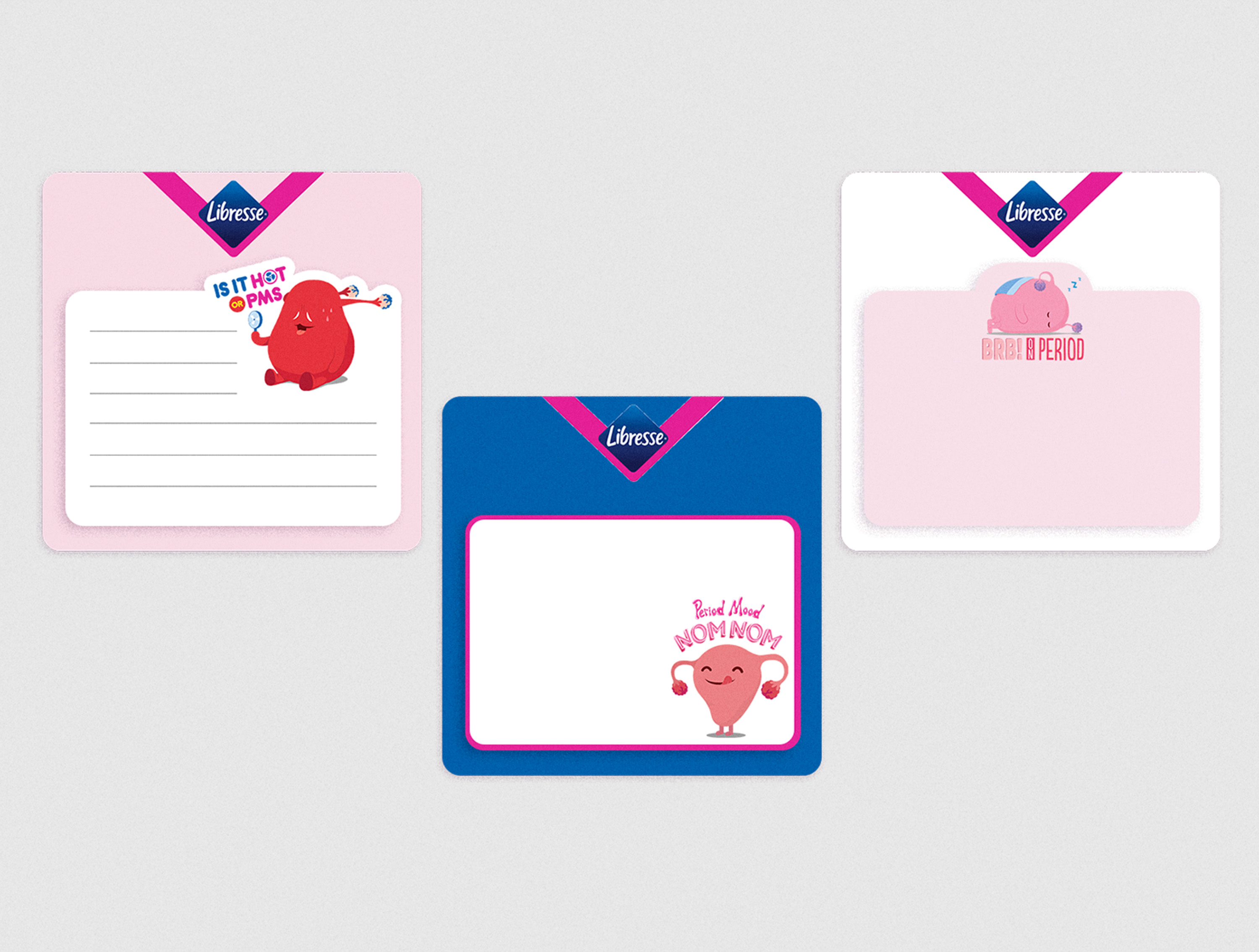
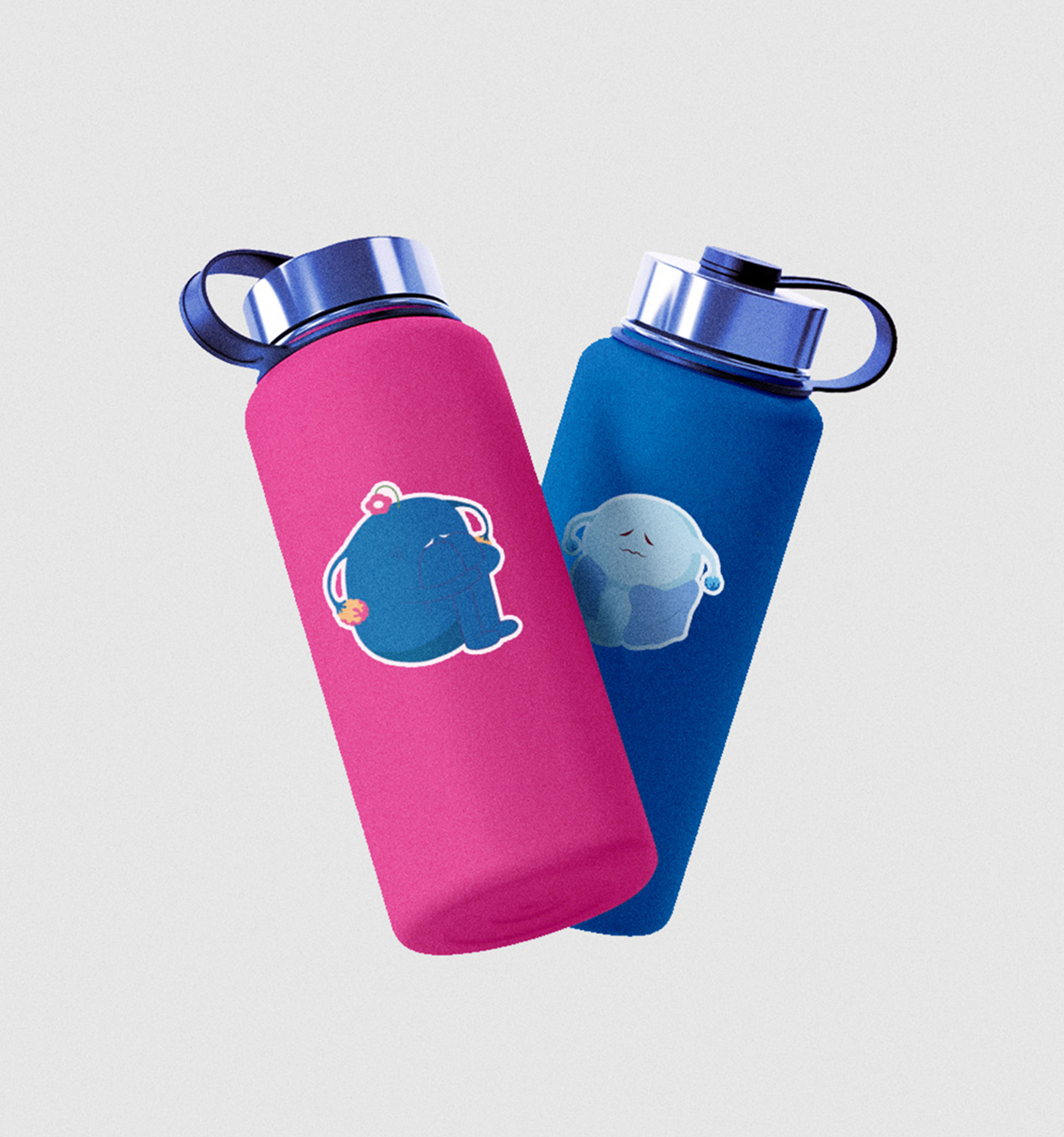
In Malaysia, girls are often taught to keep womb-related matters private. This can leave them feeling emotionally isolated during their periods and can result in complications going undiagnosed until it is too late.
The idea was to turn the womb into a series of animated characters, each expressing a common feeling girls experience during their periods, making this once-taboo topic more approachable and easier to understand.
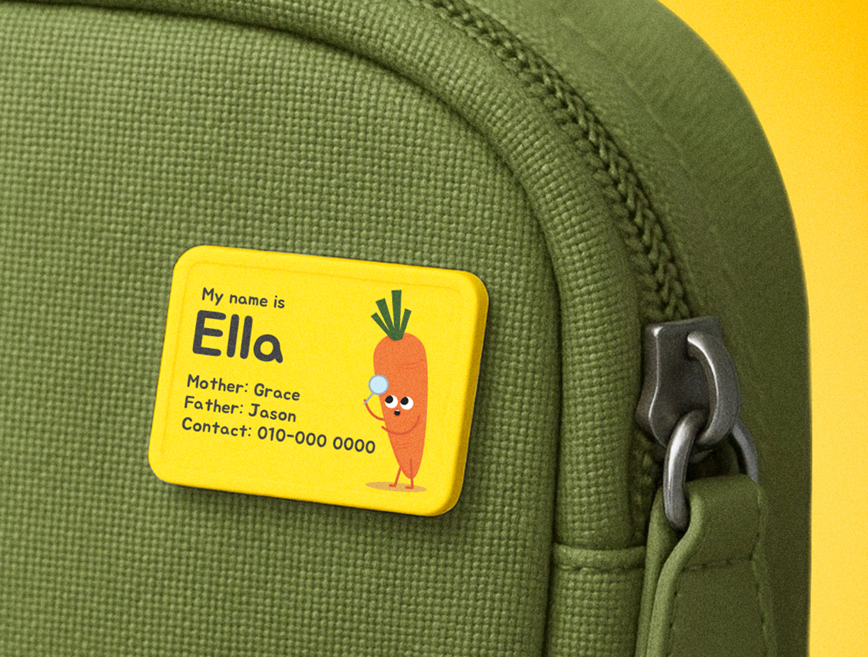
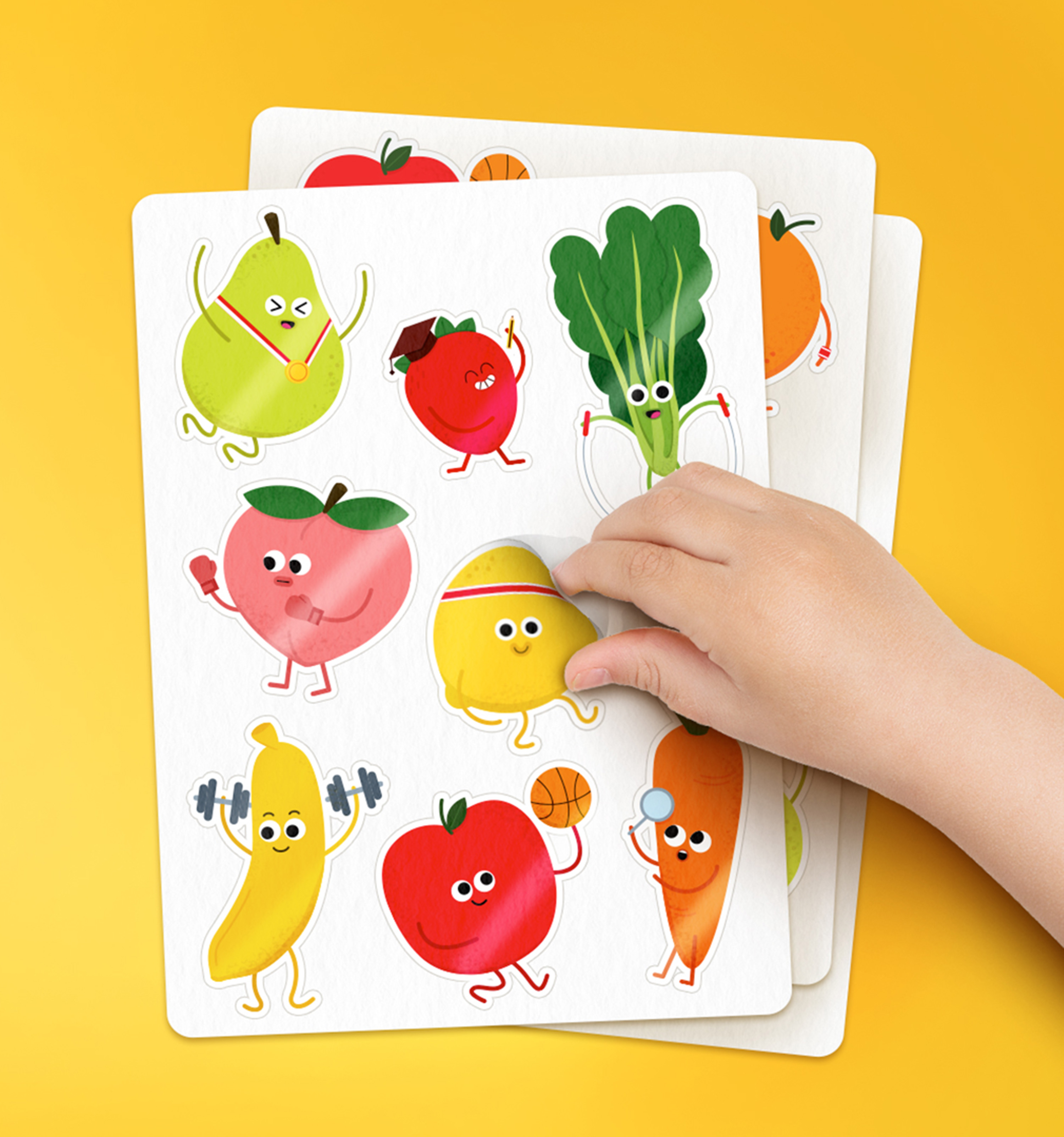
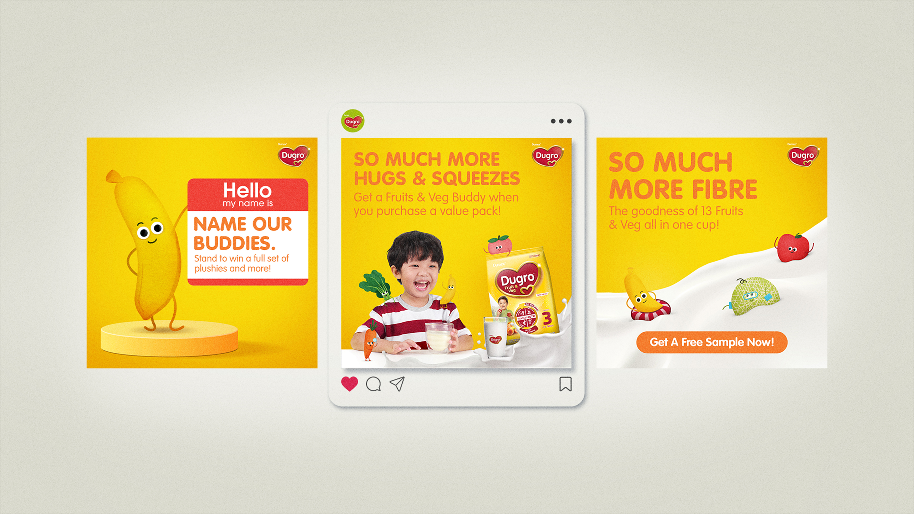
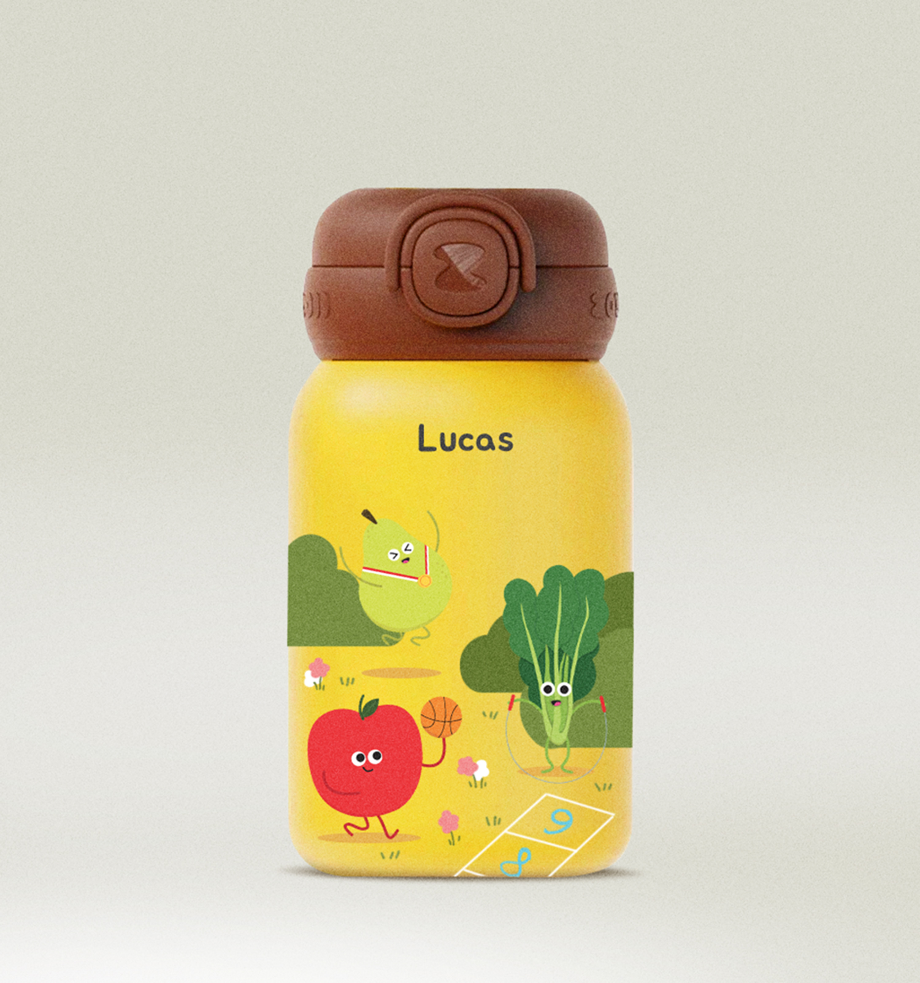
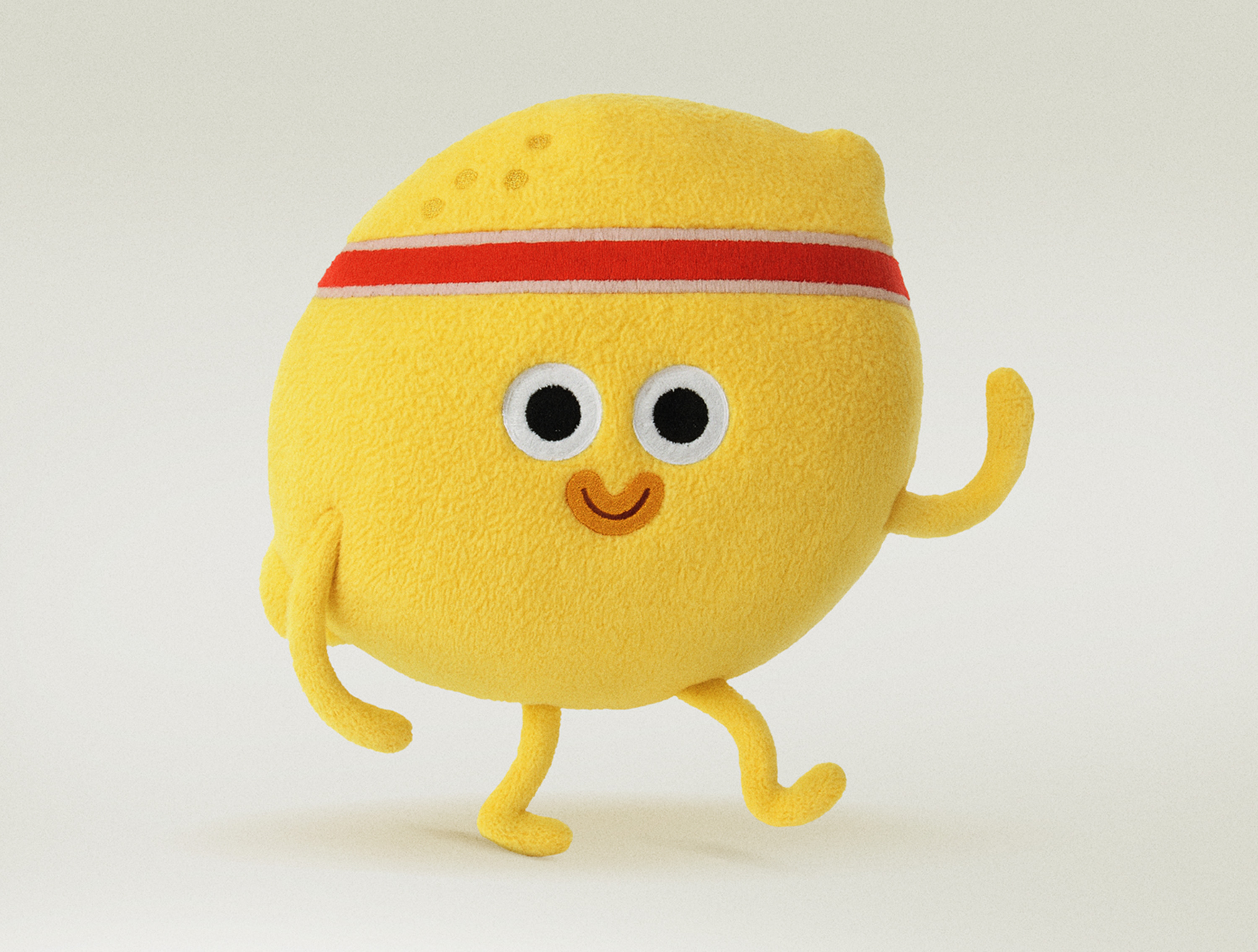
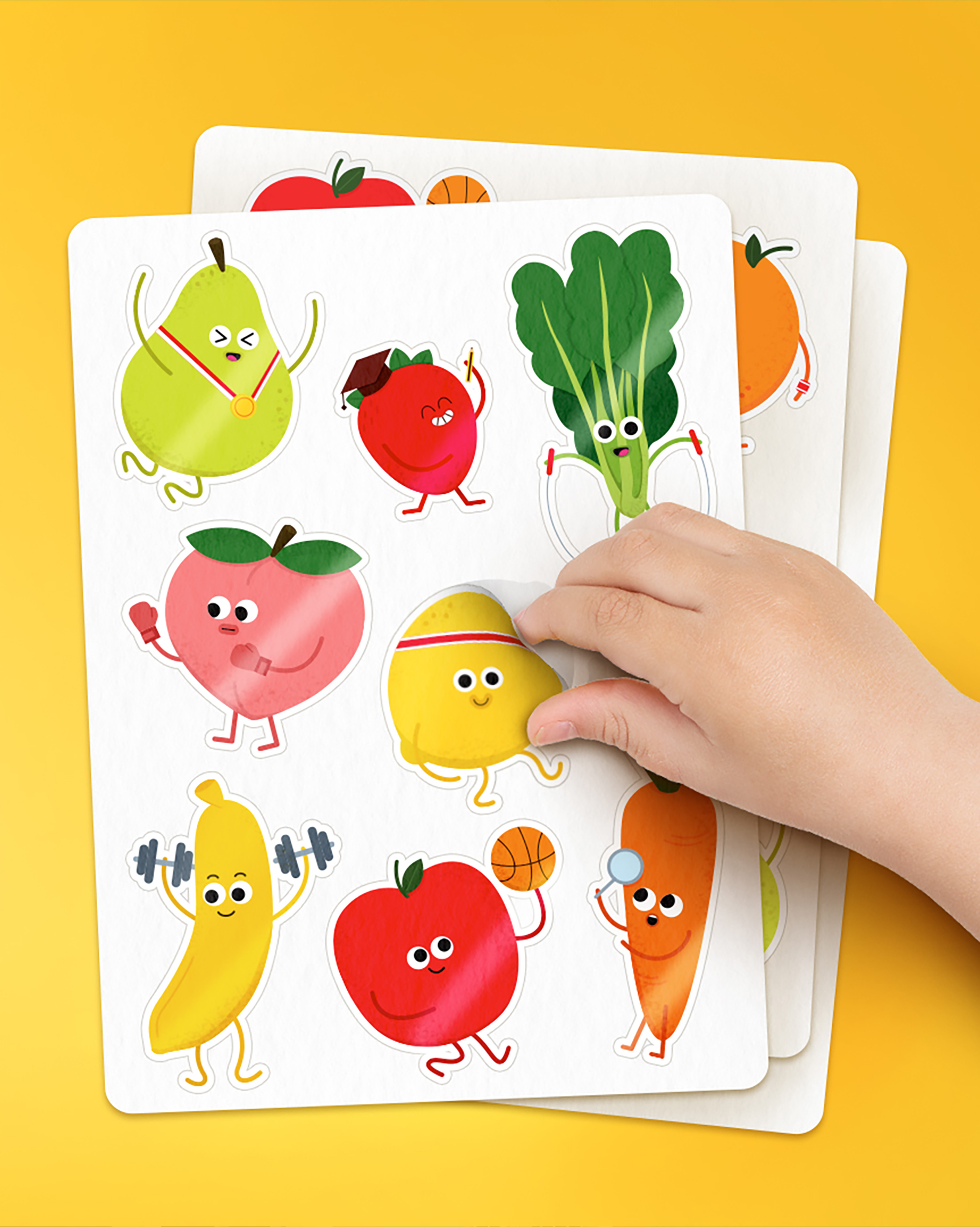
Dugro Fruit & Veg is a children’s milk formula enriched with fruit and vegetable extracts. Since many kids dislike eating greens, the campaign introduced 13 playful fruit and vegetable characters to make healthy eating fun and approachable.
These characters add a whimsical touch across all communications, helping children engage with the brand and encouraging them to “Be So Much More" in a memorable and enjoyable way.